Web Worker-assisted Email Visualizations using Vega

Faceted and overview visualizations

tl;dr: glodastrophe, the experimental entirely-client-side JS desktop-ish email app now supports Vega-based visualizations in addition to new support infrastructure for extension-y things and creating derived views based on the search/filter infrastructure.

Two of the dreams of Mozilla Messaging were:

  1. Shareable email workflows (credit to :davida).  If you could figure out how to set up your email client in a way that worked for you, you should be able to share that with others in a way that doesn’t require them to manually duplicate your efforts and ideally without you having to write code.  (And ideally without anyone having to review code/anything in order to ensure there are no privacy or security problems in the workflow.)
  2. Useful email visualizations.  While in the end, the only visualization ever shipped with Thunderbird was the simple timeline view of the faceted global search, various experiments happened along the way, some abandoned.  For example, the following screenshot shows one of the earlier stages of faceted search development where each facet attempted to visualize the relative proportion of messages sharing that facet.

faceted search UI prototype

At the time, the protovis JS visualization library was the state of the art.  Its successor the amazing, continually evolving d3 has eclipsed it.  d3, being a JS library, requires someone to write JS code.  A visualization written directly in JS runs into the whole code review issue.  What would be ideal is a means of specifying visualizations that is substantially more inert and easy to sandbox.

Enter, Vega, a visualization grammar that can be expressed in JSON that can not only define “simple” static visualizations, but also mind-blowing gapminder-style interactive visualizations.  Also, it has some very clever dataflow stuff under the hood and builds on d3 and its well-proven magic.  I performed a fairly extensive survey of the current visualization, faceting, and data processing options to help bring visualizations and faceted filtered search to glodastrophe and other potential gaia mail consumers like the Firefox OS Gaia Mail App.

Digression: Two relevant significant changes in how the gaia mail backend was designed compared to its predecessor Thunderbird (and its global database) are:

  1. As much as can possibly be done in a DOM/Web Worker(s) is done so.  This greatly assists in UI responsiveness.  Thunderbird has to do most things on the main thread because of hard-to-unwind implementation choices that permeate the codebase.
  2. It’s assumed that the local mail client may only have a subset of the messages known to the server, that the server may be smart, and that it’s possible to convince servers to support new functionality.  In many ways, this is still aspirational (the backend has not yet implemented search on server), but the architecture has always kept this in mind.

In terms of visualizations, what this means is that we pre-chew as much of the data in the worker as we can, drastically reducing both the amount of computation that needs to happen on the main (page) thread and the amount of data we have to send to it.  It also means that we could potentially farm all of this out to the server if its search capabilities are sufficiently advanced.  And/or the backend could cache previous results.

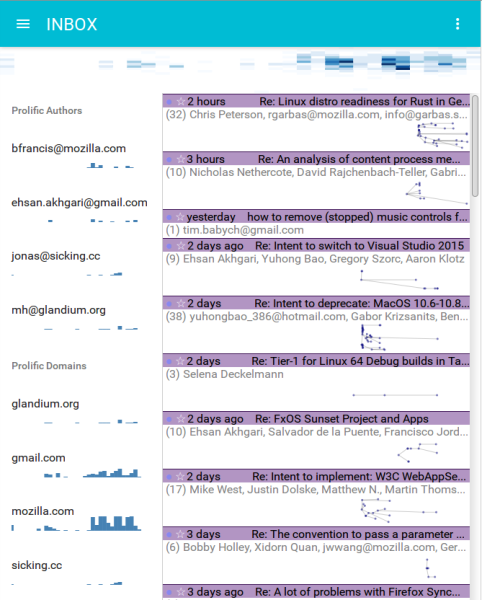
For example, in the faceted visualizations on the sidebar (placed side-by-side here):
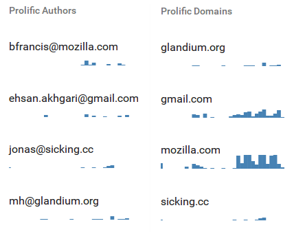
faceted-histograms

In the “Prolific Authors” visualization definition, the backend in the worker constructs a Vega dataflow (only!).  The search/filter mechanism is spun up and the visualization’s data gathering needs specify that we will load the messages that belong to each conversation in consideration.  Then for each message we extract the author and age of the message and feed that to the dataflow graph.  The data transforms bin the messages by date, facet the messages by author, and aggregate the message bins within each author.  We then sort the authors by the number of messages they authored, and limit it to the top 5 authors which we then alphabetically sort.  If we were doing this on the front-end, we’d have to send all N messages from the back-end.  Instead, we send over just 5 histograms with a maximum of 60 data-points in each histogram, one per bin.

Same deal with “Prolific domains”, but we extract the author’s mail domain and aggregate based on that.

Authored content size overview heatmap

Similarly, the overview Authored content size over time heatmap visualization sends only the aggregated heatmap bins over the wire, not all the messages.  Elaborating, for each message body part, we (now) compute an estimate of the number of actual “fresh” content bytes in the message.  Anything we can detect as a quote or a mailing list footer or multiple paragraphs of legal disclaimers doesn’t count.  The x-axis bins by time; now is on the right, the oldest considered message is on the left.  The y-axis bins by the log of the authored content size.  Messages with zero new bytes are at the bottom, massive essays are at the top.  The current visualization is useless, but I think the ingredients can and will be used to create something more informative.

Other notable glodastrophe changes since the last blog post:

  • Front-end state management is now done using redux
  • The Material UI React library has been adopted for UI widget purposes, though the conversation and message summaries still need to be overhauled.
  • React was upgraded
  • A war was fought with flexbox and flexbox won.  Hard-coding and calc() are the only reason the visualizations look reasonably sized.
  • Webpack is now used for bundling in order to facilitate all of these upgrades and reduce potential contributor friction.

More to come!

An email conversation summary visualization

We’ve been overhauling the Firefox OS Gaia Email app and its back-end to understand email conversations.  I also created a react.js-based desktop-ish development UI, glodastrophe, that consumes the same back-end.

My first attempt at summaries for glodastrophe was the following:

old summaries; 3 message tidbits

The back-end derives a conversation summary object from all of the messages that make up the conversation whenever any message in the conversation changes.  While there are some things that are always computed (the number of messages in the conversation, whether there are any unread messages, any starred/flagged messages, etc.), the back-end also provides hooks for the front-end to provide application logic to do its own processing to meet its UI needs.

In the case of this conversation summary, the application logic finds the first 3 unread messages in the conversation and stashes their date, author, and extracted snippet (if any) in a list of “tidbits”.  This also is used to determine the height of the conversation summary in the conversation list.  (The virtual list is aware of a quantized coordinate space where each conversation summary object is between 1 and 4 units high in this case.)

While this is interesting because it’s something Thunderbird’s thread pane could not do, it’s not clear that the tidbits are an efficient use of screen real-estate.  At least not when the number of unread messages in the conversation exceeds the 3 we cap the tidbits at.

time-based thread summary visualization

But our app logic can actually do anything it wants.  It could, say, establish the threading relationship of the messages in the conversation to enable us to make a highly dubious visualization of the thread structure in the conversation as well as show the activity in the conversation over time.  Much like the visualization you already saw before you read this sentence.  We can see the rhythm of the conversation.  We can know whether this is a highly active conversation that’s still ongoing, or just that someone has brought back to life.

Here’s the same visualization where we still use the d3 cluster layout but don’t clobber the x-position with our manual-quasi-logarithmic time-based scale:

the visualization without time-based x-positioning

Disclaimer: This visualization is ridiculously impractical in cases where a conversation has only a small number of messages.  But a neat thing is that the application logic could decide to use textual tidbits for small numbers of unread and a cool graph for larger numbers.  The graph’s vertical height could even vary based on the number of messages in the conversation.  Or the visualization could use thread-arcs if you like visualizations but want them based on actual research.

If you’re interested in the moving pieces in the implementation, they’re here:

So’s your facet: Faceted global search for Mozilla Thunderbird

faceting-gloda-hover-davida-1

Following in the footsteps of the MIT SIMILE project’s Exhibit tool (originally authored by David Huynh) and Thunderbird Seek extension (again by David Huynh), we are hoping to land faceted global search for Thunderbird 3.0 (a la gloda) in beta 4.

I think it’s important to point out how ridiculously awesome the Seek extension is.  It is the only example of faceted browsing or search in an e-mail client that I am aware of.  (Note: I have to assume there are some research e-mail clients out there with faceting, but I haven’t seen them.)  Given the data model available to extensions in Thunderbird 2.0 and the idiosyncratic architecture of the UI code in 2.0, it’s not only a feature marvel but also a technical marvel.

Unfortunately, there was only so much Seek could do before it hit a wall given the limitations it had to work with.  Thunderbird 2.0’s per-folder indices are just that, per-folder.  They also require (fast) O(n) search on any attribute other than their unique key.  Although Seek populated an in-memory index for each folder, it was faced with having to implement its own global indexer and persistent database.

Gloda is now at a point where a global database should no longer be the limiting factor for extensions, or the core Thunderbird experience…

faceting-gloda-action-tag-hover-bienvenu-1

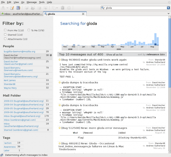
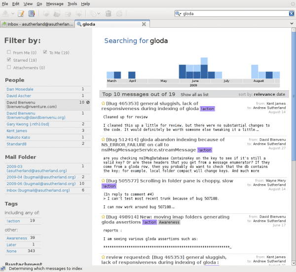
The screenshots are of a fulltext search for “gloda” in my message store.  The first screenshot is without any facets applied and me hovering over one of David Ascher’s e-mail address.  The second is after having selected the “!action” tag and hovering over one of David Bienvenu’s e-mail address.  Gloda has a concept of contact aggregation of identities but owing to a want of UI for this in the address-book right now, it doesn’t happen.  We do not yet coalesce (approximately) duplicate messages, which explains any apparent duplicates you see.

The current state of things is a result of development effort by myself and David Ascher with design input from Bryan Clark and Andreas Nilsson (with hopefully much more to come soon :).  Although we aren’t using much code from our previous exptoolbar efforts, a lot of the thinking is based on the work David, Bryan, and myself did on that.  Much thanks to Kent James, Siddharth Agarwal, and David Bienvenu for their recent and ongoing improvements to the gloda (and mailnews) back-end which help make this hopefully compelling UI feature actually usable through efficient and comprehensive indexing that does not make you want to throw your computer through a window.

If you use linux or OS X, I just linked you to try server builds.  The windows try server was sadly on fire and so couldn’t attend the build party.  The bug tracking the enhancement is bug 474711 and has repository info if you want to spin your own build.  New try server builds will also be noted there.  Please keep in mind that this is an in-progress development effort; it is not finished, there are bugs.  Accordingly, please direct any feedback/discussion to the dev-apps-thunderbird list / newsgroup rather than the bug.  Please beware that increases in awesomeness require that your gloda database be automatically blown away if you try the new version.  And first you have to turn gloda on if you have not already.

thunderbird, gloda, exptoolbar, protovis, paninaro, oh oh oh

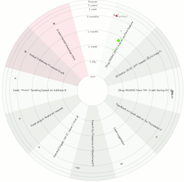
exptoolbar-protovis-gloda-256

Thunderbird.  With the global database, gloda.  Using the exptoolbar extension.  Using the protovis javascript visualization library.  For reals!  Not a prank!  Just grab the most recent XPI or grab the repo.  And be using a nightly (beta 2 might work?)

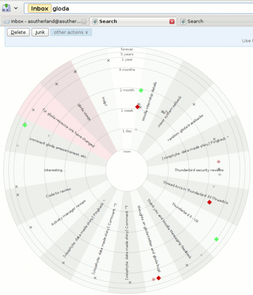
What you are looking at:

  • The exptoolbar search results page, augmented with a visualization.
  • Each conversation with search results gets its own wedge.
    • Wedges can be distinguished because of the alternating background colors.
    • Conversations that you sent a message to will have a red shading to them.  The examples may be somewhat misleading because the account where a lot of my sent mail ends up is not part of the profile used to create the screenshots.
  • Each message is placed in its conversation wedge…
    • The radius is based on the ‘age’ of the message using a log-ish scale.  Interpolation is actually linear at each level (one day, one week, one month, three months, one year, 5 years, ‘forever’.)
    • The angular placement within the wedge is based on the author of the message.  Across all wedges the placement is the same.  This helps ‘bursty’ parts of conversations (which are extremely likely) be made more obvious, while also helping to provide some understanding of conversation dynamics.
  • Message shapes are determined by whether the message is starred (diamond), sent by a ‘popular’ contact (circle), or an unpopular one (cross).  The use of popularity is a temporary measure because current gloda in trunk does not cache address-book lookups, and they are expensive.  Once the new gloda search code lands with those changes, we can rely on the existence of an address book entry.  (Starring a contact using the new message reader adds them to your address book.)
  • Message opacity is determined by whether the message is a ‘hit’ or not.  All messages in a conversation are eventually retrieved, though initially we only have the hits.
  • Message color is determined by applied tags (using the closest tango color for the first tag), or whether the message is starred (closest tango color to yellow, where I think I had removed the yellow tango colors for some unknown reason, so we get green I guess).  It’s grey if the message has no tag or star.
  • The subject of the conversation is displayed in the wedge.

exptoolbar-protovis-seek-thunderbird-256

Things that are happy:

Things that are sad (aka caveats):

  • It would probably be better if the visualization was not radar-inspired.  Besides the perceptual reasons, the subjects are harder to read than they would be in an equivalent linear-styled visualization.
  • The visualization is not interactive.  protovis officially has no interaction support yet, but if you look in the (only available minified?) source, it’s almost there.  It might be entirely there, but it didn’t work for me immediately after a quick reading of the (indented) source.
  • There is some low probability failure that occurs during the visualization updating as gloda backfills the message collections.  If it happens on the last update, you can end up with a half-built visualization.  Re-running the search will generally resolve the issue.
  • The visualization does a pretty solid job of taking up all the screen real estate and has no way to be disabled, so you have to scroll past it every time.

Future work:

  • Interactivity.
  • Perhaps showing the gravatars for the people involved in a conversation at the outer rim of the wedge, positioning them based on the author positioning we determined.
  • Perhaps lose the radar motif.
  • Your thoughts / patches!

Thunderbird and gloda go to meme-town

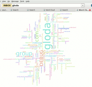
Sure, a word cloud of your blog posts is cool… but what if you could take any search of your e-mail, and turn that into a word cloud?  And then, if you click on one of those words, your search constraints would be revised to use the word you clicked on (and you’d get a useful search result, not another word cloud)?  And what if that layout algorithm were not as good as wordle?  The future is now, people!  (At least if you install like 5 extra extensions out of mercurial.)

The screenshot above is from Thunderbird trunk with a hacked exptoolbar extension (generalized, committed changes happening soon), visophyte-js, and the new glodacloud extension.  It is a proof-of-easy-gloda-extensions as suggested by David Ascher.

The layout algorithm is what we in the business of making up terminology call a recursive sub-optimal tic-tac-toe subdivision thinger.  We under-use a neat (and somewhat slow) hack to find the bounds of the words through use of canvas.mozPathText and canvas.isPointInPath to sample a grid to know where the text is and isn’t.  It’s under-used because all we use it for right now is to find the actual height above the baseline that the text stretches to (because metrics only gives us the width).  We are lazy and don’t check below the baseline at all, and totally squander our chance to be cool and put small words in the gaps in larger words.  But given the amount of time spent, I’m very happy.

Oh, and of course it uses JS and Canvas.

I’ll be wanting that latte machine now…

in context

credits where credits due:

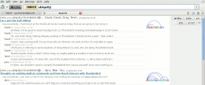
  • thread arcs a la the nice people at the IBM CUE group
  • the search view prototype is implemented by David Ascher.  the positioning of the visualization is on me as a quick hack, though.
  • the search view prototype is designed by Bryan Clark, and he has even better stuff on the way

The actual implementation is a first step of adapting knowledge from my python “visophyte” library to a JS implementation using canvas.  I am trying a more batch-oriented style of processing this time that uses explicit attributes for value-passing between logic blocks.  This is in comparison to the python implementation which is more functional in nature.  We’ll see how it turns out.

gloda’s first (primitive) visualization

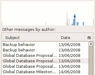
Author activity over time, current thread in blue, selected message in darkest blue.

A primitive visualization augments the gloda “other messages by author” listing by showing the messages sent by the author over time.  Messages are stacked by day.  The currently selected message is in darkest blue and also very wide.  Other messages from the same thread/conversation are in lighter blue and less wide.  Messages not in the conversation are light grey and rather narrow.

It’s not clickable, it lacks any form of scale or any feedback at all, and there are scaling issues.  (If anyone wants to save me the effort of figuring out how to get the canvas to maintain a 1:1 pixel mapping to the actual display and still ‘flex’ by adding/losing pixels, please do drop me a message or leave a comment.)  These will all change, but not yet.

I’ve pushed the changes to the mercurial repos and updated the stable tag, but I’m not publishing updated xpi’s, so you’ll need to roll your own if you care.  (The DB schema has not changed and so does not need to be blown away.)

Adding stews (hackish destructive accumulation/reduction) to CouchDB

As all misguidedly-lazy programmers are wont to do, I decided that it would be easier to ‘enhance’ CouchDB to meet my needs rather than to rewrite visotank to use SQLAlchemy. Also, I wanted to understand what CouchDB was doing under the hood with views and try my hand at some Erlang.

This Has Nothing To Do With Anything

CouchDB as currently implemented maintains a lot of information for each mapped document. There is a B-tree associated with each View Group whose keys are Document Ids and whose Values are a list of {View Id, Actual-Key-You-Mapped-In-That-View} tuples for every key mapped from that document for every view in the view group. Next, each View has a B-tree associated with it whose keys are {Actual-Key-You-Mapped, Document Id} tuples and whose values are the Actual-Value-You-Mapped.

This is all well and good, but is a poor fit for one of my key use-cases: reducing e-mail message traffic to date-binned summary statistics so I can render graphics. If I want the weekly-messages-sent count for a given ‘author’, map(message.author, blah) will allow me to filter only to messages sent by that author, but no matter what blah is, I will still get one per message.

Long blog post short, I have implemented a hackish first-pass reduce/accumulate solution to my problem. The idea is that ‘stews’ allow you to aggregate mapped data that shares the same key. I’m a little fuzzy on exactly what the definition of ‘reduce’ is in the map/reduce papers (it’s been a while, if ever), so we’ll call this ‘accumulate’ (in the SICP/Scheme sense). It is a hack because:

  • It does not unify views and ‘stews’. Whereas views are defined under ‘_design’ and accessed via ‘_view’, stews are defined under ‘_pot’ and accessed via ‘_stew’.
  • Values can only be integers right now, and it’s assumed you want to add them. (No custom JavaScript logic!)
  • I have not yet dealt with modified/removed documents. Which is to say that if you modify or remove a stew-mapped document, your accumulated values will climb ever-skyward.
  • It is in no way, shape, or form intended to be anything other than a learning experiment. (It is my hope that Damien Katz magically solves my problems in the next release. Having said that, I’m not opposed to trying to actually implement a more solid feature along these lines; coding in Erlang is wicked awesome. (sounds better with a fake accent))

It just so happens that these constraints are perfectly in line with visotank’s needs. Using stews and otherwise limiting my use of views, CouchDB is less ridiculous in its view-update times and the fully-populated (view/stew-wise) from-scratch ‘messages’ database tops out at 77M rather than 1.2G.

This also has nothing to do with anything

Anyways, if anyone is interested in the code (or the comments I added to the existing couch_view_group.erl logic), my bzr branch for CouchDB is at: http://www.visophyte.org/rev_control/bzr/couchdb/visbrero-couchdb/ . My bzr branch for couchdb-python, adding a simple unit test for stews is at: http://www.visophyte.org/rev_control/bzr/couchdb-python/visbrero/ .

Update!  The bzr repository is powerful messed up, so a better choice might be my changes in patch form:  http://www.visophyte.org/rev_control/patches/couchdb/visbrero-couchdb-stews-1.patch

Update 2! The bzr repository accessible at http://clicky.visophyte.org/rev_control/bzr/couchdb/visbrero-couchdb/ works and there’s a checkout with working copy (that you can browse) at http://clicky.visophyte.org/rev_control/bzr-checkouts/couchdb/visbrero-couchdb/ .   Note that these locations are not guaranteed to be valid for all time, but will be good for at least a month or two.

I fear my (sleepy) explanation may not be sufficient, so the unit test I added to couchdb-python may speak better to this end:

self.db['tom1'] = {'author': 'tom', 'subject': 'cheese'}
self.db['tom2'] = {'author': 'tom', 'subject': 'cats'}
self.db['tom3'] = {'author': 'tom', 'subject': 'mice'}
self.db['bob1'] = {'author': 'bob', 'subject': 'hats'}
self.db['jon1'] = {'author': 'jon', 'subject': 'hats'}
self.db['kim1'] = {'author': 'kim', 'subject': 'cats'}
self.db['kim2'] = {'author': 'kim', 'subject': 'cows'}
self.db['_pot/test'] = {'views': {
'authors': 'function(doc) { map(doc.author, 1) }',
'subjects': 'function(doc) { map(doc.subject, 1) }'
}}
authors = dict([(row.key, row.value) for row in self.db.view('_stew/test/authors')])
self.assertEqual(authors['tom'], 3)
self.assertEqual(authors['bob'], 1)
self.assertEqual(authors['jon'], 1)
self.assertEqual(authors['kim'], 2)
subjects = dict([(row.key, row.value) for row in self.db.view('_stew/test/subjects')])
self.assertEqual(subjects['cheese'], 1)
self.assertEqual(subjects['cats'], 2)
self.assertEqual(subjects['mice'], 1)

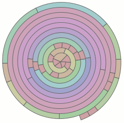
Uh, the spiral visualizations have nothing to do with the post. They are new insofar as I have never posted them before, but they are in fact rather quite old. They have a new aspect in that they now work with the cairo renderer, having relied upon ‘special’ (horrible) custom renderers in the old agg backend.

SVG in visotank

visotank-conversation-timeline-snippet.png

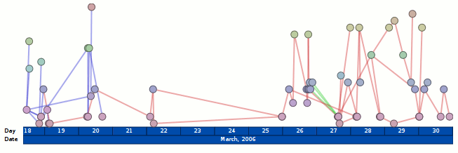
visotank now has AJAX-loaded SVG graphics. The hooks are there to actually do something when you click on stuff, but it doesn’t do anything. The visualization is ripped from my visterity plugin for posterity; it’s not supposed to be new or exciting. The fact that the SVG is loaded via AJAX is new (visterity didn’t have that) and exciting. Pretty much everything else is simply legwork relating to using application/xhtml+xml instead of txt/html and the ramifications of that, especially with AJAX.

I’ve updated what is running at http://clicky.visophyte.org:8080/, but it looks like my VPS has some issues, so I wouldn’t be surprised if it things hang or are very slow when not yet cached.  (Specifically, I think it has very serious IO issues, but its absurd amounts of memory available avoid that problem from impacting things too much.)  (Normal slowness like its refusal to pipeline requests and there being hundreds of images is not a VM problem.)  Also, the SVG stuff is unlikely to work on anything but Firefox 2; at least 3.0a8 gets angry for me on gutsy.

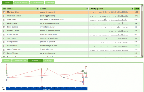
To see the SVG graphs, the steps are: 1) select at least one contact in the contacts list, 2) click on the ‘conversations’ tab in the bottom half, select a conversation (you can only select one), and 3) click on the ‘conversation’ tab in the bottom half.  I should note that you might want to wait for all of the sparkbars to load before proceeding to the next step…

visotank-screenshot-conversation-timeline.png

more (clicky!) mailing-list visualization a la visotank, couchdb

visotank-shot-1.png

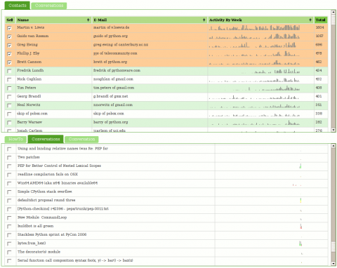
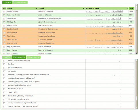
Visotank now allows you to select some authors of interest from a sortable list of contacts, and then show the conversations they were involved in. You get the previously shown sparkbars for the author’s activity. You also get sparkbars showing the conversation activity, with each author assigned a color and consistent stacking position in that sparkbar. Click on the screenshots for zoomed versions of the screenshots to see what I mean.

You can click on things yourself at http://clicky.visophyte.org:8080/. Please only go there if you’re okay with restarting your Firefox session (especially true if Firebug is on.) All tables/images are the real thing and not fetched on demand… which results in Firefox having to pull down a lot of images. Click on some rows in the contacts table to select them. Then, in the lower tab group, click on the “conversations” tab. This will then fetch all the conversations those selected users were involved in. The system will truncate more than 10 users, so don’t go crazy. The tabs are re-fetched on switch, so if you change your contact selections, in the lower tab group, click away to “HowTo”, then back to “Conversations”. The “Conversation” tab does nothing and is a big lie.  Great UI, I know.

visotank-shot-2.png

I think you will find that sparkbar visualizations of the conversation traffic with a weekly granularity are rather useless. I think a reasonable solution would be a ‘zoomed’ sparkbar with an indication of the actual uniform timeline scale included. Since the images currently show about 2 years of data, a thread that happened 1 year ago would be centered in the middle of the image, but with its actual horizontal scale being inconsistent with that position. Future work, as always.

I have used Pylon’s Beaker caching layer to attempt to make things reasonably responsive. While CouchDB view updates are sadly quite lengthy (many many minutes when dealing with 16k messages; python-dev from Jan 2006 through Nov 2007), that is thankfully a one-off sort of thing. (The data-set is immutable once imported and I don’t change schemas that often.) The main performance hit is that I can only issue one range of keys to query in a request, so if I am trying to snipe a subset of non-consecutive information, I have to issue multiple requests. (I don’t believe POSTed views can operate against views in the database…)

Regrettably, I think my conclusion about CouchDB is that it (or something like it) will be truly fantastic in the future, but it is not going to get there soon enough for anything that hopes to be ‘productized’ anytime soon. The next thing I want to look at is using a triple-store to model some of the email data schema; my efforts from the visterity hacking suggest it could be quite useful. Of course, even if triple stores work out, I suspect a more traditional SQL database will still be required for some things. Combined with a thin custom aggregation and caching layer, that could work out well.

Note: I should emphasize that my CouchDB schema could be more optimized, but part of the experiment is/was to see if the views saved me from having to jump through clever hoops.