A step sideways

This seemed like a better idea in my head:

when others ask why, I clearly am not even listening.

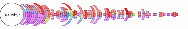
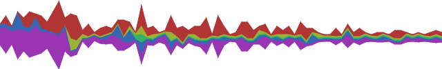
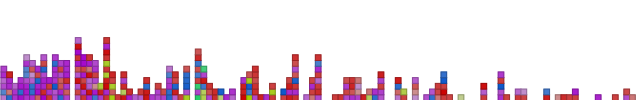
What is it? It’s a variant on the blog visualization below from this post, but using crescent/lune slices instead and with no sustain (aka, if there’s no data point, we don’t draw anything). It self-normalizes so that the maximum value range takes up a full 180 degrees. It does not bother to account for the loss of area when apportioning the slices, though it could. I doubt that would make up for the perceptual issues anyway.

older and maybe better

The good news is that the visualization motivated me to properly abstract the previously inane special-cased implementations for rings/curves to a path-based implementation like reasonable people would expect. (Refactoring still to be done.)

In other news, I’ve changed up the revision control for my chronicle-recorder patches after it became clear my stacked git approach was not going to cleanly allow concurrent development on my new laptop. The new way is a bunch of bzr branches; the ‘rev control’ page link on the left is the authority on what is what.

Blog vis with trendy stacked linechart

Frinkiac WordPress Shoutbox Stacked Linechart Flat Coloring

So, motivated by recent prettiness (C26000’s Last.fm Extra StatsWave Graph‘ and its inspiration Lee Byron’s Layered Histogram, which also reminds me of the fundamentally different but visually close-enough IBM Research/Viégas/Wattenberg’s history flow), I have put in some preliminary aggregation logic and a ‘stacked linechart’ visualization. It’s quite the poor cousin to Lee Byron’s stuff, but we’ve got to start somewhere.

Although histogram is probably a better term for the result, the visualization is actually ignorant that there’s aggregation going on, so stacked linechart it is. The data is the same data (wordpress shoutbox ‘shouts’) from my last post, but instead of block stacking to get a de facto histogram, the binned time-intervals are aggregated by author. The stacked linechart consumes these and — presto — a de facto trendy histogram. The main difference here is that the bin period is 7 days, although bugs remain. I am going to replace my haphazard date logic with python-dateutil shortly to resolve this problem.

Frinkiac WordPress Shoutbox Stacked Linechart Link Tally Coloring

Of course, the whole point of visophyte is (excessive) flexibility, so let’s at least leverage that. The above is the same data, but with the fill’s saturation varying with the total number of hyperlinks included in ‘shouts’ for that time interval, producing a quasi-retro wire-frame effect.  Stronger/bolder colors = more links, lighter/faded colors = less/no links.  Some day, perhaps a pretty spline version, but up next is getting back to Thunderbird.

A return to blog visualization, kinda

Frinkiac WordPress Shoutbox VU-Style Vis Mark 1

A visualization of the shoutbox traffic on www.frinkiac.org since the dawn of time or the blog, whichever came later. Colors are defined by the ‘shouting’ user (hue), the linearly scaled log of the word count of the contents (saturation), and a constant for value to get darker lines. So ‘brighter’ colors = longer shouts and ‘lighter’ colors = shorter shouts. All colors are regrettably ugly. The dawn of time is on the left, modern times is on the right. I think the clustering routine has decided each column is three days, although that may get a little shaky at the end of the months (quick-n-dirty date logic.)

This should look similar to…

Old Movable Type Koala Rainbow VU Vis

ye olde KoalaRainbow 0.* for MovableType. The MTKR one is actually blog posts and comments and doesn’t distinguish based on the author, but the point is that I am beginning to be able to do all the things I used to be able to do. This helps flesh out the set of base visualizations and ensure that the architecture doesn’t have any obvious holes in things. Although the visophyte vis definition is perhaps still more verbose than I would like, it doesn’t make me lose hope like the procedural MTKR one did (click on the latter picture and scroll down to witness the ugliness).