master control pecobro, the overkill performance code browser

The title isn’t true yet, but it’s disturbingly almost-true.  Pecobro’s hackish underpinnings have been “accidentally” replaced with surprisingly forward-looking code capable of supporting a much fancier feature set.  (I didn’t mean to, but I got tricked because the incremental cost to doing the ‘right thing’ was always so low.)

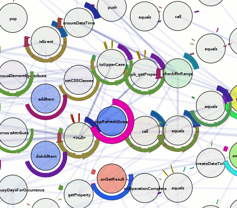
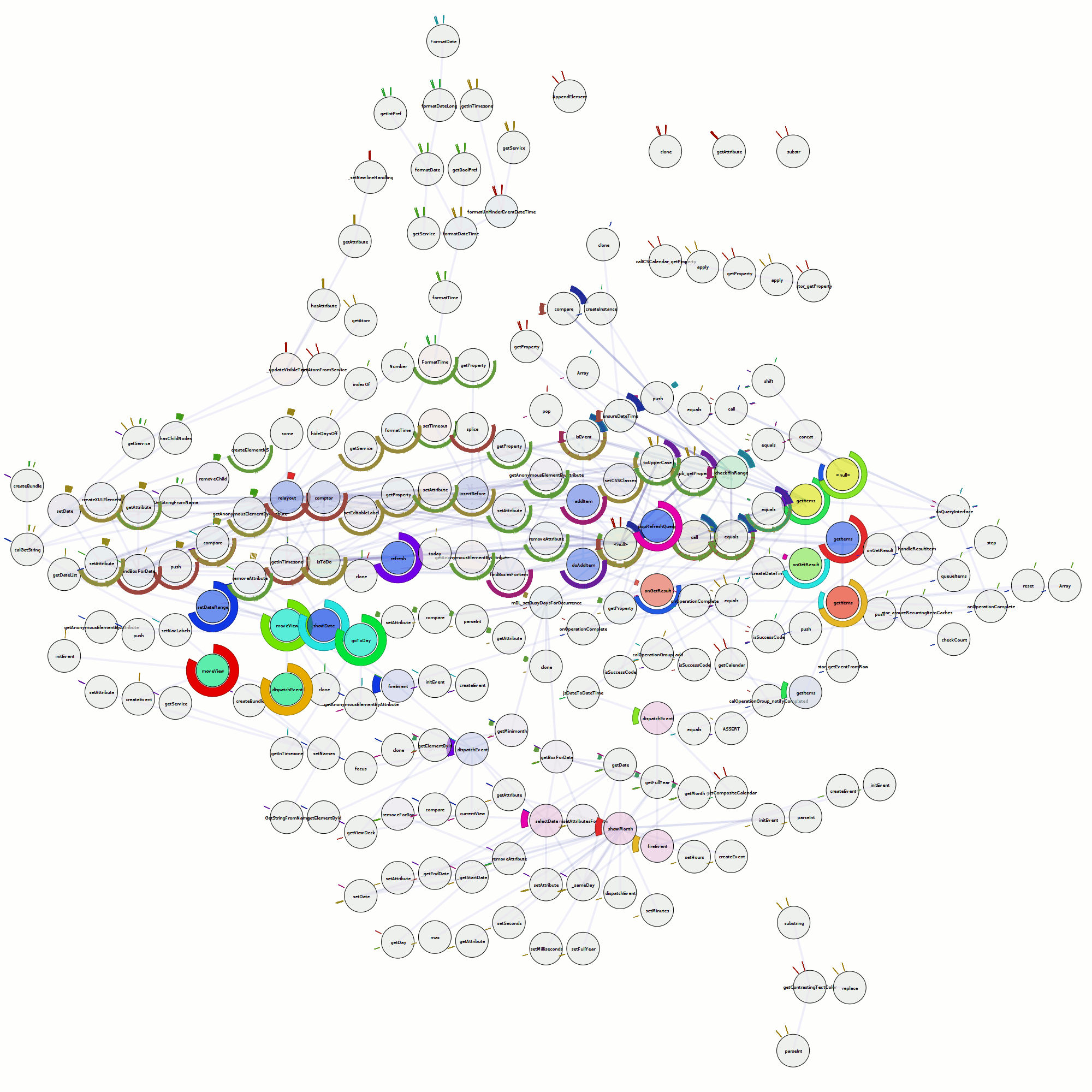
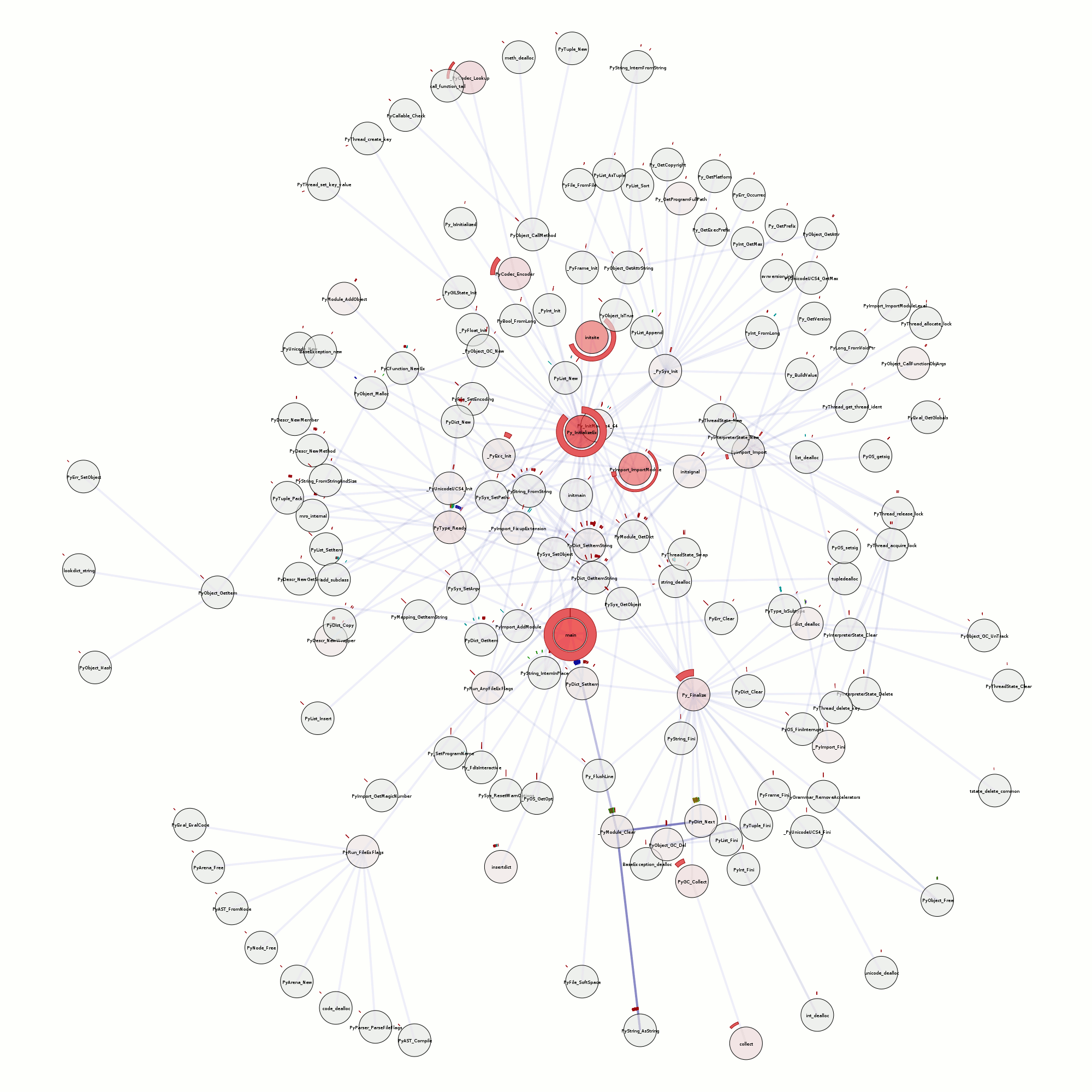
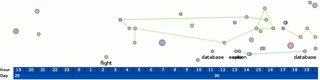
The trace that you can see here, by clicking on any of this text what has coloring (and using firefox 3 in a session that you don’t mind if it crashes), is of running Mark Banner (Standard8)‘s Thunderbird bloatTest on OS X with DTrace probes enabled, but without actually doing the bloat testing.  So Thunderbird starts up, opens the address book, closes it, opens the compose window, closes it, and then quits.

Here is a preliminary processed trace from a run triggering bug 296453.  Be forewarned that there is some missing information from the underlying trace and so it’s not all that it could be.  I think the XPConnect probes need to be fleshed out slightly more (and processed).

The code (both pecobro and mozilla codebase patches) is at: http://hg.mozilla.org/users/bugmail_asutherland.org/

What crazy overkill things can pecobro do now?

  • Parse all of the javascript code used in Thunderbird, including nearly all (maybe all?) of the 1.x enhancements.  The parser is still a bit hackish, especially when it comes to support of regexes, but it actually parses things.  Thanks to Chris Lambrou for posting his initial JavaScript.g antlr3 grammar (and BSD licensing it) that I used as a basis for my hacky version.  This was certainly a learning experience; I now know that javascript can never replace python in my heart…
  • Find all of the places functions can be defines in javascript code and do a pretty good job at figuring out reasonable names for them.  This even includes “(new)? Function()”.  This allows us to use the function-info DTrace probes to use line number information to identify functions.  We do this so that we can identify anonymous functions.
  • Handle XBL as well as we handle pure-javascript files.  (Parsing/AST fix-ups/syntax highlighting with AST traversal/etc.)
  • Parse/interpret disturbingly large portions of makefiles.  Sure, it ignores the rules, and I’ve only implemented the functions I require, but it does all the conditional and include stuff with variable expansion, including some key functions like foreach/filter/etc.
  • Parse jar manifests sufficiently well to figure out what file ends up at what chrome path.
  • Cache its javascript parse results at both the AST and (sorta-semantic) processing level, among other things.  Hooray for cerealizer which dares persist/de-persist that which pickle dare not.  (Nested classes.)  (Note: We don’t cache XBL stuff yet, and the ASTs are large enough that de-persisting them can be quite perceptible.)

What is not crazy, but still nice:

  • The traces are now much more reliable thanks to modifications to the Mozilla USDT probes to provide sufficient information for us to distinguish between JavaScript execution contexts (namely, JSContext).  Modifications were also made to avoid the ‘guessing’/ghost value problems that happen when native functions were called.
  • A foolish bug in the sparkbar calculation has been fixed.  aka “Now With Accuracy”!
  • If a function in a trace called another function or was called by another function, this will be displayed inline in the source display.
  • Infer ‘native’ functions (with the above additional modifications to the Mozilla USDT probes), assigning them to an object.  This ends up being Object, ChromeWindow, or other native Class type.  Some of this may be mooted by getting the XPConnect probes reliably in the mix.

What doesn’t it do?

  • Add the XPConnect js_Invoke probes; I punted on that because that was turning out to be difficult to get right.
  • It ignores .xul files for now.  Although xul files primarily appears in a caller context (as told by function-info probes), they can also be a callee when someone pulls a fast one and inlines some simple code in a script tag.  We brutally mis-attribute the call to the previous function when this happens.  This will eventually get resolved because we will need to understand .xul files for namespace reasons.  Also, people sound like they’re interested in who overlays what and the like, and that’s sorta right up our alley thanks to all the overkill stuff we do.
  • Exhaustively determine reads from/contributions to the ‘global’ (window or what not) namespace/scope.  The groundwork is there in terms of understanding the contribution of top-level statements to the namespace or its reads from it, but we don’t traverse into functions.
  • Associate functions with an object/type (ignoring the native function case).  This requires more semantic understanding.
  • Clicking on functions still doesn’t do anything.  I disabled that before my first post on pecobro due to firefox-crashing issues, and still haven’t gotten around to resolving it.
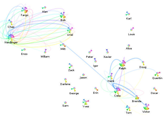
  • A usable overview visualization.  The overview diagram has become cluttered by the presence of so many ‘relevant’ (touched) files.

pecobro: the performance code browser (early stage)

At the beginning of last week, I had gotten dtrace working on a Mac Mini using the Mozilla javascript-provider probes.  Very cool stuff, but it left me with several questions about what would really be best to do next:

  • How do I best understand what I’m seeing?  (Most of the codebase is brand new to me…)
  • How do I share the data with others in a way that is both comprehensible and allows them to draw their own conclusions from the data?
  • What can I do to reduce the effort required to work on performance problems?

I was tempted to just try and just dig into the system so I could have something to show immediately, but I knew it would still take a while to see the big picture just using an editor/ctags/lxr/opengrok, even informed by dtrace.  And even then, that big picture doesn’t scale well; whatever picture I managed to formulate would be stuck inside my head…

So my solution was to try and build a tool that could help me accomplish my short-term goals soon, and have the potential to grow into a usable solution to all of the above… eventually.  The goal, in a nutshell, is to provide a code browser for javascript that is able to integrate performance information (retrieved from traces) alongside the code.  Seeing that lxr/mxr and opengrok didn’t understand javascript or XBL all that well, it also seemed feasible to try and improve on their browsing capabilities for javascript.  A far-down-the-road goal is also to be able to pull in information from the underlying C++ code as well, potentially leveraging dehydra, etc.  (This would primarily be for understanding what happens when we leave the javascript layer, not trying to be the same solution for C++ space.)

So what can it do so far?  You can go try it for yourself if you like as long as you keep your expectations very low and realize the current state does not reflect all of the bullet points below.  Also, you probably want firefox 3.0.  Or you can read my bullet points:

  • Parse custom DTrace script output!  The Mozilla DTrace probe points could probably use a little love to improve what we are able to get out.  Also, I think it’s betraying us somewhere.
  • Parse JavaScript! Sorta!  (I hacked in support for the regular expression syntax, but I haven’t corrected the ambiguity with division, so things with division break.  Also, there’s at least one or two other glitches that cause early termination.) [Yay antlr!]
  • Parse XBL!  Even with entity inlining!  Even when people put #ifdefs in the XML document! Sorta!  We don’t actually do anything intelligent with the XBL right now or with its JavaScript, but it won’t take much to get that much improved. [Yay elementtree!]
  • Visualize some stuff!  Inter-file relationship graph in the overview.  In the code and ‘Funcs’ sidebar tab you get a sparkbar where each bar represents a time interval.  The height of the par is the percentage of possible time we could have spent in that time interval.  Red means we belive that time was spent in the function itself, green means we think we spent that time in calls to other functions. [Yay visophyte!]
  • Navigate with history!  Click on the overview graph and you go to things.  Click on the file names in the ‘Files’ list and you go to the files.  I tried to make it so you could click on function names in the side bars to go to them, but jquery.scrollTo and/or firefox 3.0b5 had serious crashing issues.  [Yay jquery, jquery.history!]
  • See syntax-highlighted code with random headings intertwined (shows the parser worked) and potentially a visualization.  [Yay pygments!]

My hope in the near-term is to fix the outright bugs (parsing issues), get XBL going, and then augment the function information with more trace-derived data including more traditional call-stacks, etc.  Then the tool should be sufficiently usable that my immediate focus can change to creating automated tests to actually gather performance/execution traces so we can use the tool for what I started it for.  This may also get shelved for a while if it turns out that we need action (patches) immediately.

Mozilla JavaScript DTrace Probes, visichron style

 dtrace javascript snippet

This visualization is the result of an adapted visichron.py script (from my chronicle-recorder ‘chroniquery’ bindings) run against the output of a custom DTrace script (using the Mozilla JS providers) on OS X.  It’s a proof-of-possibility rather than anything immediately useful.

The differences from the last visichron post (using chronicle-recorder as a back-end) are:

  • Node hues are distinct based on the file the javascript was executed from.  (Saturation still varies with amount of time spent in the function.)
  • Graph layout is done using graphviz’s neato’s “ipsep” (experimental) mode.  This works fantastically well at reducing/eliminating overlap.  Having said that, a hierarchical layout may make more sense.
  • Ring colors are based on call depth (so redundantly encoded with the ring radius) rather than any knowledge about the control-flow.  Full control-flow information is not readily available and would be extremely expensive, but we could provide at least some degree of approximation using the calls made by the function as indicators.  Of course, the ring visualization at this point and for this purpose is probably better represented as non-nested (side-by-side rings of different radii; not containing each other) faux-continuous ring slices with transparency varying by amount of time spent in the function at that call-depth.  This would simplify the object model, allowing for non-insane use of the SVG backend and interactivity enhancements.

scaled indexed

chronicle-recorder and amd64, hooray!

overview: visichron.py trace python -f main -d 3

My personal laptop rolls amd64-style (rather than i686), and chronicle-recorder’s valgrind component was not working on it (“illegal instruction”). I have done some vendor-branch dancing to get chronicle-recorder’s valgrind sub-directory to use valgrind 3.3.0. A bzr branch of just the valgrind subdirectory (drop-in or build separately and make sure you invoke valgrind from that location) is available here: http://www.visophyte.org/rev_control/bzr/valgrind-chronicle/valgrind-chronicle/

A probably faster location to bzr branch from is here: http://clicky.visophyte.org/rev_control/bzr/valgrind-chronicle/valgrind-chronicle/

and a tarball of the tip is here: http://www.visophyte.org/rev_control/tarballs/valgrind-chronicle-r6.tar.bz2

I have also updated chroniquery (my python binding for chronicle-query’s JSON interface, and its own set of tools that build on it) to work with amd64. Its bzr branch is here: http://www.visophyte.org/rev_control/bzr/chroniquery/trunk/

The goal of all of this was to be able to run chronicle against Thunderbird, which I was able to do. Unfortunately, visichron (the visualizing part of chroniquery using visophyte) is not quite ready for such an undertaking at this time.  (Not to mention a few C++ symbols issues…)

snippet: visichron.py trace python -f main -d 3

However, it was powerful enough to handle visualizing the trace resulting from invoking python on a python file with just “print ‘hello world'” in it. So that’s what you see here, albeit limited to only 3 call levels deep. Click on the upper picture to see the whole thing at 2000×2000, or just look on the lower picture to get an idea of what’s going on. Just like my first post using visichron, the rings are colored based on a (naive) control-flow-taken basis. The ring colors are per-function, however. Also, the node colors are ‘hot’ colored based on how many ‘ticks’ were spent inside the functions, multiple counting for recursion.

Other interesting changes include some primitive watch functionality for chronisole’s ‘trace’ mode. Also, the previously unmentioned readchron.py now understands and prints BunchedEffect and RegEffect info. (readchron aspires to be along the lines of readelf for chronicle databases, but with more colors.)

SVG in visotank

visotank-conversation-timeline-snippet.png

visotank now has AJAX-loaded SVG graphics. The hooks are there to actually do something when you click on stuff, but it doesn’t do anything. The visualization is ripped from my visterity plugin for posterity; it’s not supposed to be new or exciting. The fact that the SVG is loaded via AJAX is new (visterity didn’t have that) and exciting. Pretty much everything else is simply legwork relating to using application/xhtml+xml instead of txt/html and the ramifications of that, especially with AJAX.

I’ve updated what is running at http://clicky.visophyte.org:8080/, but it looks like my VPS has some issues, so I wouldn’t be surprised if it things hang or are very slow when not yet cached.  (Specifically, I think it has very serious IO issues, but its absurd amounts of memory available avoid that problem from impacting things too much.)  (Normal slowness like its refusal to pipeline requests and there being hundreds of images is not a VM problem.)  Also, the SVG stuff is unlikely to work on anything but Firefox 2; at least 3.0a8 gets angry for me on gutsy.

To see the SVG graphs, the steps are: 1) select at least one contact in the contacts list, 2) click on the ‘conversations’ tab in the bottom half, select a conversation (you can only select one), and 3) click on the ‘conversation’ tab in the bottom half.  I should note that you might want to wait for all of the sparkbars to load before proceeding to the next step…

visotank-screenshot-conversation-timeline.png

more (clicky!) mailing-list visualization a la visotank, couchdb

visotank-shot-1.png

Visotank now allows you to select some authors of interest from a sortable list of contacts, and then show the conversations they were involved in. You get the previously shown sparkbars for the author’s activity. You also get sparkbars showing the conversation activity, with each author assigned a color and consistent stacking position in that sparkbar. Click on the screenshots for zoomed versions of the screenshots to see what I mean.

You can click on things yourself at http://clicky.visophyte.org:8080/. Please only go there if you’re okay with restarting your Firefox session (especially true if Firebug is on.) All tables/images are the real thing and not fetched on demand… which results in Firefox having to pull down a lot of images. Click on some rows in the contacts table to select them. Then, in the lower tab group, click on the “conversations” tab. This will then fetch all the conversations those selected users were involved in. The system will truncate more than 10 users, so don’t go crazy. The tabs are re-fetched on switch, so if you change your contact selections, in the lower tab group, click away to “HowTo”, then back to “Conversations”. The “Conversation” tab does nothing and is a big lie.  Great UI, I know.

visotank-shot-2.png

I think you will find that sparkbar visualizations of the conversation traffic with a weekly granularity are rather useless. I think a reasonable solution would be a ‘zoomed’ sparkbar with an indication of the actual uniform timeline scale included. Since the images currently show about 2 years of data, a thread that happened 1 year ago would be centered in the middle of the image, but with its actual horizontal scale being inconsistent with that position. Future work, as always.

I have used Pylon’s Beaker caching layer to attempt to make things reasonably responsive. While CouchDB view updates are sadly quite lengthy (many many minutes when dealing with 16k messages; python-dev from Jan 2006 through Nov 2007), that is thankfully a one-off sort of thing. (The data-set is immutable once imported and I don’t change schemas that often.) The main performance hit is that I can only issue one range of keys to query in a request, so if I am trying to snipe a subset of non-consecutive information, I have to issue multiple requests. (I don’t believe POSTed views can operate against views in the database…)

Regrettably, I think my conclusion about CouchDB is that it (or something like it) will be truly fantastic in the future, but it is not going to get there soon enough for anything that hopes to be ‘productized’ anytime soon. The next thing I want to look at is using a triple-store to model some of the email data schema; my efforts from the visterity hacking suggest it could be quite useful. Of course, even if triple stores work out, I suspect a more traditional SQL database will still be required for some things. Combined with a thin custom aggregation and caching layer, that could work out well.

Note: I should emphasize that my CouchDB schema could be more optimized, but part of the experiment is/was to see if the views saved me from having to jump through clever hoops.

first steps to interactive fun using CouchDB

visotank-first-python-dev-sparkbars1.png

First, let me say that Pylons with its Paste magic is delightful; lots of nice round edges helped me get something simple up and running in no time, and using genshi to boot.

The new tool, visotank, is ingesting the python-dev mailman archives (as previously visualized) and putting them into CouchDB. The near-term goal is to allow for interactive exploration/visualization of the archives. The current result, as pictured, is simply sparkline barcharts of people’s posting history. Left-to-right, present-to-past, weekly, one (vertical) pixel per message, truncating at the image height (12 pixels).

Although the input processing thus far is specific to mailing list archives, the couchdb schema in use is for generic e-mail traffic. The messages are even coerced into rfc2822 format for ‘raw’ storage.

The ability to use ‘map’ multiple times in couchdb views to spread information is delightful. What I really would like is more reduce functionality or, more specifically, just accumulate. The sparkbars get their data from statistics with keys [contact id, timestamp of time period] and value 1, one per message. I would love for couchdb to provide a way to aggregate all those values with identical keys into a single row with the sum as the value. I’ll look into this and the view implementation before writing any more on the subject, but if someone out there already knows a way to do this, please let me know.

visotank-first-python-dev-sparkbars2.png

radial (radar) email vis, with care factors

radial-care-factor-vis.png

It’s a radial e-mail visualization intended to be the basis for a “situational awareness” overview of your e-mail. I’ve added the beginnings of a ‘care factor’* (“do I care about this person/message?”) concept to messages and contacts, which is used to assist in focusing your attention only to messages/people you care about. Right now, the care factor is simply whether you have ever sent the contact/author of a message an e-mail directly (to = 1.0), indirectly (cc = 0.5), or not at all (nada/ninguno=0.0). That can obviously be expanded upon in many directions; involvement of people you care about in message threads (with that person), intensity of your communication with that person, explicit interest-levels via tags, social network propagation (Google’s OpenSocial) without the person previously having existed in your e-mail corpus, etc.

Some more details about the visualization:

  • Things close to the center happened more recently. Things further away happened in the past. This seems like the most reasonable ‘radar’ metaphor for e-mail. If we were dealing with to-do items with due dates, then it would make sense that they are moving inward. However, the reality of e-mail is that if you don’t deal with them soon, they ‘fall off your radar’. My first thought to fuse the two would be to have messages associated with to-do tasks stick out quite obviously, latch once they hit the ‘edge’, and generally grow more ominous and threatening as time goes by. Of course, it’s probably not helpful to make people’s to-do lists seem like something they can’t escape…
    • The central grey circle is a void to ensure that angle is still meaningful even when the time is at a minimum; otherwise things would stack up and be generally extra confusing.
  • The angle is mapped to a single author/contact. This is currently random, but my intent is to allow clustering of contacts and quasi-persistent angular locations. So messages from your family might tend to come from the North, your friends the East, mailing lists the West, and ads from the South. (Let’s assume you get no spam.)  Actual geographic relationships would be a neat trick, but practically foolish.
  • Messages with a low care-factor are made more subtle by having reduced opacities. I forgot to make the edges linking messages to their parent more subtle…
  • Contacts with a high care-factor get their (anonymized) name in a strong color and their slice of the pie highlighted with a color. Contacts with a low care-factor have their names displayed more subtly and just get a grey hue for their outer-ring marker/label. The intent with the slice coloring is mainly to be intensity based with only one or two hues in use; I think using more colors will quickly overwhelm the display.
  • Time markers are in use, but may not be obvious. The blue ring labeled ’30’ (along the x-axis) indicates that’s October 30th. The inner white ring is November 1st, but I’m not clear on why it wasn’t labeled as such (aka bug). The time marker logic needs to be refactored to provide more usable single “ruler” labeling (the timeline use currently is biased towards 2 rulers, which is where the month and year went). See the test program output from below for a better example of time display, although the month/year are still AWOL in another ruler.

radial-blah-blah-blah.png

And there’s the test program. Note that edges connect a message to its parent, and currently always flow clock-wise for time. So the innermost red message is the parent of the inner-most green message. I’m a bit conflicted about this; the consistency is nice, but the relationship would probably be more obvious if we took the shortest path. Also, since e-mail reply relationships are causal, it’s not like there’s any doubt which message was a reply to the other.

* I say ‘care factor’ because I did this work on a red-eye flight where my tiredness overwhelmed my natural defense against puns, and since Halloween was recent, and there was that tv show called ‘scare factor’, etc. etc.

some email analysis for some email visualization

An attempt to apply hidden topic markov models to e-mail to perform topic analysis has morphed into simply deriving (aggregate) word-frequency information for TF-IDF purposes. The e-mails I attempted to analyze from my corpus appear to simply have been too short and wanting for quantity to pull a rabbit out of the (algorithmic) hat. (I only threw e-mails amongst my ‘village’-tagged contacts, as previously visualized.)

poor-mans-themail-but-hey-first-pass.png

Luckily, there’s a lot you can do with such information. (And in fact, I ended up using the word frequency info to attempt to normalize out e-mail signatures since I didn’t feel like doing the right thing for signatures at the time.) The bad news is I am not doing anything polished or good with the info yet.

The above is a quick proof-of-it-kinda-works which apes Themail‘s monthly words concept. If you’re not familiar with Themail, click the link, read the PDF. It is/was a covet-able research prototype that let ‘you’ explore your history, e-mail-wise. It’s not available for download, hence ‘was’, and was only available to participating subjects, hence ‘you’. The good news is that, as always, you can download my hacked-up version of posterity and my visterity plugin. I wouldn’t try using it if I were you, though.

conv-index-with-terms-as-databased.png

The second screenshot is my Inbox with the ‘best’ scoring keyword (using traditional tf-idf, not the themail revised metrics) displayed for each message where the histogram information is available. Since I only ran the processing code against a set of my contacts, only messages involving those people have a keyword displayed.

I’m going to try and pull in my old pre-gmail email into the system to try and get some more (personal) data to work with. Or, people who are not spammers, e-mail me so I have some more correspondence. sombrero@alum.mit.edu. Conversations about why the Pet Shop Boys are the greatest band ever are preferable. Eventually I’ll try and pull in my gaim/pidgin logs which would be more useful, but that’s arguably a different data case with special needs, and I’m already spread pretty thin focus-wise as is, so that will have to wait.

Anyone going to InfoVis 2007? And a dubious contact vis.

I’m going to be at Vis 2007/InfoVis 2007/VAST 2007 next week thanks to my employer, The PTR Group (who is hiring, especially embedded folk in the greater DC area). So, if anyone who reads this will be there, feel free to drop me a line in the comments below or via e-mail at sombrero@alum.mit.edu.

magneto-contact-vis-dubious.png

The above is an attempt to visualize the per-month message flows between contacts, originally drawing inspiration from iron filings in a magnetic field. It doesn’t really work, even filtering things so only messages between the contacts involving “Nerdlinger” (upper left quadrant) and “Celia” (lower right quadrant) are displayed.

The Celia one works out a lot better, as you can see. Please overlook the fact that somehow there are all sorts of messages from Celia during that blue month with neither her nor the other contacts having any meaningful message traffic per the pie-chart. (The filtering constraint is that the contacts of interest have to either be in the to/cc or the from part.) This is a result of a bug in my contact consolidation logic (now fixed), that resulted in the summary statistics not properly being updated in all cases. Recalculating the statistics isn’t going to happen tonight, so this screenshot shall forever be buggy.

What I take away from this visualization is that when attempting to indicate the relative proportion of messages between contacts across time, it would probably be better to use a single straight rainbow line. I define a rainbow line as a line made up of multiple colors; I’m sure there’s a better (pre-existing) term for the concept.

revised-me-relative-sparkbars-redblue.png

And these are some of the newer sparkline bars that only include messages to-me-from-the-contact (above: blue for to, light blue for cc), or from-me-to-the-contact (below: red for to, pink for cc). The color scheme is a red-shift (away from me)/blue-shift (towards me) sort of metaphor which no one (cooler than me) should ever guess. I think I’ll have to resort to text or icons, or just stop trying to cram so much information in there.