SVG in visotank

visotank-conversation-timeline-snippet.png

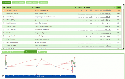
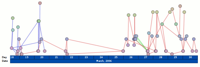
visotank now has AJAX-loaded SVG graphics. The hooks are there to actually do something when you click on stuff, but it doesn’t do anything. The visualization is ripped from my visterity plugin for posterity; it’s not supposed to be new or exciting. The fact that the SVG is loaded via AJAX is new (visterity didn’t have that) and exciting. Pretty much everything else is simply legwork relating to using application/xhtml+xml instead of txt/html and the ramifications of that, especially with AJAX.

I’ve updated what is running at http://clicky.visophyte.org:8080/, but it looks like my VPS has some issues, so I wouldn’t be surprised if it things hang or are very slow when not yet cached.  (Specifically, I think it has very serious IO issues, but its absurd amounts of memory available avoid that problem from impacting things too much.)  (Normal slowness like its refusal to pipeline requests and there being hundreds of images is not a VM problem.)  Also, the SVG stuff is unlikely to work on anything but Firefox 2; at least 3.0a8 gets angry for me on gutsy.

To see the SVG graphs, the steps are: 1) select at least one contact in the contacts list, 2) click on the ‘conversations’ tab in the bottom half, select a conversation (you can only select one), and 3) click on the ‘conversation’ tab in the bottom half.  I should note that you might want to wait for all of the sparkbars to load before proceeding to the next step…

visotank-screenshot-conversation-timeline.png

more (clicky!) mailing-list visualization a la visotank, couchdb

visotank-shot-1.png

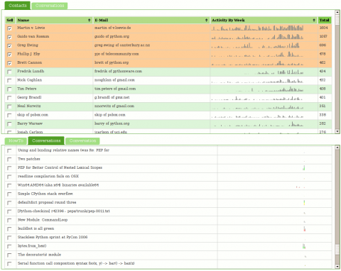
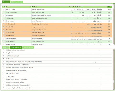
Visotank now allows you to select some authors of interest from a sortable list of contacts, and then show the conversations they were involved in. You get the previously shown sparkbars for the author’s activity. You also get sparkbars showing the conversation activity, with each author assigned a color and consistent stacking position in that sparkbar. Click on the screenshots for zoomed versions of the screenshots to see what I mean.

You can click on things yourself at http://clicky.visophyte.org:8080/. Please only go there if you’re okay with restarting your Firefox session (especially true if Firebug is on.) All tables/images are the real thing and not fetched on demand… which results in Firefox having to pull down a lot of images. Click on some rows in the contacts table to select them. Then, in the lower tab group, click on the “conversations” tab. This will then fetch all the conversations those selected users were involved in. The system will truncate more than 10 users, so don’t go crazy. The tabs are re-fetched on switch, so if you change your contact selections, in the lower tab group, click away to “HowTo”, then back to “Conversations”. The “Conversation” tab does nothing and is a big lie.  Great UI, I know.
visotank-shot-2.png

I think you will find that sparkbar visualizations of the conversation traffic with a weekly granularity are rather useless. I think a reasonable solution would be a ‘zoomed’ sparkbar with an indication of the actual uniform timeline scale included. Since the images currently show about 2 years of data, a thread that happened 1 year ago would be centered in the middle of the image, but with its actual horizontal scale being inconsistent with that position. Future work, as always.

I have used Pylon’s Beaker caching layer to attempt to make things reasonably responsive. While CouchDB view updates are sadly quite lengthy (many many minutes when dealing with 16k messages; python-dev from Jan 2006 through Nov 2007), that is thankfully a one-off sort of thing. (The data-set is immutable once imported and I don’t change schemas that often.) The main performance hit is that I can only issue one range of keys to query in a request, so if I am trying to snipe a subset of non-consecutive information, I have to issue multiple requests. (I don’t believe POSTed views can operate against views in the database…)

Regrettably, I think my conclusion about CouchDB is that it (or something like it) will be truly fantastic in the future, but it is not going to get there soon enough for anything that hopes to be ‘productized’ anytime soon. The next thing I want to look at is using a triple-store to model some of the email data schema; my efforts from the visterity hacking suggest it could be quite useful. Of course, even if triple stores work out, I suspect a more traditional SQL database will still be required for some things. Combined with a thin custom aggregation and caching layer, that could work out well.

Note: I should emphasize that my CouchDB schema could be more optimized, but part of the experiment is/was to see if the views saved me from having to jump through clever hoops.
Click your way to health. Oh, and email visualization.

The SVG renderer is in and brought with it much refactoring of the renderers. Cairo still works. But what does this buy us?

visterity-conv-threadarc.png

It buys us a working clickable demo of posterity with the visterity plugin. And a second one too. (You probably need to be using Firefox for it to work. And one with SVG support to boot. Firefox 2.0.0.6 on Ubuntu gutsy definitely works at the minimum.)

Oh, I should probably clarify “working”. I used Firefox’s “Save Page As…” functionality so you get the same experience I got when browsing that page. But if you think you can click on any of the other links and read my e-mail, you will be sadly disappointed.

visterity-conv-timeline.png

For the unadventurous, I will tell you what you could do if you clicked on either of those images:

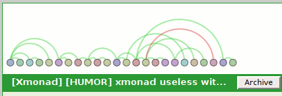
  • The circular nodes have title attributes with the name of the author of the email, so if you hover you get a tooltip with their name. (Not fancified, but it could be.)
  • Clicking on the circular nodes expands the e-mail in the conversation and smooth-scrolls you to that e-mail.

It does not get you any form of connection in the opposite direction. So as you move your mouse over the message headers, the messages in the visualization do not light up. However, I probably wouldn’t be bringing that up if I didn’t plan to address it. I mean, who would do that and make themselves look bad? Not me, certainly. I’m cagey.

Oh, and please keep in mind that these visualizations are not intended to be polished in any way shape or form. In fact, it took all of 5 minutes to throw the time-line vis together, which would explain why the use of color is rather redundant. (It would be okay if I had an animated transition between that visualization and another visualization. But I don’t. It turns out I’m okay with making myself look bad.)