Thunderbird stacked linechart visualization

Stacked linechart visualization of j-devel by sender, march 05 through june 06, no sustain

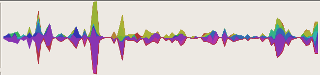
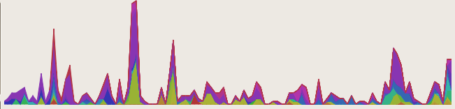
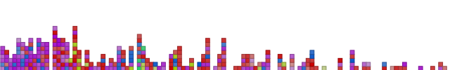
The last post‘s visualization is put to work here visualizing the traffic on the j-devel mailing list (for the j text editor, but also beloved for armed bear common lisp) from March 2005 through now, June 13 2007, clustering on 7-day intervals. Each series is a specific author. ‘Sustain’, or the number of pixels of space to give to each series that doesn’t have traffic is at 0 because the number of one-time posters turns things into a mess of a lie. In the last post, sustain was at 2 because it made things prettier without significantly distorting the data. Decay might be a good compromise, although still introducing some distortion; really, the visualization then becomes a graph of ‘perceived activity’.

Not too many changes to do this; added a polygon renderer to the mozilla svg renderer backend and implemented an extremely naive type-dispatching in the thunderbird datafeed provider to fall back to the native python dispatcher so that it can process the aggregate nodes.

I should also note that there are just enough posters to the list to make the fallacy of using consecutive HSV points for consecutive data-series without additional variability a bad idea. At the bottom the two purplish colors pretty nearly blend together. Since the series may appear and disappear at will, it’s not sufficient to just hop the saturation or value between two values for alternating colors. Probably the thing to do is to ensure a minimal distance in the color-space and either spiraling in through the color wheel or just have multiple circles on the color wheel. We run out of usable colors eventually there too, but we can always fall-back to a graph-coloring algorithm to cheat and provide sufficient contrast between more closely spaced colors (in color-space; and forget perceptual color-space).

UPDATE:

Stacked linechart visualization of j-devel by sender, march 05 through june 06, no sustain, bottom align

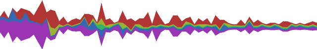
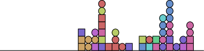
Er, so, looking at the visualization a little more, I realized if I’m going to talk about distortion, I should probably admit that the naive centering-layout algorithm probably hoses things up too.  So, to my loyal readers entirely consisting of people foolish enough to click on links I send them via IM, you get a bonus visualization which is the exact same thing as the above, but with the alignment routine set to ‘bottom’, which is arguably more accurate.

Blog vis with trendy stacked linechart

Frinkiac WordPress Shoutbox Stacked Linechart Flat Coloring

So, motivated by recent prettiness (C26000’s Last.fm Extra StatsWave Graph‘ and its inspiration Lee Byron’s Layered Histogram, which also reminds me of the fundamentally different but visually close-enough IBM Research/Viégas/Wattenberg’s history flow), I have put in some preliminary aggregation logic and a ‘stacked linechart’ visualization. It’s quite the poor cousin to Lee Byron’s stuff, but we’ve got to start somewhere.

Although histogram is probably a better term for the result, the visualization is actually ignorant that there’s aggregation going on, so stacked linechart it is. The data is the same data (wordpress shoutbox ‘shouts’) from my last post, but instead of block stacking to get a de facto histogram, the binned time-intervals are aggregated by author. The stacked linechart consumes these and — presto — a de facto trendy histogram. The main difference here is that the bin period is 7 days, although bugs remain. I am going to replace my haphazard date logic with python-dateutil shortly to resolve this problem.

Frinkiac WordPress Shoutbox Stacked Linechart Link Tally Coloring

Of course, the whole point of visophyte is (excessive) flexibility, so let’s at least leverage that. The above is the same data, but with the fill’s saturation varying with the total number of hyperlinks included in ‘shouts’ for that time interval, producing a quasi-retro wire-frame effect.  Stronger/bolder colors = more links, lighter/faded colors = less/no links.  Some day, perhaps a pretty spline version, but up next is getting back to Thunderbird.

A return to blog visualization, kinda

Frinkiac WordPress Shoutbox VU-Style Vis Mark 1

A visualization of the shoutbox traffic on www.frinkiac.org since the dawn of time or the blog, whichever came later. Colors are defined by the ‘shouting’ user (hue), the linearly scaled log of the word count of the contents (saturation), and a constant for value to get darker lines. So ‘brighter’ colors = longer shouts and ‘lighter’ colors = shorter shouts. All colors are regrettably ugly. The dawn of time is on the left, modern times is on the right. I think the clustering routine has decided each column is three days, although that may get a little shaky at the end of the months (quick-n-dirty date logic.)

This should look similar to…

Old Movable Type Koala Rainbow VU Vis

ye olde KoalaRainbow 0.* for MovableType. The MTKR one is actually blog posts and comments and doesn’t distinguish based on the author, but the point is that I am beginning to be able to do all the things I used to be able to do. This helps flesh out the set of base visualizations and ensure that the architecture doesn’t have any obvious holes in things. Although the visophyte vis definition is perhaps still more verbose than I would like, it doesn’t make me lose hope like the procedural MTKR one did (click on the latter picture and scroll down to witness the ugliness).