We’ve been overhauling the Firefox OS Gaia Email app and its back-end to understand email conversations. I also created a react.js-based desktop-ish development UI, glodastrophe, that consumes the same back-end.
My first attempt at summaries for glodastrophe was the following:
The back-end derives a conversation summary object from all of the messages that make up the conversation whenever any message in the conversation changes. While there are some things that are always computed (the number of messages in the conversation, whether there are any unread messages, any starred/flagged messages, etc.), the back-end also provides hooks for the front-end to provide application logic to do its own processing to meet its UI needs.
In the case of this conversation summary, the application logic finds the first 3 unread messages in the conversation and stashes their date, author, and extracted snippet (if any) in a list of “tidbits”. This also is used to determine the height of the conversation summary in the conversation list. (The virtual list is aware of a quantized coordinate space where each conversation summary object is between 1 and 4 units high in this case.)
While this is interesting because it’s something Thunderbird’s thread pane could not do, it’s not clear that the tidbits are an efficient use of screen real-estate. At least not when the number of unread messages in the conversation exceeds the 3 we cap the tidbits at.
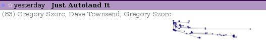
But our app logic can actually do anything it wants. It could, say, establish the threading relationship of the messages in the conversation to enable us to make a highly dubious visualization of the thread structure in the conversation as well as show the activity in the conversation over time. Much like the visualization you already saw before you read this sentence. We can see the rhythm of the conversation. We can know whether this is a highly active conversation that’s still ongoing, or just that someone has brought back to life.
Here’s the same visualization where we still use the d3 cluster layout but don’t clobber the x-position with our manual-quasi-logarithmic time-based scale:
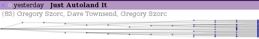
Disclaimer: This visualization is ridiculously impractical in cases where a conversation has only a small number of messages. But a neat thing is that the application logic could decide to use textual tidbits for small numbers of unread and a cool graph for larger numbers. The graph’s vertical height could even vary based on the number of messages in the conversation. Or the visualization could use thread-arcs if you like visualizations but want them based on actual research.
If you’re interested in the moving pieces in the implementation, they’re here: