Web Worker-assisted Email Visualizations using Vega

Faceted and overview visualizations

tl;dr: glodastrophe, the experimental entirely-client-side JS desktop-ish email app now supports Vega-based visualizations in addition to new support infrastructure for extension-y things and creating derived views based on the search/filter infrastructure.

Two of the dreams of Mozilla Messaging were:

  1. Shareable email workflows (credit to :davida).  If you could figure out how to set up your email client in a way that worked for you, you should be able to share that with others in a way that doesn’t require them to manually duplicate your efforts and ideally without you having to write code.  (And ideally without anyone having to review code/anything in order to ensure there are no privacy or security problems in the workflow.)
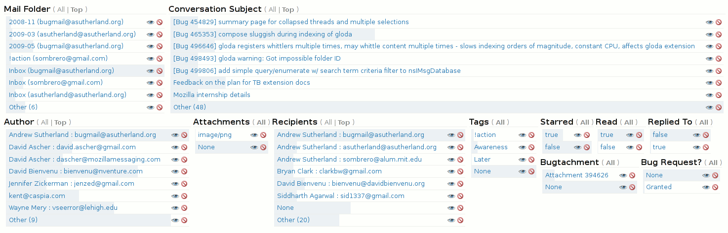
  2. Useful email visualizations.  While in the end, the only visualization ever shipped with Thunderbird was the simple timeline view of the faceted global search, various experiments happened along the way, some abandoned.  For example, the following screenshot shows one of the earlier stages of faceted search development where each facet attempted to visualize the relative proportion of messages sharing that facet.

faceted search UI prototype

At the time, the protovis JS visualization library was the state of the art.  Its successor the amazing, continually evolving d3 has eclipsed it.  d3, being a JS library, requires someone to write JS code.  A visualization written directly in JS runs into the whole code review issue.  What would be ideal is a means of specifying visualizations that is substantially more inert and easy to sandbox.

Enter, Vega, a visualization grammar that can be expressed in JSON that can not only define “simple” static visualizations, but also mind-blowing gapminder-style interactive visualizations.  Also, it has some very clever dataflow stuff under the hood and builds on d3 and its well-proven magic.  I performed a fairly extensive survey of the current visualization, faceting, and data processing options to help bring visualizations and faceted filtered search to glodastrophe and other potential gaia mail consumers like the Firefox OS Gaia Mail App.

Digression: Two relevant significant changes in how the gaia mail backend was designed compared to its predecessor Thunderbird (and its global database) are:

  1. As much as can possibly be done in a DOM/Web Worker(s) is done so.  This greatly assists in UI responsiveness.  Thunderbird has to do most things on the main thread because of hard-to-unwind implementation choices that permeate the codebase.
  2. It’s assumed that the local mail client may only have a subset of the messages known to the server, that the server may be smart, and that it’s possible to convince servers to support new functionality.  In many ways, this is still aspirational (the backend has not yet implemented search on server), but the architecture has always kept this in mind.

In terms of visualizations, what this means is that we pre-chew as much of the data in the worker as we can, drastically reducing both the amount of computation that needs to happen on the main (page) thread and the amount of data we have to send to it.  It also means that we could potentially farm all of this out to the server if its search capabilities are sufficiently advanced.  And/or the backend could cache previous results.

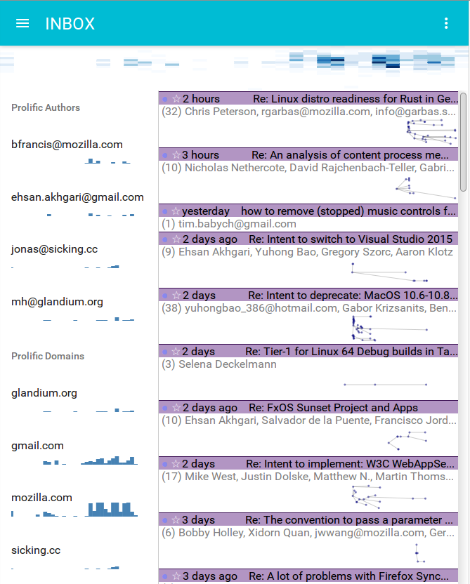
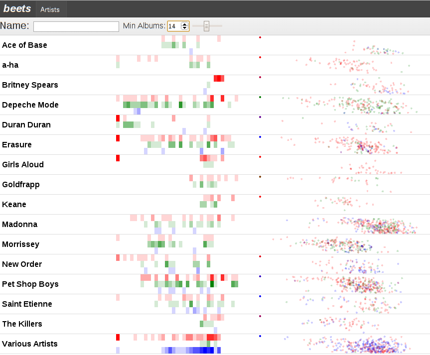
For example, in the faceted visualizations on the sidebar (placed side-by-side here):

faceted-histograms

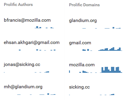
In the “Prolific Authors” visualization definition, the backend in the worker constructs a Vega dataflow (only!).  The search/filter mechanism is spun up and the visualization’s data gathering needs specify that we will load the messages that belong to each conversation in consideration.  Then for each message we extract the author and age of the message and feed that to the dataflow graph.  The data transforms bin the messages by date, facet the messages by author, and aggregate the message bins within each author.  We then sort the authors by the number of messages they authored, and limit it to the top 5 authors which we then alphabetically sort.  If we were doing this on the front-end, we’d have to send all N messages from the back-end.  Instead, we send over just 5 histograms with a maximum of 60 data-points in each histogram, one per bin.

Same deal with “Prolific domains”, but we extract the author’s mail domain and aggregate based on that.

Authored content size overview heatmap

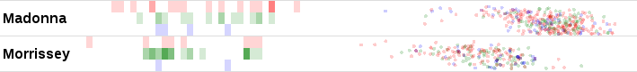
Similarly, the overview Authored content size over time heatmap visualization sends only the aggregated heatmap bins over the wire, not all the messages.  Elaborating, for each message body part, we (now) compute an estimate of the number of actual “fresh” content bytes in the message.  Anything we can detect as a quote or a mailing list footer or multiple paragraphs of legal disclaimers doesn’t count.  The x-axis bins by time; now is on the right, the oldest considered message is on the left.  The y-axis bins by the log of the authored content size.  Messages with zero new bytes are at the bottom, massive essays are at the top.  The current visualization is useless, but I think the ingredients can and will be used to create something more informative.

Other notable glodastrophe changes since the last blog post:

  • Front-end state management is now done using redux
  • The Material UI React library has been adopted for UI widget purposes, though the conversation and message summaries still need to be overhauled.
  • React was upgraded
  • A war was fought with flexbox and flexbox won.  Hard-coding and calc() are the only reason the visualizations look reasonably sized.
  • Webpack is now used for bundling in order to facilitate all of these upgrades and reduce potential contributor friction.

More to come!

An email conversation summary visualization

We’ve been overhauling the Firefox OS Gaia Email app and its back-end to understand email conversations.  I also created a react.js-based desktop-ish development UI, glodastrophe, that consumes the same back-end.

My first attempt at summaries for glodastrophe was the following:

old summaries; 3 message tidbits

The back-end derives a conversation summary object from all of the messages that make up the conversation whenever any message in the conversation changes.  While there are some things that are always computed (the number of messages in the conversation, whether there are any unread messages, any starred/flagged messages, etc.), the back-end also provides hooks for the front-end to provide application logic to do its own processing to meet its UI needs.

In the case of this conversation summary, the application logic finds the first 3 unread messages in the conversation and stashes their date, author, and extracted snippet (if any) in a list of “tidbits”.  This also is used to determine the height of the conversation summary in the conversation list.  (The virtual list is aware of a quantized coordinate space where each conversation summary object is between 1 and 4 units high in this case.)

While this is interesting because it’s something Thunderbird’s thread pane could not do, it’s not clear that the tidbits are an efficient use of screen real-estate.  At least not when the number of unread messages in the conversation exceeds the 3 we cap the tidbits at.

time-based thread summary visualization

But our app logic can actually do anything it wants.  It could, say, establish the threading relationship of the messages in the conversation to enable us to make a highly dubious visualization of the thread structure in the conversation as well as show the activity in the conversation over time.  Much like the visualization you already saw before you read this sentence.  We can see the rhythm of the conversation.  We can know whether this is a highly active conversation that’s still ongoing, or just that someone has brought back to life.

Here’s the same visualization where we still use the d3 cluster layout but don’t clobber the x-position with our manual-quasi-logarithmic time-based scale:

the visualization without time-based x-positioning

Disclaimer: This visualization is ridiculously impractical in cases where a conversation has only a small number of messages.  But a neat thing is that the application logic could decide to use textual tidbits for small numbers of unread and a cool graph for larger numbers.  The graph’s vertical height could even vary based on the number of messages in the conversation.  Or the visualization could use thread-arcs if you like visualizations but want them based on actual research.

If you’re interested in the moving pieces in the implementation, they’re here:

webpd: a Polymer-based web UI for the beets music library manager

beets webpd filtered artists list

beets is the extensible music database tool every programmer with a music collection has dreamed of writing.  At its simplest it’s a clever tagger that can normalize your music against the MusicBrainz database and then store the results in a searchable SQLite database.  But with plugins it can fetch album art, use the Discogs music database for tagging too, calculate ReplayGain values for all your music, integrate meta-data from The Echo Nest, etc.  It even has a Music Player Daemon server-mode (bpd) and a simple HTML interface (web) that lets you search for tracks and play them in your browse using the HTML5 audio tag.

I’ve tried a lot of music players through the years (alphabetically: amarok, banshee, exaile, quodlibetrhythmbox).  They all are great music players and (at least!) satisfy the traditional Artist/Album/Track hierarchy use-case, but when you exceed 20,000 tracks and you have a lot of compilation cd’s, that frequently ends up not being enough. Extending them usually turned out to be too hard / not fun enough, although sometimes it was just a question of time and seeking greener pastures.

But enough context; if you’re reading my blog you probably are on board with the web platform being the greatest platform ever.  The notable bits of the implementation are:

  • Server-wise, it’s a mash-up of beets’ MPD-alike plugin bpd and its web plugin.  Rather than needing to speak the MPD protocol over TCP to get your server to play music, you can just hit it with an HTTP POST and it will enqueue and play the song.  Server-sent events/EventSource are used to let the web UI hypothetically update as things happen on the server.  Right now the client can indeed tell the server to play a song and hear an update via the EventSource channel, but there’s almost certainly a resource leak on the server-side and there’s a lot more web/bpd interlinking required to get it reliable.  (Python’s Flask is neat, but I’m not yet clear on how to properly manage the life-cycle of a long-lived request that only dies when the connection dies since I’m seeing the appcontext get torn down even before the generator starts running.)
  • The client is implemented in Polymer on top of some simple backbone.js collections that build on the existing logic from the beets web plugin.
    • The artist list uses the polymer-virtual-list element which is important if you’re going to be scrolling through a ton of artists.  The implementation is page-based; you tell it how many pages you want and how many items are on each page.  As you scroll it fires events that compel you to generate the appropriate page.  It’s an interesting implementation:
      • Pages are allowed to be variable height and therefore their contents are too, although a fixedHeight mode is also supported.
      • In variable-height mode, scroll offsets are translated to page positions by guessing the page based on the height of the first page and then walking up/down from there based on cached page-sizes until the right page size is found.  If there is missing information because the user managed to trigger a huge jump, extrapolation is performed based on the average item size from the first page.
      • Any changes to the contents of the list regrettably require discarding all existing pages/bindings.  At this time there is no way to indicate a splice at a certain point that should simply result in a displacement of the existing items.
    • Albums are loaded in batches from the server and artists dynamically derived from them.  Although this would allow for the UI to update as things are retrieved, the virtual-list invalidation issue concerned me enough to have the artist-list defer initialization until all albums are loaded.  On my machine a couple thousand albums load pretty quickly, so this isn’t a huge deal.
    • There’s filtering by artist name and number of albums in the database by that artist built on backbone-filtered-collection.  The latter one is important to me because scrolling through hundreds of artists where I might only own one cd or not even one whole cd is annoying.  (Although the latter is somewhat addressed currently by only using the albumartist for the artist generation so various artists compilations don’t clutter things up.)
    • If you click on an artist it plays the first track (numerically) from the first album (alphabetically) associated with the artist.  This does limit the songs you can listen to somewhat…
    • visualizations are done using d3.js; one svg per visualization

beets webpd madonna and morrissey

“What’s with all those tastefully chosen colors?” is what you are probably asking yourself.  The answer?  Two things!

  1. A visualization of albums/releases in the database by time, heat-map style.
    • We bin all of the albums that beets knows about by year.  In this case we assume that 1980 is the first interesting year and so put 1979 and everything before it (including albums without a year) in the very first bin on the left.  The current year is the rightmost bucket.
    • We vertically divide the albums into “albums” (red), “singles” (green), and “compilations” (blue).  This is accomplished by taking the MusicBrainz Release Group / Types and mapping them down to our smaller space.
    • The more albums in a bin, the stronger the color.
  2. A scatter-plot using the echo nest‘s acoustic attributes for the tracks where:
    • the x-axis is “danceability”.  Things to the left are less danceable.  Things to the right are more danceable.
    • the y-axis is “valence” which they define as “the musical positiveness conveyed by a track”.  Things near the top are sadder, things near the bottom are happier.
    • the colors are based on the type of album the track is from.  The idea was that singles tend to have remixes on them, so it’s interesting if we always see a big cluster of green remixes to the right.
    • tracks without the relevant data all end up in the upper-left corner.  There are a lot of these.  The echo nest is extremely generous in allowing non-commercial use of their API, but they limit you to 20 requests per minute and at this point the beets echonest plugin needs to upload (transcoded) versions of all my tracks since my music collection is apparently more esoteric than what the servers already have fingerprints for.

Together these visualizations let us infer:

  • Madonna is more dancey than Morrissey!  Shocking, right?
  • I bought the Morrissey singles box sets. And I got ripped off because there’s a distinct lack of green dots over on the right side.

Code is currently in the webpd branch of my beets fork although I should probably try and split it out into a separate repo.  You need to enable the webpd plugin like you would any other plugin for it to work.  There’s still a lot lot lot more work to be done for it to be usable, but I think it’s neat already.  It definitely works in Firefox and Chrome.

about:nosy can now show CPU usage using jsprobes

Refresher: about:nosy was introduced one week ago as a way to see the memory usage of your tabs and extensions (that live in compartments).  It sorta looked like this:

Except those (green) bars on the right are new.  The ones on the left, they show memory.  The ones on the right, they show CPU usage.  New data points enter on the left, surf across to the right, then fall into oblivion.  I have it on good authority that researchers are looking into some way of labeling these things so that you don’t have to read a blog post to understand them.  But until they do, I have a blogging gig, so let’s hope it takes them a bit longer.

The above is a picture of the bars belonging to a tab viewing a Mozilla Demo Studio demo by ybochatay https://developer.mozilla.org/en-US/demos/detail/animation-of-weather-fronts/launch.  What’s really neat about this example is that you can see it was going to town on the CPU in the past (right; past), then usage fell off a cliff.  Why?  Because I changed from that tab to the about:nosy tab.  I’m going to assume that’s Firefox’s setTimeout/setInterval throttling of background tabs was at work and the team is to be congratulated for that.  If it’s the case that the demo or the demo framework is very responsible, kudos to those involved parties.

We track CPU utilization on a per-compartment basis, taking care to only attribute usage to a single compartment per thread at a time.  In the event of ill-behaved parties spinning a nested event loop, we are not currently clever enough to stop the clock in this implementation.  Native code costs like reflows that are incurred with the JS still on the stack will happily be attributed to the compartment.

The magic that powers the CPU tracking is Brian Burg‘s jsprobes implementation.  See his blog post and master probe hacker (ETW!) Steve Fink‘s blog post on its magical powers.

If you are adventurous…

…you can build your own Firefox build with jsprobes.  The patch series to use is my updated fork found here on bitbucket.  You’ll want to build with “ac_add_options –enable-jsprobes”.  The one non-jsprobes change in there is to cause all XPConnect memory reporters to provide the address of their compartment just like system compartments do.  Doing so allows us to correlate compartment CPU usage to the compartment’s memory reporter information without going crazy.

You can verify things work by trying out about:jsprobes, a simple extension you can hack on to play with probes.  You can also check out the Steve Fink created/Brian Burg jsprobes-enabled* about:gc implementation which provides us with the screenshots in the immediate vicinity of this sentence.  I’m not sure what those squiggly things on the left and the bottom of the boxes filled with pretty lines and dots are; I’ll see if I can find a blog post explaining them.

Or you can grab the source for about:nosy.

* I think this is the attribution breakdown based on my own inference; I could be wrong.  Either way, they’re both awesome.

If you are not adventurous…

…I will hopefully spin some try builds in the near future.  Wait for those.  Right now about:nosy still has unacceptable levels of performance impact on your session once you get a bunch of tabs so the custom builds would be one-off novelty uses for 30 seconds.

But while you wait, maybe you would like to peruse the probes that power the CPU monitoring?

In closing?

It’s worth noting that there are other viable ways to track compartment CPU usage, but jsprobes are the funnest.

about:nosy is about:memory with charts, helps you lay blame more easily

about:memory and the memory reporter infrastructure that powers it are amazing.  They provide an explicit hierarchy that breaks down the memory use in the system to the subsystems and increasingly the causes of allocation.  about:memory looks like this (if you stand a few feet back from your monitor and take off your glasses):

If you are going to look at about:memory, it is probably for one of two reasons:

  1. You are Nicholas Nethercote or one of his merry band of MemShrink hackers kicking ass and taking names (of inefficient uses of memory).  In this case, about:memory is exactly what you need.
  2. You suspect some tab in Firefox has gone crazy and you want to figure out which one it is and take your vengeance upon it.  Vengeance can take the form of thinking mean thoughts, closing the tab, or writing a snarky tweet.  about:memory will let you do this, but you have to look at a lot of text and you may already be too late to find the culprit!  If only there was an easier way…

Enter about:nosy:

It can show us a list of all the open tabs and their memory usage sans JS for now, as per the above screenshot.  If you expand the tab capsules, you get to see the list of all the inner windows/iframes that live in the hierarchy of that page.  In most cases the list is either really short and boring or really long and boring.  In the case of www.cnn.com I end up with 26 inner windows.

It can also show us memory aggregated by origin.  We do show JS for this case because JS is currently only trackable on a per-origin basis.  When Bug 650353 gets fixed or the memory reporters get more specific we should be able to apportion JS usage to pages directly.

It also attempts to aggregate extension JS compartments back to their owning extension.  We ask the add-on manager for a list of the installed extensions to find their filesystem roots, ask the resource protocol to explain resource mappings, and from there are able to translate such paths.  Just keep in mind that traditional overlay-based extensions do not create their own compartments and so are invisible for tracking purposes.

In the screenshot above, you can see that about:nosy keeps the charts exciting by generating a ridiculous amount of garbage all by itself.  Much of this is just the about:memory tree-building code that we are reusing.  If you refreshed about:memory once a second you would probably see similar garbage creation from the main system JS compartment.

You can install a restartless XPI (update: points at 0.3 now which does not screw up style shell apportionment and uses a better add-on SDK that does not create throwaway JS compartments every second) of the state of the now that will not auto-update.  It wants a recent nightly build of Firefox because it makes assumptions about the structure of the memory reporters in order to better serve you.

You can find the source repo on github.  It requires the add-on SDK to build.  It might seem a little overkill for just graphing memory history, but if you’re looking at the repo you will notice my goal is to use Brian Burg‘s jsprobes work aided by Steve Fink and now de-bitrotted by me (but still a bit crashy) to be able to graph CPU usage, including raw JS, layout/reflow, and paint (eventually, after adding probe points).  It’s also possible for those statistics to be gathered via static mechanisms, but the probes are fun and I want to see them work.

The joy of integrated logging and log viewing with fancy logs

The deuxdrop messaging experiment‘s current incarnation exists as an (under development) Jetpack that runs in Firefox.  I am still trying to shake out functionality to be driven by the UI rather than headless unit tests.  While firebug has been a great help, another boon has been the logging framework and log viewing framework developed for the unit tests.  (Previous posts here and here).  Since the log is made up of structured JSON data, all the log processing logic is written in JS, and the log viewing UI is HTML/CSS/JS, it is trivial to embed the log viewer into the Jetpack itself.

If you type about:loggest in the URL bar (or better yet, create a bookmark on the bookmark bar and click that), the log viewer is displayed.  Deuxdrop’s client daemon logic (which runs in a hidden frame), uses a log reaper that runs at 1-second intervals.  If anything happens log-wise during that second, it is packaged and added to a circular-buffer style list of the last 60 seconds where anything happened.  When the log viewer starts up, it asks for and receives the data.  The result looks like the above small screenshot.  If no errors were logged during the time interval, it is automatically collapsed.

Let us experience the joy of integrated logging by looking at a real problem I recently encountered.  In the development UI (accessible via about:dddev), I brought up a list of my contacts after starting a conversation.  It looks like this right now:

The problem is that I, the user, am “Andrew Sutherland” and should not be in my own contact list.  Also, the display should not be claiming there are an undefined number of unread messages from me, but that is likely fallout from the system intentionally not maintaining such information about me, the user.

I want to quickly figure out why this is happening, so I bring up about:loggest and open the most recent time entry to see what happened when this query was issued and filled:

I can see that the query ended up issuing database requests for both Walternate (purple) and myself (green), strongly suggesting that the database index being queried on names me.

I wonder if the conversation processing logic was the code that did this… let’s check by going to the time slice where the conversation was processed, expanding it, and only screenshotting some of it:

Yes, the conversation logic did this.  It’s generating index values in the peepData table for the idxPeepAny and idxPeepRecip indices.  But I thought my unit tests covered this?  Nope.  It turns that although we test that a peep query returns the right thing both cold from the database and inductively via notifications as contact relationships are established, we don’t issue a new query after creating a conversation.  Furthermore, we only issued queries against the alphabetical index, not against idxPeepAny.  So we rectify that by augmenting the unit test:

  // - make sure that the conversation addition did not screw up our peeps list
  T.group('check peeps list after conversation join');
  lqFinalAllPeeps = moda_a.do_queryPeeps("allPeepsFinal:any", {by: 'any'});

And the test indeed now fails:

The relevant bit is in the lower right, which I blow up here with the “unexpected event” obj popup displayed above it, and the “failed expectation” obj popup below it.  The postAnno stuff is to indicate what is new in the query result.  Because it’s a freshly issued query and this is the first set of results, everything is new.  It’s probably worth noting that these errors would usually show up as a single “mismatched” error instead of an unexpected/failed pair in our tests, but the specific logger was operating in unordered set mode because we don’t care about the exact order that different query notifications occur in, we just care that they do occur.

(The structure is intended to later be enhanced to provide a nicer visualization where we only show the contents of the “state” attribute and use preAnno to indicate annotations on a representation of the most recent state for the object (from a previous log entry) and postAnno to indicate annotations on the now-current representation “state”.  For postAnno, values of 1 represent an addition, and values of 0 represent a change or event firing on the object.)

A potentially even more exciting bit of integrated logging is that about:loggest-server opens a tab that retrieves its contents from the server.  When run with the –loggest-web-debug flag, the server loads a module that cranks up the logging and does the same 1-second interval log reaping magic and exposes it for HTTP retrieval.  While this specific configuration with the high level of detailed logging is only appropriate for a developer-machine test server, it is incredibly valuable to be able to just pop open another tab and see what the server just got up to.

In any event, I leave it as an exercise to the reader to assume that I will take care of the bug now that it’s extremely clear what the problem is.  Well, extremely clear if I had taken a bigger screenshot of the conversation creation log.  Above the region captured is a header that indicates the actions are being triggered by the ‘convJoin’ task and the entry (which is visible) indicates the update_conv_data function likely kicked off the database activity.

PS: All the gibberish looking characters in the screenshots are crypto keys or other binary data that lack aliases mapping them to known objects.  Examples of successfully mapped aliases are the colored blocks.  In the case of the conversation creation gibberish, we are seeing the conversation id.  Those aliases are generated as a separate pass by the log reaper by walking the set of existing queries and using helper functions to map the items currently exposed by the queries to human names because it’s quick and easy and is O(what’s being looked at) not O(size of the database).  In the case of the conversation, there was no query against the conversation and I also have not written the helper function yet, which is why it did not get aliased.  Unit tests don’t have the problem because we create aliases for everything.

overview ownership/communication graphs for rich execution logs

relationship-overview-spgm

My last blog post covered the fancy pants logging being used for the deuxdrop project.  To summarize:

  • we have loggers
  • they are organized by ownership hierarchy
  • they provide sufficient metadata that we can reconstruct the loggers that were talking to each other
This can result in a lot of loggers.  If you look at the log output from the last blog post (caution: BIG JSON file in standalone ArbPL instance) you might notice a list of loggers that looks something like the below, except not quite as sideways or shrunk:

last generation's logger hierarchy rotated sideways

Obviously, that much raw data is not super helpful.  So now we process the hierarchy, constructing graph nodes or aggregate graph nodes for things that are interesting in their own or in aggregate.  We use d3 of the vaunted protovis lineage to visualize the network and graphviz to lay it out.

d3 has a super-polished, fun-to-use interactive force-directed graph implementation, but graphviz’s circo layout produces better results.  Given that ArbPL already has a processing step for intake, it wasn’t too much extra work to include a step where we use the same JS code as on the client to generate a dot file, pass it to circo to lay it out, then extract the layout information and store it with the log data.  Many props to Gregoire Lejeune for his node-graphviz bindings that made it so easy to do.

overview-z-joined-notif-highlighted

Although the overview graph on its own is neat, it becomes useful by showing us the involved loggers/actors in a test step by highlighting them.  It does this by listening for wmsy‘s focus change events to know what the focused test step is.  (Since mouse interaction also causes toggling, it’s easiest to appreciate the process by using the up/down arrow keys to change focus without expanding the steps.  And if you want to toggle the expanded state without involving the mouse, you can hit the enter key.)

z-joined-step-callout-causes-highlighting

For reference, the steps look like the above, and the highlighted one has the ever-so-fashionable glowing fancy focus ring.

If you would like to see this for yourself, you can check out the archived (and therefore less likely to break) standalone version of the example log file: https://clicky.visophyte.org/examples/arbpl-loggest/20110720/.  The previously super-huge JSON file is now about an order-of-magnitude smaller because I started eliding large strings that are of no human interest.

new adventures in rich (execution) logs for debugging and program understanding

Understanding what is going on inside software can be very hard, even for the developers most familiar with the software.  During my time working on Thunderbird I used a variety of techniques to try and peer inside: printf/dump/console.log, debuggers, execution analysis (dtrace, chronicle recorder, with object diffs, on timelines), logging (log4j style, with  timelines, with rich data, extra instrumentation and custom presentations, prettier and hooked up to dump on test failures), improving platform error reporting, gdb extensions, control-flow analysis of SQL queries (vanilla, augmented with systemtap perf probes), performance analysis (VProbes with custom UI, systemtap, crammed into the SpeedTracer UI, custom UI with the async work), chewing existing log facilities’ output (TB IMAPgecko layout), and asynchronous operation causality reconstruction (systemtap, JS promises).

Logging with rich, structured data easily provided the most bang-for-the-buck because it:

  1. Provided the benefit of baked-in human meaning with some degree of semantic hierarchy.
  2. Was less likely to make wrong assumptions about what data was relevant.  How many times have you had to go back to change what a printf is logging?
  3. Once sufficiently automated, required no activation energy, no extra steps, and everyone can see the results.
However, it still has numerous downsides/gotchas:
  1. Potential performance impact, especially with rich, structured data.
  2. If people don’t write log statements, you don’t get log entries.
  3. If an error propagates and no one catches it or otherwise says anything about it, your log trace stops dead.
  4. Lack of context can hide causation and leave you filtering through tons of entries trying to reconstruct what happened from shadows on the cave wall.


As a result, when I recently started on a new project (implemented in JS), I tried to make sure to bake logging into the system from the ground up:
  • The core classes, abstractions, and APIs generate log entries automatically so developers don’t need to fill their code with boilerplate.
  • Loggers are built around object ownership hierarchies/life-cycles to provide context and the ability to filter.  This is in contrast to log4j style logging which is usually organized around code module hierarchies, noting that log4j does provide nested diagnostic contexts.
  • The test framework is designed around writing tests in terms of expectations around the loggers.  This helps ensure interesting things get logged.  It also improves the quality of the tests by making it easier to ensure the tests are really doing what you think they are doing.
  • Logger definitions explicitly name the log events they will generate and their semantic type, some of which have special handling.  The currently supported types are: state changes, latched states, events, asynchronous jobs (with separate begin and end entries), calls (which wrap a function call, catching exceptions), and errors.  This allows specialized processing and better automated analysis without having to try and reverse engineer the meaning using regular expressions.
  • Performance is addressed by instantiating different logger classes based on needs.  For modules not under test (or without logging desired), everything turns into no-ops except for events and errors which are counted for reporting to a time-series database for system health/performance/etc analysis.  The decision making process happens at runtime and is able to see the parent logger, so heavy-weight logging can be used on a statistical sampling basis or only for specific users experiencing problems/etc.
  • Loggers can give themselves complex semantic names that can be used to reconstruct relationships between loggers when the ownership hierarchy is not available or not appropriate.  For example, we can link both sides of the connection between a client and a server by having the loggers make sure to name themselves and the other side.
  • Simple wrapper helpers exist that make it easy to wrap a function so that a custom log entry is generated and it “holds” the call in limbo from whence it can later be “released”.  This allows unit tests to break complicated behaviour into discrete steps that humans can understand.  Far better to look at one thing at a time than eight things all jumbled together (or filtered back down to one, potentially hiding important details).


In any event, as one might surmise from the screenshots, this is more than a dream, it’s a pastel colored reality.

What are the screenshots showing?

  1. The logger hierarchy.  The colored bits are “named things”.  The test framework has the concept of things, actors, and loggers.  Each actor corresponds to exactly one logger and is the object on which tests specify their expectations.  Actors can be owned by other actors, resulting in a hierarchy we call a family.  Each family gets tagged with a distinct identifier that allows us to associate a color with them.  Things provide a human name to a (hopefully) unique string.  Things can be owned by actors and get tagged with the family name and so can be colorized.  In the logger hierarchy, the stuff to the right of the colon is the semantic name of the logger.  So “clientConn: A client to X longtermat endpoint blah” is really (under the hood) an array of strings where “A client” is actually the crypto key so named.  There are two colors because the connection is naming both its own identifying crypto key and the server’s crypto key it is trying to talk to.
  2. An example of the display of log entries.  Each logger gets its own column to display its entries in.  The header shows the name of the logger and is colored based on that logger’s family.  The colors were not shown in the logger hierarchy because I think it would end up too busy.  Each entry is timestamped with the number of milliseconds since the start of the test.  The event names are arbitrarily in blue to help delineate them from other semantic classes.  For example, “handleMsg” is a call-type.  The “obj” bits with the dotted stuff under it means something we can click on to see more of.  The events being shown are part of a CurveCP-style connection establishment.
  3. Similar to the previous screenshot, but here you can see named thing resolution in play with arguments that are strings.
  4. And if we click on one of those “obj” bits, we get a nice nested table display of the object.  As you can see from the pretty colors, named thing resolution is also in play.  You can also see crypto keys I did not name and which accordingly look like gibberish.  It is probably worth noting that some developer participation is required to make sure to put toJSON() implementations on all the complex objects that are exposed to the logger to make sure we don’t try and serialize huge swathes of object graph.  While this is a “don’t break the system” requirement, it also makes it easy to expose the useful bits of information for debugging.

If you would like to see the actual log display UI for yourself on the log from the screenshots (and can stomach it fetching 2+ MiB of compressed JSON), you can see it at https://clicky.visophyte.org/examples/arbpl-loggest/20110712/.  While the logs normally live on the ArbitraryPushlog (ArbPL) server, links to it are currently not stable because its all-in-one hbase datastore keeps self-destructing.  I baked ArbPL into a standalone form that lives at that URL and so should ideally not break so much.  Fingers-crossed.

build matrices for arbitrarypushlog

A TraceMonkey Push

As I mentioned in my teaser on rich thunderbird mozmill logs, in order to get the build logs and provide failure clustering you already have to do most of the stuff tinderboxpushlog does.  One of the key things is summarizing the builds in a way that is useful, where the definition of “useful” probably varies a lot between users.

While Thunderbird has an extremely boring set of build types (build, xpcshell, mozmill), my first take on summarizing them was no good.  While fixing it, I decided to feature creep (out of my hobby time allocation) and see if I could create a presentation that could handle the prolific Firefox and TraceMonkey trees.

A Firefox Push

While I am not going to claim it’s perfect, I like it.  It’s probably also important to caveat that not all Tracemonkey builds are categorized.  The mobile talos runs identify themselves by a completely different set of names from the desktop ones, and there’s not really room for columns for that.  Additionally, some builds cite a revision for “mobile-browser”, but we ignore that extra meta-data.  Although the design was intended to handle Thunderbird’s repository where each build is a tuple of “comm-central” and “mozilla-central” revision used, we really need to have that tuple for every build in the tinderbox tree, and TraceMonkey is not providing it.  (We could kick builds without the info to the “outer” push as an enhancement.)

A Thunderbird (well, comm-central) push.

As a gesture of friendship to non-Thunderbird trees, we now also process mochitest and reftest logs, although I’m failing to surface some of the details retrieved in the UI.

Anywho, you can see arbpl in action for yourself at arbpl.visophyte.org.  It cron scrapes every 5 minutes.  The error recovery logic is not production-grade yet; the scraper can fall victim to partially written tinderbox JSON files on the tinderbox server, which means that some trees might not see updates for longer than that.  And various other things may go wrong too.  The client does not auto-refresh or use Socket.IO or anything.  If you want to run your own, hit github.  If you want to read the source, you should probably hit github too, because the production serving mode is reasonably optimized and crams all the JS into a single (gzipped) file.

why so slow, pushlog?

I am doing something where I need to talk to the Mozilla hg pushlog.  I noticed things were running disturbingly slow, so I figured I’d look into it.  I’m using node.js so htracr (a node.js, libpcap-based via node_pcap http transaction visualizer) seemed like the easiest and most fun way to figure out what is going on.  (In a web browser I would just use the built-in timeline.)

slooooooooooow...

The short request is a comm-central pushlog request by date.  The long request is a mozilla-central pushlog request by date.  mozilla-central has more pushes, suggesting that the query is either doing something sketchy like a table scan or there is lock contention.  Quick investigation showed no successful pushes in the given timeframe, eliminating lock contention from the likely list of causes.  (The implementation uses SQLite, which, when not running with the Write-Ahead-Log enabled, will only experience contention when the reads are occurring from separate connections.)

This suggests the query is doing a table scan.  This tends to be a reasonably straightforward problem.  But since I have a SQLite opcode visualizer in my toolkit (now on github!) that needs plugs periodically to keep it on the tip of everyone’s tongue, I used that. Plug! Plug! Plug!

If you care about these kind of things, click on the small image on the left and look for the red text.  The giant warning flag is the “Rewind” on the changesets table and the control flow that performs a “Next”  that appears to be part of a loop case right off the bat.  (Note that this is using SQLite 3.6.23.1 since I assume that’s what hg.mozilla.org is using.)  Summary: we perform one table scan of the changesets table for every push in the date range.

The “bad” schema is:

CREATE TABLE changesets (pushid INTEGER, rev INTEGER, node text);
CREATE TABLE pushlog (id INTEGER PRIMARY KEY AUTOINCREMENT, user TEXT, date INTEGER);
CREATE UNIQUE INDEX changeset_node ON changesets (node);
CREATE UNIQUE INDEX changeset_rev ON changesets (rev);
CREATE INDEX pushlog_date ON pushlog (date);
CREATE INDEX pushlog_user ON pushlog (user)

The query is: SELECT id, user, date, node from pushlog LEFT JOIN changesets ON id = pushid WHERE date > 1298306930 AND date < 1298306955 ORDER BY id DESC, rev DESC;

The query plan via EXPLAIN QUERY PLAN from SQLite 3.6.23.1 on the “bad” schema is:

0|0|TABLE pushlog WITH INDEX pushlog_date
1|1|TABLE changesets

This is obvious if you know what you’re looking for; unfortunately the indication of the problem is the lack of “WITH INDEX” or the like rather than text that calls out the problem. The much nicer SQLite 3.7.4 EXPLAIN QUERY PLAN (which has great documentation!) would make the problem much more obvious by saying “SCAN TABLE” if not for the fact that it ends up creating an automatic index:

0|0|0|SEARCH TABLE pushlog USING INDEX pushlog_date (date>? AND date<?) (~110000 rows)
0|1|1|SEARCH TABLE changesets USING AUTOMATIC COVERING INDEX (pushid=?) (~7 rows)
0|0|0|USE TEMP B-TREE FOR ORDER BY

Although one table scan accompanied by a b-tree building is probably a better idea than N table scans, if you read this and think “SQLite 3.7.x just saved someone’s bacon”, you would be wrong because it still throws away the index at the end.  The server is still experiencing an initial vicious kick in the pants every time the statement is run; there are just no lighter follow-up kicks (lighter because of the OS disk cache, you see…).

In any event, the problem is that there is no index on the pushid column in the changesets table.  (And pushid can’t be the primary key because it is not unique.  There’s no benefit to using a composite key since SQLite will still create a simple rowid key once we use a composite, so an index is the way to go.)

Once we fix this, our graph looks like the second one at left (in SQLite 3.6.23.1).  Again, looking for red text and now also orange text, the key things are that we no longer have a “Rewind” or “Next”, and instead have a SeekGe on the index and a Seek on the table using the row id the index told us about.  (We are not using a covering index because we expect extremely high locality in the table based on rowid because the insertions happen consecutively in a single transaction.)

The 3.6.23.1 query plan now looks like:

0|0|TABLE pushlog WITH INDEX pushlog_date
1|1|TABLE changesets WITH INDEX changeset_pushid

Much nicer! What does the lovely 3.7.4 say?:

0|0|0|SEARCH TABLE pushlog USING INDEX pushlog_date (date>? AND date<?) (~110000 rows)
0|1|1|SEARCH TABLE changesets USING INDEX changeset_pushid (pushid=?) (~10 rows)
0|0|0|USE TEMP B-TREE FOR ORDER BY

Awww yeah. Anywho, here’s the schema one wants to use:

CREATE TABLE changesets (pushid INTEGER, rev INTEGER, node text);
CREATE TABLE pushlog (id INTEGER PRIMARY KEY AUTOINCREMENT, user TEXT, date INTEGER);
CREATE INDEX changeset_pushid ON changesets (pushid);
CREATE UNIQUE INDEX changeset_node ON changesets (node);
CREATE UNIQUE INDEX changeset_rev ON changesets (rev);
CREATE INDEX pushlog_date ON pushlog (date);
CREATE INDEX pushlog_user ON pushlog (user);

I am off to file this as a bug… filed as bug 635765.

UPDATE: I initially had a brain glitch where I proposed using a primary key rather than an additional index.  Unfortunately, this is what got pushed out to feed readers during the 30 seconds before I realized my massive mistake.  If you have come to this page to note the bad-idea-ness of that, please enjoy the corrected blog-post which explains why the primary key is not the best idea before going on to point out any other serious brain glitches 🙂

UPDATE 2 (Feb 22, 2011):  Good news: the change has landed and all the existing databases have been updated.  Woo!  Bad news: although things are probably faster now, things are still way too slow.  (Given that this specific deficiency was determined by inspection and not actual profiling, this is not so surprising.)  It would appear that the retrieval of the information about the changesets is the cause of the slowdown.  More inspection on my part suggests that populating the list of tags may be involved, but that’s just a quick guess.  Please follow the bug or follow-on bugs if you want to witness the entire exciting saga.