status/future fyi. no pictures.

I have accepted a position at Mozilla Messaging and will start at the end of March. Posting has been rare as of late and will be rare until then because my spare cycles are being given over to providing closure to my day-job projects, dealing with various hardware failures, and other small fires.

Hobby-wise, this will translate into a focus on visualizing e-mail from within Thunderbird. My nascent Python library, visophyte, will likely have a JavaScript sibling, but will not be abandoned.

Job-wise, I expect to focus on improving Thunderbird for both users and extension developers. Although my interest in creating a useful visualization extension will inform my efforts, it will not be my focus. Which is to say, do not worry that I will be engaging in flights of fancy and neglecting the core of Thunderbird. However, do be happy that good visualizations will depend on non-trivial data analysis and snappy, interactive behaviour and that this should translate into good things for Thunderbird, even if you don’t like shiny things.

It wasn’t an easy decision to leave my current employer (I have only great things to say about The PTR Group; check them out if you’re in the greater DC metro area), but Mozilla Messaging is an exceedingly rare opportunity that I could not pass up.

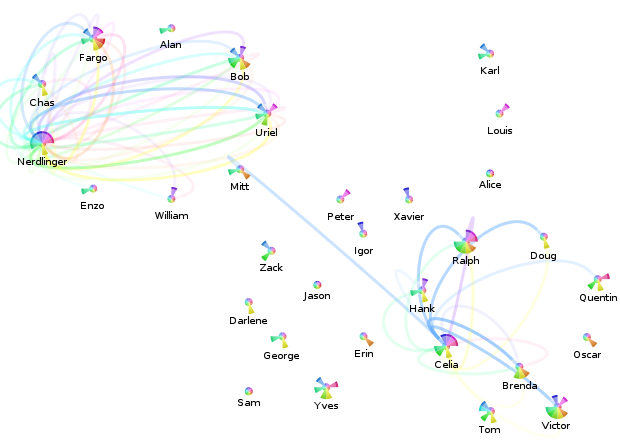
Anyone going to InfoVis 2007? And a dubious contact vis.

I’m going to be at Vis 2007/InfoVis 2007/VAST 2007 next week thanks to my employer, The PTR Group (who is hiring, especially embedded folk in the greater DC area). So, if anyone who reads this will be there, feel free to drop me a line in the comments below or via e-mail at sombrero@alum.mit.edu.

magneto-contact-vis-dubious.png

The above is an attempt to visualize the per-month message flows between contacts, originally drawing inspiration from iron filings in a magnetic field. It doesn’t really work, even filtering things so only messages between the contacts involving “Nerdlinger” (upper left quadrant) and “Celia” (lower right quadrant) are displayed.

The Celia one works out a lot better, as you can see. Please overlook the fact that somehow there are all sorts of messages from Celia during that blue month with neither her nor the other contacts having any meaningful message traffic per the pie-chart. (The filtering constraint is that the contacts of interest have to either be in the to/cc or the from part.) This is a result of a bug in my contact consolidation logic (now fixed), that resulted in the summary statistics not properly being updated in all cases. Recalculating the statistics isn’t going to happen tonight, so this screenshot shall forever be buggy.

What I take away from this visualization is that when attempting to indicate the relative proportion of messages between contacts across time, it would probably be better to use a single straight rainbow line. I define a rainbow line as a line made up of multiple colors; I’m sure there’s a better (pre-existing) term for the concept.

revised-me-relative-sparkbars-redblue.png

And these are some of the newer sparkline bars that only include messages to-me-from-the-contact (above: blue for to, light blue for cc), or from-me-to-the-contact (below: red for to, pink for cc). The color scheme is a red-shift (away from me)/blue-shift (towards me) sort of metaphor which no one (cooler than me) should ever guess. I think I’ll have to resort to text or icons, or just stop trying to cram so much information in there.