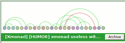
about:nosy is about:memory with charts, helps you lay blame more easily

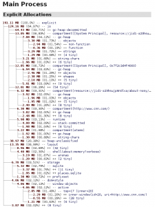
about:memory and the memory reporter infrastructure that powers it are amazing.  They provide an explicit hierarchy that breaks down the memory use in the system to the subsystems and increasingly the causes of allocation.  about:memory looks like this (if you stand a few feet back from your monitor and take off your glasses):

If you are going to look at about:memory, it is probably for one of two reasons:

  1. You are Nicholas Nethercote or one of his merry band of MemShrink hackers kicking ass and taking names (of inefficient uses of memory).  In this case, about:memory is exactly what you need.
  2. You suspect some tab in Firefox has gone crazy and you want to figure out which one it is and take your vengeance upon it.  Vengeance can take the form of thinking mean thoughts, closing the tab, or writing a snarky tweet.  about:memory will let you do this, but you have to look at a lot of text and you may already be too late to find the culprit!  If only there was an easier way…

Enter about:nosy:

It can show us a list of all the open tabs and their memory usage sans JS for now, as per the above screenshot.  If you expand the tab capsules, you get to see the list of all the inner windows/iframes that live in the hierarchy of that page.  In most cases the list is either really short and boring or really long and boring.  In the case of www.cnn.com I end up with 26 inner windows.

It can also show us memory aggregated by origin.  We do show JS for this case because JS is currently only trackable on a per-origin basis.  When Bug 650353 gets fixed or the memory reporters get more specific we should be able to apportion JS usage to pages directly.

It also attempts to aggregate extension JS compartments back to their owning extension.  We ask the add-on manager for a list of the installed extensions to find their filesystem roots, ask the resource protocol to explain resource mappings, and from there are able to translate such paths.  Just keep in mind that traditional overlay-based extensions do not create their own compartments and so are invisible for tracking purposes.

In the screenshot above, you can see that about:nosy keeps the charts exciting by generating a ridiculous amount of garbage all by itself.  Much of this is just the about:memory tree-building code that we are reusing.  If you refreshed about:memory once a second you would probably see similar garbage creation from the main system JS compartment.

You can install a restartless XPI (update: points at 0.3 now which does not screw up style shell apportionment and uses a better add-on SDK that does not create throwaway JS compartments every second) of the state of the now that will not auto-update.  It wants a recent nightly build of Firefox because it makes assumptions about the structure of the memory reporters in order to better serve you.

You can find the source repo on github.  It requires the add-on SDK to build.  It might seem a little overkill for just graphing memory history, but if you’re looking at the repo you will notice my goal is to use Brian Burg‘s jsprobes work aided by Steve Fink and now de-bitrotted by me (but still a bit crashy) to be able to graph CPU usage, including raw JS, layout/reflow, and paint (eventually, after adding probe points).  It’s also possible for those statistics to be gathered via static mechanisms, but the probes are fun and I want to see them work.

displaying execution traces on a SIMILE timeline

chronimoz-timeline-1

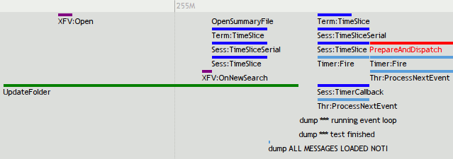
chroniquery can now output JSON for display using the SIMILE timeline widget.  And I am finally done trying to figure out what was going wrong.  Click the pictures to experience the timeline sensation for yourself.

Related interesting things:

  • Supports a fancy if specific constraint mechanism.  For example, PrepareAndDispatch is only displayed in the context of nsTimerImpl::Fire using the following line in the config file:
[func@PrepareAndDispatch]
only_show_if=backtrace,4,nsTimerImpl::Fire
  • Supports displaying arguments in the title using the config file.  For example, displaying the observer service’s topic (plus putting it in its own band and giving it a nice prefix):
[class@nsObserverService]
prefixAlias=Obs:
band=context
list_args=aTopic
  • We actually get the dump() output by logging where _IO_fputs shows up.  We constrain its output by adding an extensible (if currently somewhat specialized) argument-based constraint.
  • Things in red are red because their return codes were exceptional, per my last blog post.  Things in other colors are that way because of the config file.
  • The bubbles that show up when you click on things tell you the return value and arguments for the call in question.  We could include a backtrace, but they are expensive to compute (currently), so I don’t.
  • All layout is using the timeline widget’s layout.  There is no correspondence between stack depth and anything else.

chronimoz-timeline-2

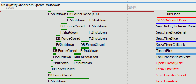
An important limitation is that all functions displayed here were explicitly chosen for display.  Some form of automated mechanism could be used, but unless chronicle-query starts caching more things, it would be really slow.  Here’s the command-line used for the above:

chron-xpc mozrun-9022.db jsontrace -t 1 -f nsObserverService::NotifyObservers -f nsThread::ProcessNextEvent -f nsTimerImpl::Fire -f nsMsgSearchSession::NotifyListenersDone -f nsMsgDBFolder::Shutdown  -f nsMsgLocalMailFolder::AddMessage -f nsMsgDatabase::Open -f nsMsgDatabase::ForceClosed -f nsMsgLocalMailFolder::GetDatabaseWithReparse -f nsMsgDBFolder::OnAnnouncerGoingAway -f nsMsgDBFolder::AddSubfolder -f nsMsgSearchOfflineMail::OpenSummaryFile -f nsMsgSearchSession::TimerCallback -f nsMsgSearchSession::TimeSlice -f nsMsgSearchSession::TimeSliceSerial -f nsMsgSearchScopeTerm::TimeSlice -f nsMsgXFVirtualFolderDBView::Open -f nsMsgXFVirtualFolderDBView::OnNewSearch -f nsMsgXFVirtualFolderDBView::OnSearchDone  -f js_GC -f PrepareAndDispatch -f nsMsgLocalMailFolder::UpdateFolder -f _IO_fputs

LogSploder, logsploding its way to your logs soon! also, logsplosion!

logsploder screenshot with gloda

In our last logging adventure, we hooked Log4Moz up to Chainsaw.  As great as Chainsaw is, it did not meet all of my needs, least of all easy redistribution.  So I present another project in a long line of fantastically named projects… LogSploder!

The general setup is this:

  • log4moz with a concept of “contexts”, a change in logging function argument expectations (think FireBug’s console.log), a JSON formatter that knows to send the contexts over the wire as JSON rather than stringifying them, plus our SocketAppender from the ChainSaw fun.  The JSONed messages representations get sent to…
  • LogSploder (a XULRunner app) listening on localhost.  It currently is context-centric, binning all log messages based on their context.  The contexts (and their state transitions) are tracked and visualized (using the still-quite-hacky visophyte-js).  Clicking on a context displays the list of log messages associated with that context and their timestamps.  We really should also display any other metadata hiding in the context, but we don’t.  (Although the visualization does grab stuff out of there for the dubious coloring choices.)

So, why, and what are we looking at?

When developing/using Thunderbird’s exciting new prototype message/contact/etc views, it became obvious that performance was not all that it could be.  As we all know, the proper way to optimize performance is to figure out what’s taking up the most time.  And the proper way to figure that out is to write a new tool from near-scratch.  We are interested in both comprehension of what is actually happening as well as a mechanism for performance tracking.

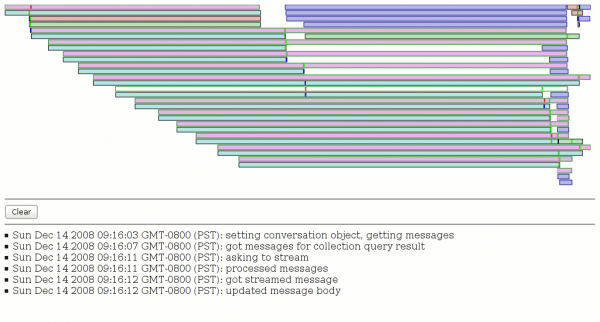
The screenshot above shows the result of issuing a gloda query with a constraint of one of my Inbox folders with a fulltext search for “gloda” *before any optimization*.  (We already have multiple optimizations in place!) The pinkish fill with greenish borders are our XBL result bindings, the blue-ish fill with more obviously blue borders are message streaming requests, and everything else (with a grey border and varying colors) is a gloda database query.  The white bar in the middle of the display is a XBL context I hovered over and clicked on.

The brighter colored vertical bars inside the rectangles are markers for state changes in the context.  The bright red markers are the most significant, they are state changes we logged before large blocks of code in the XBL that we presumed might be expensive.  And boy howdy, do they look expensive!  The first/top XBL bar (which ends up creating a whole bunch of other XBL bindings which result in lots of gloda queries) ties up the event thread for several seconds (from the red-bar to the end of the box).  The one I hovered over likewise ties things up from its red bar until the green bar several seconds later.

Now, I should point out that the heavy lifting of the database queries actually happens on a background thread, and without instrumentation of that mechanism, it’s hard for us to know when they are active or actually complete.  (We can only see the results when the main thread’s event queue is draining, and only remotely accurately when it’s not backlogged.)  But just from the visualization we can see that at the very least the first XBL dude is not being efficient with its queries.  The second expensive one (the hovered one) appears to chewing up processor cycles without much help from background processes.  (There is one recent gloda query, but we know it to be cheap.  The message stream requests may have some impact since mailnews’ IMAP code is multi-threaded, although they really only should be happening on the main thread (might not be, though!).  Since the query was against one folder, we know that there is no mailbox reparse happening.)

Er, so, I doubt anyone actually cares about what was inefficient, so I’ll stop now.  My point is mainly that even with the incredibly ugly visualization and what not, this tool is already quite useful.  It’s hard to tell that just from a screenshot, since a lot of the power is being able to click on a bar and see the log messages from that context.  There’s obviously a lot to do.  Probably one of the lower-hanging pieces of fruit is to display context causality and/or ownership.  Unfortunately this requires explicit state passing or use of a shared execution mechanism; the trick of using thread-locals that log4j gets to use for its nested diagnostic contexts is simply not an option for us.

Thunderbird and gloda go to meme-town

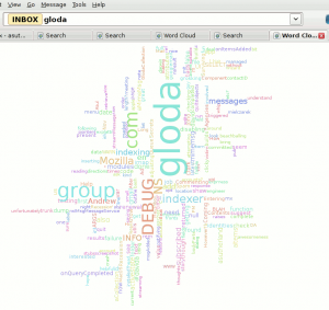
Sure, a word cloud of your blog posts is cool… but what if you could take any search of your e-mail, and turn that into a word cloud?  And then, if you click on one of those words, your search constraints would be revised to use the word you clicked on (and you’d get a useful search result, not another word cloud)?  And what if that layout algorithm were not as good as wordle?  The future is now, people!  (At least if you install like 5 extra extensions out of mercurial.)

The screenshot above is from Thunderbird trunk with a hacked exptoolbar extension (generalized, committed changes happening soon), visophyte-js, and the new glodacloud extension.  It is a proof-of-easy-gloda-extensions as suggested by David Ascher.

The layout algorithm is what we in the business of making up terminology call a recursive sub-optimal tic-tac-toe subdivision thinger.  We under-use a neat (and somewhat slow) hack to find the bounds of the words through use of canvas.mozPathText and canvas.isPointInPath to sample a grid to know where the text is and isn’t.  It’s under-used because all we use it for right now is to find the actual height above the baseline that the text stretches to (because metrics only gives us the width).  We are lazy and don’t check below the baseline at all, and totally squander our chance to be cool and put small words in the gaps in larger words.  But given the amount of time spent, I’m very happy.

Oh, and of course it uses JS and Canvas.

SVG in visotank

visotank-conversation-timeline-snippet.png

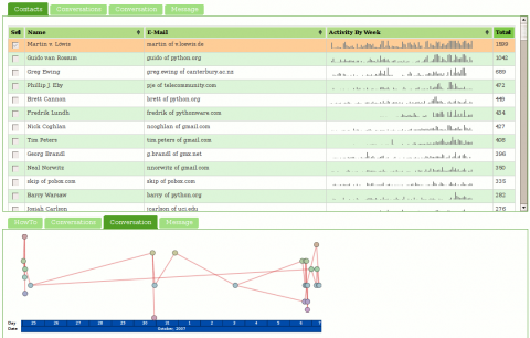
visotank now has AJAX-loaded SVG graphics. The hooks are there to actually do something when you click on stuff, but it doesn’t do anything. The visualization is ripped from my visterity plugin for posterity; it’s not supposed to be new or exciting. The fact that the SVG is loaded via AJAX is new (visterity didn’t have that) and exciting. Pretty much everything else is simply legwork relating to using application/xhtml+xml instead of txt/html and the ramifications of that, especially with AJAX.

I’ve updated what is running at http://clicky.visophyte.org:8080/, but it looks like my VPS has some issues, so I wouldn’t be surprised if it things hang or are very slow when not yet cached.  (Specifically, I think it has very serious IO issues, but its absurd amounts of memory available avoid that problem from impacting things too much.)  (Normal slowness like its refusal to pipeline requests and there being hundreds of images is not a VM problem.)  Also, the SVG stuff is unlikely to work on anything but Firefox 2; at least 3.0a8 gets angry for me on gutsy.

To see the SVG graphs, the steps are: 1) select at least one contact in the contacts list, 2) click on the ‘conversations’ tab in the bottom half, select a conversation (you can only select one), and 3) click on the ‘conversation’ tab in the bottom half.  I should note that you might want to wait for all of the sparkbars to load before proceeding to the next step…

visotank-screenshot-conversation-timeline.png

more (clicky!) mailing-list visualization a la visotank, couchdb

visotank-shot-1.png

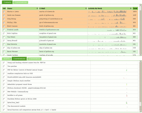
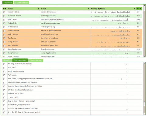
Visotank now allows you to select some authors of interest from a sortable list of contacts, and then show the conversations they were involved in. You get the previously shown sparkbars for the author’s activity. You also get sparkbars showing the conversation activity, with each author assigned a color and consistent stacking position in that sparkbar. Click on the screenshots for zoomed versions of the screenshots to see what I mean.

You can click on things yourself at http://clicky.visophyte.org:8080/. Please only go there if you’re okay with restarting your Firefox session (especially true if Firebug is on.) All tables/images are the real thing and not fetched on demand… which results in Firefox having to pull down a lot of images. Click on some rows in the contacts table to select them. Then, in the lower tab group, click on the “conversations” tab. This will then fetch all the conversations those selected users were involved in. The system will truncate more than 10 users, so don’t go crazy. The tabs are re-fetched on switch, so if you change your contact selections, in the lower tab group, click away to “HowTo”, then back to “Conversations”. The “Conversation” tab does nothing and is a big lie.  Great UI, I know.

visotank-shot-2.png

I think you will find that sparkbar visualizations of the conversation traffic with a weekly granularity are rather useless. I think a reasonable solution would be a ‘zoomed’ sparkbar with an indication of the actual uniform timeline scale included. Since the images currently show about 2 years of data, a thread that happened 1 year ago would be centered in the middle of the image, but with its actual horizontal scale being inconsistent with that position. Future work, as always.

I have used Pylon’s Beaker caching layer to attempt to make things reasonably responsive. While CouchDB view updates are sadly quite lengthy (many many minutes when dealing with 16k messages; python-dev from Jan 2006 through Nov 2007), that is thankfully a one-off sort of thing. (The data-set is immutable once imported and I don’t change schemas that often.) The main performance hit is that I can only issue one range of keys to query in a request, so if I am trying to snipe a subset of non-consecutive information, I have to issue multiple requests. (I don’t believe POSTed views can operate against views in the database…)

Regrettably, I think my conclusion about CouchDB is that it (or something like it) will be truly fantastic in the future, but it is not going to get there soon enough for anything that hopes to be ‘productized’ anytime soon. The next thing I want to look at is using a triple-store to model some of the email data schema; my efforts from the visterity hacking suggest it could be quite useful. Of course, even if triple stores work out, I suspect a more traditional SQL database will still be required for some things. Combined with a thin custom aggregation and caching layer, that could work out well.

Note: I should emphasize that my CouchDB schema could be more optimized, but part of the experiment is/was to see if the views saved me from having to jump through clever hoops.

Click your way to health. Oh, and email visualization.

The SVG renderer is in and brought with it much refactoring of the renderers. Cairo still works. But what does this buy us?

visterity-conv-threadarc.png

It buys us a working clickable demo of posterity with the visterity plugin. And a second one too. (You probably need to be using Firefox for it to work. And one with SVG support to boot. Firefox 2.0.0.6 on Ubuntu gutsy definitely works at the minimum.)

Oh, I should probably clarify “working”. I used Firefox’s “Save Page As…” functionality so you get the same experience I got when browsing that page. But if you think you can click on any of the other links and read my e-mail, you will be sadly disappointed.

visterity-conv-timeline.png

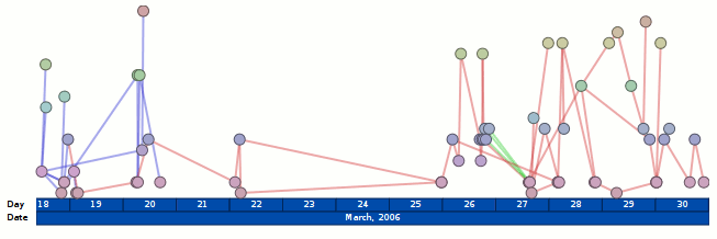
For the unadventurous, I will tell you what you could do if you clicked on either of those images:

  • The circular nodes have title attributes with the name of the author of the email, so if you hover you get a tooltip with their name. (Not fancified, but it could be.)
  • Clicking on the circular nodes expands the e-mail in the conversation and smooth-scrolls you to that e-mail.

It does not get you any form of connection in the opposite direction. So as you move your mouse over the message headers, the messages in the visualization do not light up. However, I probably wouldn’t be bringing that up if I didn’t plan to address it. I mean, who would do that and make themselves look bad? Not me, certainly. I’m cagey.

Oh, and please keep in mind that these visualizations are not intended to be polished in any way shape or form. In fact, it took all of 5 minutes to throw the time-line vis together, which would explain why the use of color is rather redundant. (It would be okay if I had an animated transition between that visualization and another visualization. But I don’t. It turns out I’m okay with making myself look bad.)