Visualizing asynchronous JavaScript promises (Q-style Promises/B)

Asynchronous JS can be unwieldy and confusing.  Specifically, callbacks can be unwieldy, especially when you introduce error handling and start chaining asynchronous operations.  So, people frequently turn to something like Python’s Twisted‘s deferreds which provide for explicit error handling and the ability for ‘callbacks’ to return yet another asynchronous operation.

In CommonJS-land, there are proposals for deferred-ish promises.  In a dangerously concise nutshell, these are:

  • Promises/A: promises have a then(callback, errback) method.
  • Promises/B: the promises module has a when(value, callback, errback) helper function.

I am in the Promises/B camp because the when construct lets you not care whether value is actually a promise or not both now and in the future.  The bad news about Promises/B is that:

  • It is currently not duck typable (but there is a mailing list proposal to support unification that I am all for) and so really only works if you have exactly one promises module in your application.
  • The implementation will make your brain implode-then-explode because it is architected for safety and to support transparent remoting.

To elaborate on the (elegant) complexity, it uses a message-passing idiom where you send your “when” request to the promise which is then responsible for actually executing your callback or error back.  So if value is actually a value, it just invokes your callback on the value.  If value was a promise, it queues your callback until the promise is resolved.  If value was a rejection, it invokes your rejection handler.  When a callback returns a new promise, any “when”s that were targeted at the associated promise end up retargeted to the newly returned promise.  The bad debugging news is that almost every message-transmission step is forward()ed into a subsequent turn of the event loop which results in debuggers losing a lot of context.  (Although anything that maintains linkages between the code that created a timer and the fired timer event or other causal chaining at least has a fighting chance.)
In short, promises make things more manageable, but they don’t really make things less confusing, at least not without a little help.  Some time ago I created a modified version of Kris Kowal‘s Q library implementation that:

  • Allows you to describe what a promise actually represents using human words.
  • Tracks relationships between promises (or allows you to describe them) so that you can know all of the promises that a given promise depends/depended on.
  • Completely abandons the security/safety stuff that kept promises isolated.

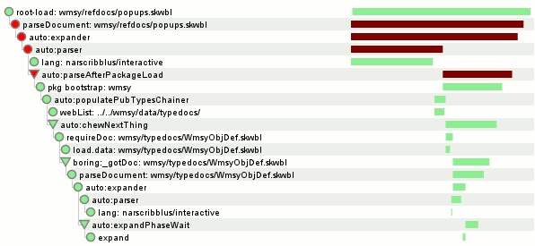
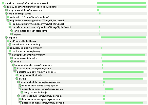
The end goal was to support debugging/understanding of code that uses promises by converting that data into something usable like a visualization.  I’ve done this now, applying it to jstut’s (soon-to-be-formerly narscribblus’) load process to help understand what work is actually being done.  If you are somehow using jstut trunk, you can invoke document.jstutVisualizeDocLoad(/* show boring? */ false) from your JS console and see such a graph in all its majesty for your currently loaded document.

The first screenshot (show boring = true) is of a case where a parse failure of the root document occurred and we display a friendly parse error screen.  The second screenshot (show boring = false) is the top bit of the successful presentation of the same document where I have not arbitrarily deleted a syntactically important line.

A basic description of the visualization:

  • It’s a hierarchical protovis indented tree.  The children of a node are the promises it depended on.  A promise that depended in parallel(-ish) on multiple promises will have multiple children.  The special case is that if we had a “when” W depending on promise X, and X was resolved with promise Y, then W gets retargeted to Y.  This is represented in the visualization as W having children X and Y, but with Y having a triangle icon instead of a circle in order to differentiate from W having depended on X and Y in parallel from the get-go.
  • The poor man’s timeline on the right-hand side shows the time-span between when the promise was created and when it was resolved.  It is not showing how long the callback function took to run, although it will fall strictly within the shown time-span.  Time-bar widths are lower bounded at 1 pixel, so the duration of something 1-pixel wide is not representative of anything other than position.
  • Nodes are green if they were resolved, yellow if they were never resolved, red if they were rejected.  Nodes are gray if the node and its dependencies were already shown elsewhere in the graph; dependencies are not shown in such a case.  This reduces redundancy in the visualization while still expressing actual dependencies.
  • Timelines are green if the promise was resolved, maroon if it was never resolved or rejected.  If the timeline is never resolved, it goes all the way to the right edge.
  • Boring nodes are elided when so configured; their interesting children spliced in in their place.  A node is boring if its “what” description starts with “auto:” or “boring:”.  The when() logic automatically annotates an “auto:functionName” if the callback function has a name.

You can find pwomise.js and pwomise-vis.js in the narscribblus/jstut repo.  It’s called pwomise not to be adorable but rather to make it clear that it’s not promise.js.  I have added various comments to pwomise.js that may aid in understanding.  Sometime soon I will update my demo setup on clicky.visophyte.org so that all can partake.

wmsy’s debug UI’s decision tree visualizer

wmsy, the Widget Manifesting SYstem, figures out what widget to display by having widgets specify the constraints for situations in which they are applicable.  (Yes, this is an outgrowth of an earlier life involving multiple dispatch.)  Code that wants to bind an object into a widget provides the static, unchanging context/constraints at definition time and then presents the actual object to be bound at (surprise!) widget bind time.

This is realized by building a decision tree of sorts out of our pool of constraints.  Logical inconsistencies are “avoided” by optionally specifying an explicit prioritization of attributes to split on, taking us much closer to (rather constrained) multiple dispatch.  For efficiency, all those static constraints are used to perform partial traversal of the decision tree ahead of time so that the determination of which widget factory to use at bind time ideally only needs to evaluate the things that can actually vary.

When I conceived of this strategy, I asserted to myself that the complexity of understanding what goes wrong could be mitigated by providing a visualization / exploration tool for the built decision tree along with other Debug UI features.  In software development this usually jinxes things, but I’m happy to say not in this specific case.

In any event, wmsy’s debug UI now has its first feature.  A visualization of the current widget factory decision tree.  Grey nodes are branch nodes, yellow nodes are check nodes (no branching, just verifying that all constraints that were not already checked by branch nodes are correct), and green nodes are result nodes.  Nodes stroked in purple have a partial traversal pointing at them and the stroke width is a function of the number of such partials.  The highly dashed labels for the (green) result nodes are the fully namespaced widget names.  Future work will be to cause clicking on them to bring up details on the widget and/or jump to the widget source in-document using skywriter or in an external text editor (via extension).

The Debug UI can be accessed in any document using wmsy by bringing up your debugger console and typing “document.wmsyDebugUI()”.  This triggers a dynamic load of the UI code (hooray RequireJS!) which then does its thing.  Major props to the protovis visualization toolkit and its built-in partition layout that made creating the graph quite easy.

fighting non-deterministic xpcshell unit tests through causality tracking with systemtap; step 1

It’s a story as old as time itself.  You write a unit test.  It works for you.  But the evil spirits in the tinderboxes cause the test to fail.  The trick is knowing that evil spirits are a lot like genies.  When you ask for a wish, genies will try and screw you over by choosing ridiculous values wherever you forgot to constrain things.  For example, I got my dream job, but now I live in Canada.  The tinderbox evil spirits do the same thing, but usually by causing pathological thread scheduling.

This happened to me the other day and a number of our other tests are running slower than they should, so I decided it was time for another round of incremental amortized tool-building.  Building on my previous systemtap applied to mozilla adventures by porting things to the new JS representations in mozilla-2.0 and adding some new trace events I can now generate traces that:

  • Know when the event loop is processing an event.  Because we reconstruct a nested tree from our trace information and we have a number of other probes, we can also attribute the event to higher-level concepts like timer callbacks.
  • Know when a new runnable is scheduled for execution on a thread or a new timer firing is scheduled, etc.  To help understand why this happened we emit a JS backtrace at that point.  (We could also get a native backtrace cheaply, or even a unified backtrace with some legwork.)
  • Know when high-level events occur during the execution of the unit test.  We hook the dump() implementations in the relevant contexts (xpcshell, JS components/modules, sandboxes) and then we can listen in on all the juicy secrets the test framework shouts into the wind.  What is notable about this choice of probe point is that it:
    • is low frequency, at least if you are reasonably sane about your output.
    • provides a useful correlation between what it is going on under the hood with something that makes sense to the developer.
    • does not cause the JS engine to need to avoid tracing or start logging everything that ever happens.

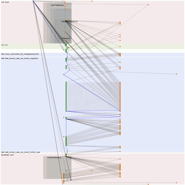
Because we know when the runnables are created (including what runnable they live inside of) and when they run, we are able to build what I call a causality graph because it sounds cool.  Right now this takes the form of a hierarchical graph.  Branches form when a runnable (or the top-level) schedules more than one runnable during the execution of a single runnable.  The dream is to semi-automatically (heuristics / human annotations may be required) transform the hierarchical graph into one that merges these branches back into a single branch when appropriate.  Collapsing linear runs into a single graph node is also desired, but easy.  Such fanciness may not actually be required to fix test non-determinism, of course.

The protovis-based visualization above has the following exciting bullet points describing it:

  • Time flows vertically downwards.  Time in this case is defined by a globally sequential counter incremented for each trace event.  Time used to be the number of nanoseconds since the start of the run, but there seemed to somehow be clock skew between my various processor cores that live in a single chip.
  • Horizontally, threads are spaced out and within those threads the type of events are spaced out.
    • The weird nested alpha grey levels convey nesting of JS_ExecuteScript calls which indicates both xpcshell file loads and JS component/module top-level executions as a result of initial import.  If there is enough vertical space, labels are shown, otherwise they are collapsed.
  • Those sweet horizontal bands convey the various phases of operation and have helpful labels.
  • The nodes are either events caused by top-level runnable being executed by the event loop or important events that merit the creation of synthetic nodes in the causal graph.  For example, we promote the execution of a JS file to its own link so we can more clearly see when a file caused something to happen.  Likewise, we generate new links when analysis of dump() output tells us a test started or stopped.
  • The blue edges are expressing the primary causal chain as determined by the dump() analysis logic.  If you are telling us a test started/ended, it only follows that you are on the primary causal chain.
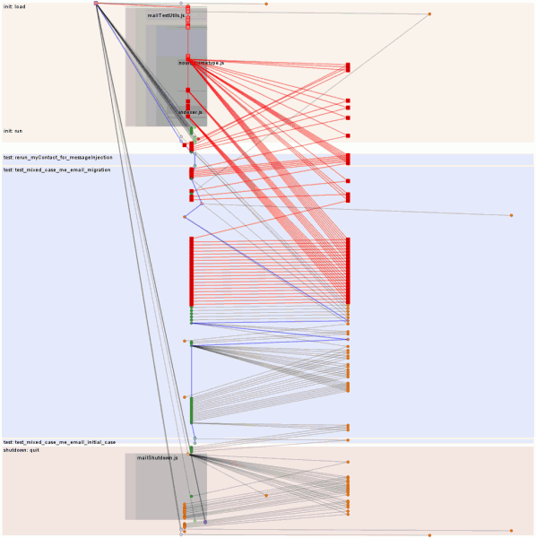
  • If you were viewing it in a web browser, you could click on the nodes and it would console.log them and then you could see what is actually happening in there.  If you hovered over nodes they would also highlight their ancestors and descendents in various loud shades of red.

  • The specific execution being visualized had a lot of asynchronous mozStorage stuff going on.  (The right busy thread is the asynchronous thread for the database.)  The second image has the main init chain hovered, resulting in all the async fallout from the initialization process being highlighted in red.  At first glance it’s rather concerning that the initialization process is still going on inside the first real test.  Thanks to the strict ordering of event queues, we can see that everything that happens on the primary causal chain after it hops over to the async thread and back is safe because of that ordering.  The question is whether bad things could happen prior to that joining.  The answer?  In another blog post, I fear.
    • Or “probably”, given that the test has a known potential intermittent failure.  (The test is in dangerous waters because it is re-triggering synchronous database code that normally is only invoked during the startup phase before references are available to the code and before any asynchronous dispatches occur.  All the other tests in the directory are able to play by the rules and so all of their logic should be well-ordered, although we might still expect the initialization logic to likewise complete in what is technically a test phase.  Since the goal is just to make tests deterministic (as long as we do not sacrifice realism), the simplest solution may just be to force the init phase to complete before allowing the tests to start.  The gloda support logic already has an unused hook capable of accomplishing this that I may have forgotten to hook up…

Repo is my usual systemtapping repo.  Things you might type if you wanted to use the tools follow:

  • make SOLO_FILE=test_name.js EXTRA_TEST_ARGS=”–debugger /path/to/tb-test-help/systemtap/chewchewwoowoo.py –debugger-args ‘/path/to/tb-test-help/systemtap/mozperfish/mozperfish.stp –‘” check-one
  • python /path/to/tb-test-help/chewchewwoowoo.py –re-run=/tmp/chewtap-##### mozperfish/mozperfish.stp /path/to/mozilla/dist/bin/xpcshell

The two major gotchas to be aware of are that you need to: a) make your xpcshell build with jemalloc since I left some jemalloc specific memory probes in there, and b) you may need to run the first command several times because systemtap has some seriously non-deterministic dwarf logic going on right now where it claims that it doesn’t believe that certain types are actually unions/structs/whatnot.

ediosk: an emacs buffer switcher for the rest of us

Emacs users and would-be emacs users, are you tired of those emacs developers in their ivory towers not supporting buffer switching via touch-screen on a computer that’s not running emacs and using modern web browser technology instead of disproven parentheses-based technology?  Be tired no more!*

Thanks to Christopher Wellons and Chunye Wang’s work on emacs-httpd it is a simple matter to expose a JSON representation of the current set of frames/windows/buffers in your emacs session and provide non-REST manipulation mechanisms via a webserver implemented in elisp.

Once you have exposed an API, it is a subsequent simple matter to implement some JavaScript that understands these things and presents a nice UI.  In this case, we have used the Jetpack SDK, wmsy (the Widget Manifesting SYstem, an widgeting framework I am developing), and protovis.

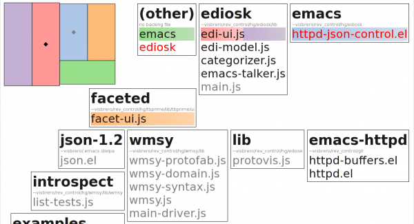
The screenshot basically captures the entire feature-set:

  • A protovis-based visualization that shows the location of all of the emacs “windows” (the things that show buffers).  Emacs reports to us the pixel-space coordinates/sizes of the “frames” (GUI windows) and “windows”, so this all comes magically for free.  The downside is your emacs windows need to be in the same coordinate space, so use of multiple X displays without use of DMX will likely lead to weird overlap.
    • The selected “window” in each “frame” gets a diamond.  The active frame’s diamond gets to be black instead of gray.
    • Clicking on a “window” focuses/raises the containing “frame” and selects the “window”.
  • Buffers grouped by the directory they live in (if they have a backing file).
    • Buffers visible in windows have their background composed of the colors for all the windows they are in.
    • Buffers that are modified have their text colored red.
    • Buffers that have not been freshly displayed in a window recently have their text colored grey.
    • Clicking on a buffer displays it in what the UI believes to be the currently selected frame’s currently selected window.

* This entire paragraph is a joke**; no flaming necessary.

** ediosk is not a joke though.  I seriously have a touch-screen monitor hooked up to my windows build machine to the right of my two monitors hooked up to my linux/primary development machine.  While c-x b (icicle mode) will still be my dominant buffer switching mechanism, I expect ediosk to prove useful/amusing for cases where the number of buffers greatly exceeds my mental stack, when I am switching contexts, or when I am working in multiple branches simultaneously.

who is starring Firefox tinderbox failures and how long before they do?

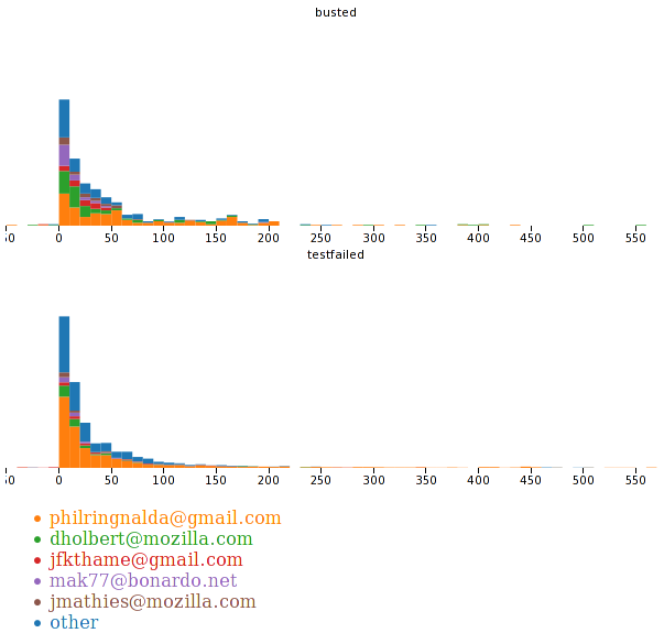
Using the accumulated data in my CouchDB instance about the Firefox tinderbox and Protovis, we can see how long it takes before a testfailed/busted build gets starred and who stars it.  The horizontal axis is the number of minutes between the end of the build and when it gets starred.  If someone stars the build before it finishes running, a negative number is possible.  The vertical axis is a double-height histogram, which is to say the scaling is percentage based and don’t try to infer absolute numbers.  Colors tell us who did the starring.

The winner is philor.  I knew that going in, I just wanted to see it.  Thank you for reducing the pain of dealing with the tree!

thunderbird, gloda, exptoolbar, protovis, paninaro, oh oh oh

exptoolbar-protovis-gloda-256

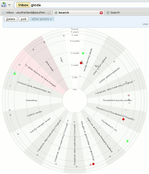
Thunderbird.  With the global database, gloda.  Using the exptoolbar extension.  Using the protovis javascript visualization library.  For reals!  Not a prank!  Just grab the most recent XPI or grab the repo.  And be using a nightly (beta 2 might work?)

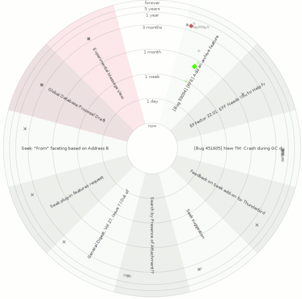
What you are looking at:

  • The exptoolbar search results page, augmented with a visualization.
  • Each conversation with search results gets its own wedge.
    • Wedges can be distinguished because of the alternating background colors.
    • Conversations that you sent a message to will have a red shading to them.  The examples may be somewhat misleading because the account where a lot of my sent mail ends up is not part of the profile used to create the screenshots.
  • Each message is placed in its conversation wedge…
    • The radius is based on the ‘age’ of the message using a log-ish scale.  Interpolation is actually linear at each level (one day, one week, one month, three months, one year, 5 years, ‘forever’.)
    • The angular placement within the wedge is based on the author of the message.  Across all wedges the placement is the same.  This helps ‘bursty’ parts of conversations (which are extremely likely) be made more obvious, while also helping to provide some understanding of conversation dynamics.
  • Message shapes are determined by whether the message is starred (diamond), sent by a ‘popular’ contact (circle), or an unpopular one (cross).  The use of popularity is a temporary measure because current gloda in trunk does not cache address-book lookups, and they are expensive.  Once the new gloda search code lands with those changes, we can rely on the existence of an address book entry.  (Starring a contact using the new message reader adds them to your address book.)
  • Message opacity is determined by whether the message is a ‘hit’ or not.  All messages in a conversation are eventually retrieved, though initially we only have the hits.
  • Message color is determined by applied tags (using the closest tango color for the first tag), or whether the message is starred (closest tango color to yellow, where I think I had removed the yellow tango colors for some unknown reason, so we get green I guess).  It’s grey if the message has no tag or star.
  • The subject of the conversation is displayed in the wedge.

exptoolbar-protovis-seek-thunderbird-256

Things that are happy:

Things that are sad (aka caveats):

  • It would probably be better if the visualization was not radar-inspired.  Besides the perceptual reasons, the subjects are harder to read than they would be in an equivalent linear-styled visualization.
  • The visualization is not interactive.  protovis officially has no interaction support yet, but if you look in the (only available minified?) source, it’s almost there.  It might be entirely there, but it didn’t work for me immediately after a quick reading of the (indented) source.
  • There is some low probability failure that occurs during the visualization updating as gloda backfills the message collections.  If it happens on the last update, you can end up with a half-built visualization.  Re-running the search will generally resolve the issue.
  • The visualization does a pretty solid job of taking up all the screen real estate and has no way to be disabled, so you have to scroll past it every time.

Future work:

  • Interactivity.
  • Perhaps showing the gravatars for the people involved in a conversation at the outer rim of the wedge, positioning them based on the author positioning we determined.
  • Perhaps lose the radar motif.
  • Your thoughts / patches!