more (clicky!) mailing-list visualization a la visotank, couchdb

visotank-shot-1.png

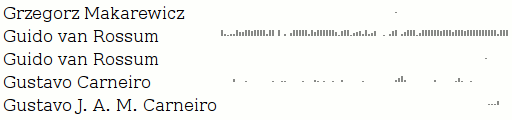
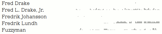
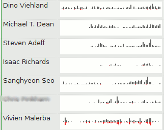
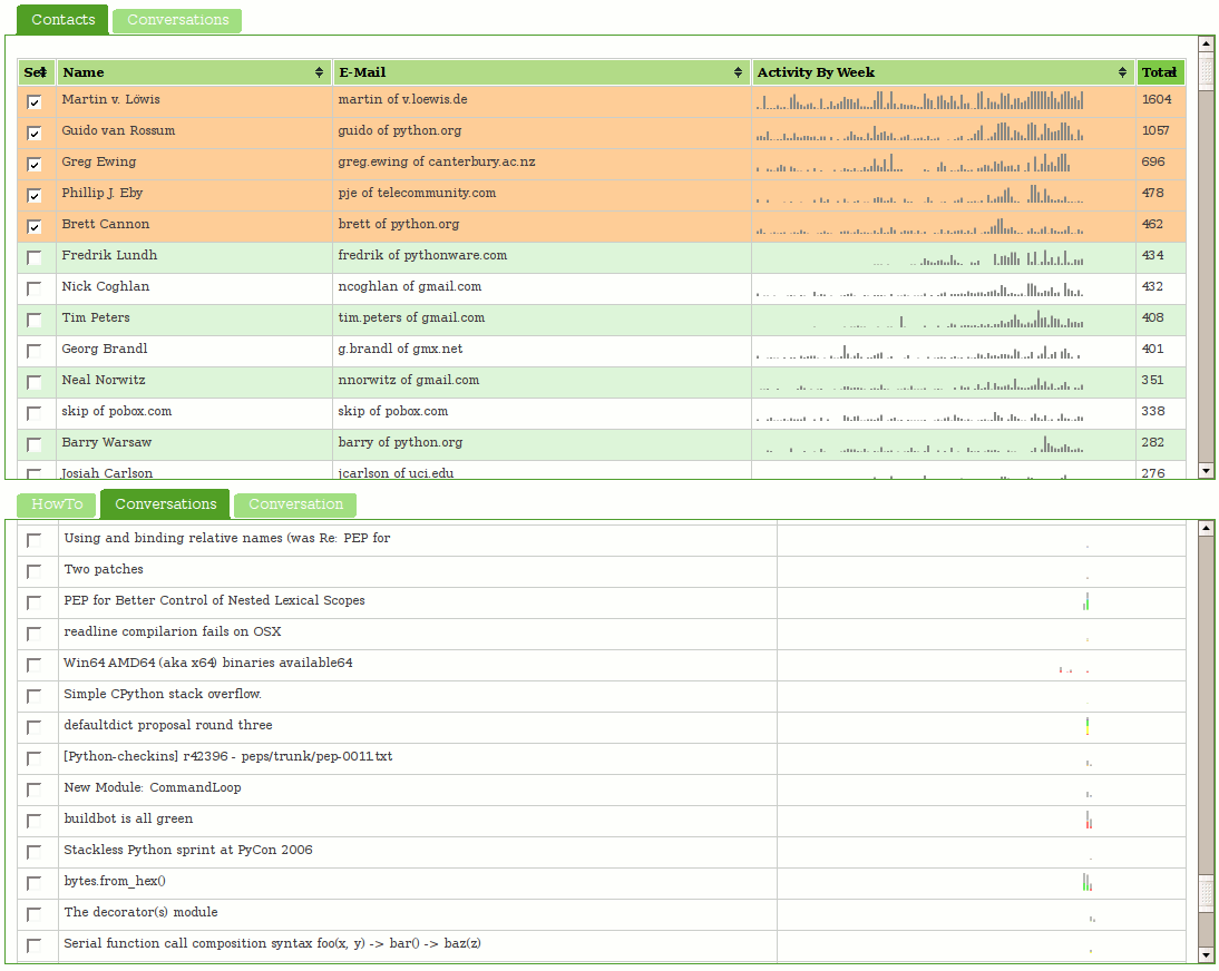
Visotank now allows you to select some authors of interest from a sortable list of contacts, and then show the conversations they were involved in. You get the previously shown sparkbars for the author’s activity. You also get sparkbars showing the conversation activity, with each author assigned a color and consistent stacking position in that sparkbar. Click on the screenshots for zoomed versions of the screenshots to see what I mean.

You can click on things yourself at http://clicky.visophyte.org:8080/. Please only go there if you’re okay with restarting your Firefox session (especially true if Firebug is on.) All tables/images are the real thing and not fetched on demand… which results in Firefox having to pull down a lot of images. Click on some rows in the contacts table to select them. Then, in the lower tab group, click on the “conversations” tab. This will then fetch all the conversations those selected users were involved in. The system will truncate more than 10 users, so don’t go crazy. The tabs are re-fetched on switch, so if you change your contact selections, in the lower tab group, click away to “HowTo”, then back to “Conversations”. The “Conversation” tab does nothing and is a big lie.  Great UI, I know.

visotank-shot-2.png

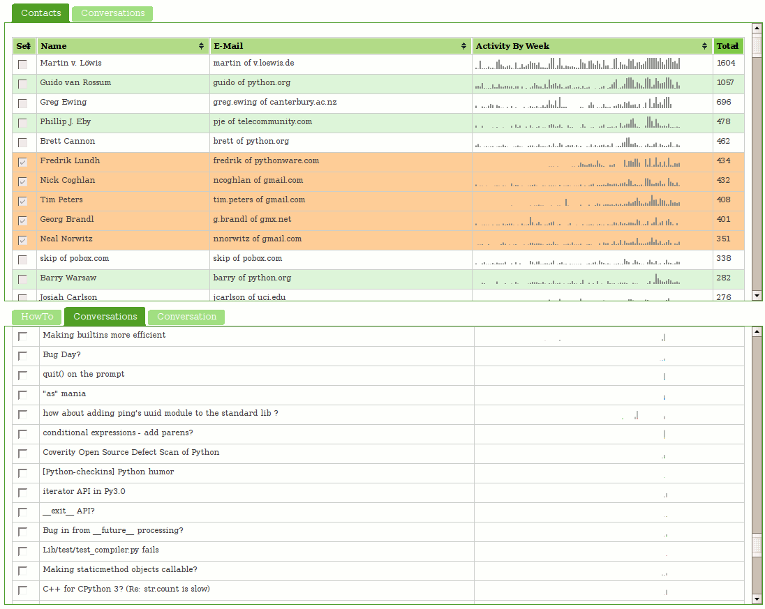
I think you will find that sparkbar visualizations of the conversation traffic with a weekly granularity are rather useless. I think a reasonable solution would be a ‘zoomed’ sparkbar with an indication of the actual uniform timeline scale included. Since the images currently show about 2 years of data, a thread that happened 1 year ago would be centered in the middle of the image, but with its actual horizontal scale being inconsistent with that position. Future work, as always.

I have used Pylon’s Beaker caching layer to attempt to make things reasonably responsive. While CouchDB view updates are sadly quite lengthy (many many minutes when dealing with 16k messages; python-dev from Jan 2006 through Nov 2007), that is thankfully a one-off sort of thing. (The data-set is immutable once imported and I don’t change schemas that often.) The main performance hit is that I can only issue one range of keys to query in a request, so if I am trying to snipe a subset of non-consecutive information, I have to issue multiple requests. (I don’t believe POSTed views can operate against views in the database…)

Regrettably, I think my conclusion about CouchDB is that it (or something like it) will be truly fantastic in the future, but it is not going to get there soon enough for anything that hopes to be ‘productized’ anytime soon. The next thing I want to look at is using a triple-store to model some of the email data schema; my efforts from the visterity hacking suggest it could be quite useful. Of course, even if triple stores work out, I suspect a more traditional SQL database will still be required for some things. Combined with a thin custom aggregation and caching layer, that could work out well.

Note: I should emphasize that my CouchDB schema could be more optimized, but part of the experiment is/was to see if the views saved me from having to jump through clever hoops.

first steps to interactive fun using CouchDB

visotank-first-python-dev-sparkbars1.png

First, let me say that Pylons with its Paste magic is delightful; lots of nice round edges helped me get something simple up and running in no time, and using genshi to boot.

The new tool, visotank, is ingesting the python-dev mailman archives (as previously visualized) and putting them into CouchDB. The near-term goal is to allow for interactive exploration/visualization of the archives. The current result, as pictured, is simply sparkline barcharts of people’s posting history. Left-to-right, present-to-past, weekly, one (vertical) pixel per message, truncating at the image height (12 pixels).

Although the input processing thus far is specific to mailing list archives, the couchdb schema in use is for generic e-mail traffic. The messages are even coerced into rfc2822 format for ‘raw’ storage.

The ability to use ‘map’ multiple times in couchdb views to spread information is delightful. What I really would like is more reduce functionality or, more specifically, just accumulate. The sparkbars get their data from statistics with keys [contact id, timestamp of time period] and value 1, one per message. I would love for couchdb to provide a way to aggregate all those values with identical keys into a single row with the sum as the value. I’ll look into this and the view implementation before writing any more on the subject, but if someone out there already knows a way to do this, please let me know.

visotank-first-python-dev-sparkbars2.png

contacts, tallies, sparklines, but no clever title.

sparkbar-contacts-others.png

I have hacked up my local posterity bzr branch to process messages to extract contacts (and mailing lists). These contacts result in synthetic tags (to, from, and cc) applied to each message. My changes also include maintaining per-time interval (day, ISO week, month, year, ever) sparse counts for each tag.

Visophyte (bzr trunk) has been augmented to create bar-graph style sparklines (as coined/created/etc. by Tufte). Visterity, my happy-go-visualizy posterity plugin (also in the visophyte repository), consumes the new posterity contact statistics and produces what you see above.

sparkbar-contacts-me.png

If you’re not sure what you’re seeing, each bar is a week. The grey-colored bars ‘above’ the invisible line are messages from that contact (to anyone). The red-colored bars ‘below’ the line are messages to that contact (from anyone), while the lighter-red-colored-bars below the line are messages cc’ed or bcc’ed to that contact (from anyone).

It is important to reiterate that, at this time, these from/to/cc relations have nothing to do with the person whose email repository it is (mine, in this case). If messages are red, that doesn’t mean I sent them the message; it just means someone sent them a message and it somehow passed through my account. Of course, when viewing a list of contacts, I’m only really going to care about that person’s interactions with me. So that is a must-have and up on the near-term to-do list. The current set of tags are really most useful in attempting to visualize messages sent through a mailing list or other broadcast medium, which is also of great interest to me.

I should probably also note that when writing the list-handling logic here, I forgot to have the code generate an implied ‘to’ when the person replied only to the list but the author of the previous message could be presumed to be the intended recipient of the message. Which explains why so many of the people in the example image up there do not end up receiving many messages. I would have fixed this, but re-processing my full downloaded gmail corpus of something like 68,000 messages takes a while.

Also, the blurred out guy in the example doesn’t need to be blurred out. I ended up eliding a useless column that I had decided to blur for no clear reason, but in my sleep-desiring state I also screwed up and blurred a column that really didn’t need to be blurred. (All the people shown have posted to public mailing lists, so their e-mail addresses are already out their, and their names aren’t exactly going to get them more spam. And OCR would be required anyways, as the sparklines are images rather than inline-SVG for caching reasons.)

UPDATE: Uh, as I quickly re-read the post and looked at the sparkline, I realized I completely flipped (both color-and above/below) the sparkline from what I had originally intended.  Thankfully my original intent didn’t make all that much sense either, at least color-wise, so I think I can sleep easy without correcting that.  Better color suggestions,etc. are appreciated.