first steps to interactive fun using CouchDB

visotank-first-python-dev-sparkbars1.png

First, let me say that Pylons with its Paste magic is delightful; lots of nice round edges helped me get something simple up and running in no time, and using genshi to boot.

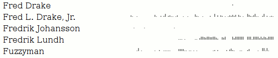
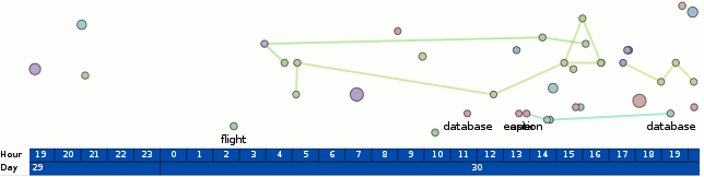
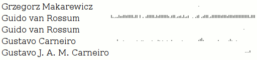
The new tool, visotank, is ingesting the python-dev mailman archives (as previously visualized) and putting them into CouchDB. The near-term goal is to allow for interactive exploration/visualization of the archives. The current result, as pictured, is simply sparkline barcharts of people’s posting history. Left-to-right, present-to-past, weekly, one (vertical) pixel per message, truncating at the image height (12 pixels).

Although the input processing thus far is specific to mailing list archives, the couchdb schema in use is for generic e-mail traffic. The messages are even coerced into rfc2822 format for ‘raw’ storage.

The ability to use ‘map’ multiple times in couchdb views to spread information is delightful. What I really would like is more reduce functionality or, more specifically, just accumulate. The sparkbars get their data from statistics with keys [contact id, timestamp of time period] and value 1, one per message. I would love for couchdb to provide a way to aggregate all those values with identical keys into a single row with the sum as the value. I’ll look into this and the view implementation before writing any more on the subject, but if someone out there already knows a way to do this, please let me know.

visotank-first-python-dev-sparkbars2.png

radial (radar) email vis, with care factors

radial-care-factor-vis.png

It’s a radial e-mail visualization intended to be the basis for a “situational awareness” overview of your e-mail. I’ve added the beginnings of a ‘care factor’* (“do I care about this person/message?”) concept to messages and contacts, which is used to assist in focusing your attention only to messages/people you care about. Right now, the care factor is simply whether you have ever sent the contact/author of a message an e-mail directly (to = 1.0), indirectly (cc = 0.5), or not at all (nada/ninguno=0.0). That can obviously be expanded upon in many directions; involvement of people you care about in message threads (with that person), intensity of your communication with that person, explicit interest-levels via tags, social network propagation (Google’s OpenSocial) without the person previously having existed in your e-mail corpus, etc.

Some more details about the visualization:

  • Things close to the center happened more recently. Things further away happened in the past. This seems like the most reasonable ‘radar’ metaphor for e-mail. If we were dealing with to-do items with due dates, then it would make sense that they are moving inward. However, the reality of e-mail is that if you don’t deal with them soon, they ‘fall off your radar’. My first thought to fuse the two would be to have messages associated with to-do tasks stick out quite obviously, latch once they hit the ‘edge’, and generally grow more ominous and threatening as time goes by. Of course, it’s probably not helpful to make people’s to-do lists seem like something they can’t escape…
    • The central grey circle is a void to ensure that angle is still meaningful even when the time is at a minimum; otherwise things would stack up and be generally extra confusing.
  • The angle is mapped to a single author/contact. This is currently random, but my intent is to allow clustering of contacts and quasi-persistent angular locations. So messages from your family might tend to come from the North, your friends the East, mailing lists the West, and ads from the South. (Let’s assume you get no spam.)  Actual geographic relationships would be a neat trick, but practically foolish.
  • Messages with a low care-factor are made more subtle by having reduced opacities. I forgot to make the edges linking messages to their parent more subtle…
  • Contacts with a high care-factor get their (anonymized) name in a strong color and their slice of the pie highlighted with a color. Contacts with a low care-factor have their names displayed more subtly and just get a grey hue for their outer-ring marker/label. The intent with the slice coloring is mainly to be intensity based with only one or two hues in use; I think using more colors will quickly overwhelm the display.
  • Time markers are in use, but may not be obvious. The blue ring labeled ’30’ (along the x-axis) indicates that’s October 30th. The inner white ring is November 1st, but I’m not clear on why it wasn’t labeled as such (aka bug). The time marker logic needs to be refactored to provide more usable single “ruler” labeling (the timeline use currently is biased towards 2 rulers, which is where the month and year went). See the test program output from below for a better example of time display, although the month/year are still AWOL in another ruler.

radial-blah-blah-blah.png

And there’s the test program. Note that edges connect a message to its parent, and currently always flow clock-wise for time. So the innermost red message is the parent of the inner-most green message. I’m a bit conflicted about this; the consistency is nice, but the relationship would probably be more obvious if we took the shortest path. Also, since e-mail reply relationships are causal, it’s not like there’s any doubt which message was a reply to the other.

* I say ‘care factor’ because I did this work on a red-eye flight where my tiredness overwhelmed my natural defense against puns, and since Halloween was recent, and there was that tv show called ‘scare factor’, etc. etc.

some email analysis for some email visualization

An attempt to apply hidden topic markov models to e-mail to perform topic analysis has morphed into simply deriving (aggregate) word-frequency information for TF-IDF purposes. The e-mails I attempted to analyze from my corpus appear to simply have been too short and wanting for quantity to pull a rabbit out of the (algorithmic) hat. (I only threw e-mails amongst my ‘village’-tagged contacts, as previously visualized.)

poor-mans-themail-but-hey-first-pass.png

Luckily, there’s a lot you can do with such information. (And in fact, I ended up using the word frequency info to attempt to normalize out e-mail signatures since I didn’t feel like doing the right thing for signatures at the time.) The bad news is I am not doing anything polished or good with the info yet.

The above is a quick proof-of-it-kinda-works which apes Themail‘s monthly words concept. If you’re not familiar with Themail, click the link, read the PDF. It is/was a covet-able research prototype that let ‘you’ explore your history, e-mail-wise. It’s not available for download, hence ‘was’, and was only available to participating subjects, hence ‘you’. The good news is that, as always, you can download my hacked-up version of posterity and my visterity plugin. I wouldn’t try using it if I were you, though.

conv-index-with-terms-as-databased.png

The second screenshot is my Inbox with the ‘best’ scoring keyword (using traditional tf-idf, not the themail revised metrics) displayed for each message where the histogram information is available. Since I only ran the processing code against a set of my contacts, only messages involving those people have a keyword displayed.

I’m going to try and pull in my old pre-gmail email into the system to try and get some more (personal) data to work with. Or, people who are not spammers, e-mail me so I have some more correspondence. sombrero@alum.mit.edu. Conversations about why the Pet Shop Boys are the greatest band ever are preferable. Eventually I’ll try and pull in my gaim/pidgin logs which would be more useful, but that’s arguably a different data case with special needs, and I’m already spread pretty thin focus-wise as is, so that will have to wait.