visualizing contact relationships

anonymized-contacts-village.png

First, there’s bad news on the shiny front. Although I made the SVG renderer capable of producing the gel-like circles, Mozilla’s SVG support currently lacks the features to do it as implemented. (Curse your full-featured-ness, Eye of GNOME!) Hopefully someday soon, it will support the synthetic BackgroundImage filter input (bug).

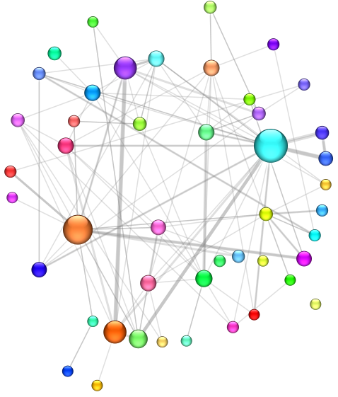
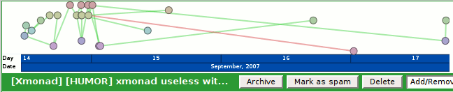
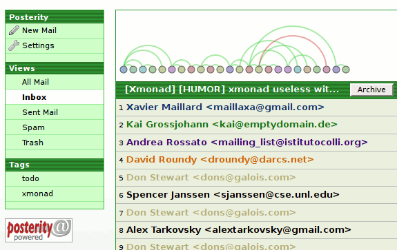
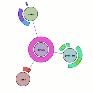
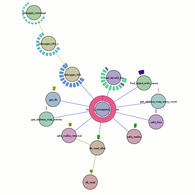
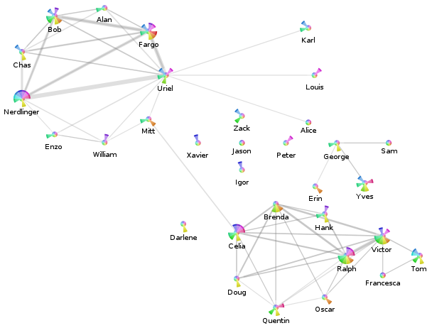
Our show-and-tell for the end of this weekend is a screenshot of the anonymized visualization from my Posterity contacts page for my ‘village’ tag (using my visterity plugin):

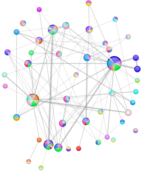
  • The nodes represent the contacts tagged with ‘village’.
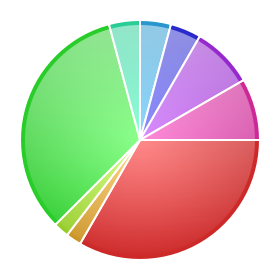
    • The pie-slices represent the activity of the contact overall for the last year:
      • Each pie slice corresponds to a month. The current month is the slice just below due east, and we go back in time as we rotate around clockwise. The oldest month is just above due east.
      • The radius is a clamped linear scaling (over all nodes displayed and all months) of the number of messages sent by this person to anyone (including me).
      • The color is just a consistent hue-variation designed to look pretty. I was actually planning to use a single color whose saturation was at max for the current month and decayed to black for the oldest month. That arguably would reduce confusion as to what pie slice means what.
    • The labels are anonymized. There’s a mapper in there that maps people’s actual names (eventually nicknames) to what you see.
  • The edges represent e-mail messages sent from the displayed contacts to the other displayed contacts. Since I did not add my contact to this label group, this means I have no impact on things.
    • The edge widths are a linear scaling of the number of messages sent from the one contact to the other. Because the edges are actually directed, there may be two edges between two nodes which will overlap. Because the edges are not fully opaque, you should be able to figure out if the communication is at least symmetric or asymmetric.

Interestingly, you can see that the two major clusters of contacts are linked by ‘Mitt’ and ‘Celia’.

mailman-flow-whoknows.png

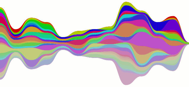
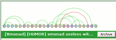
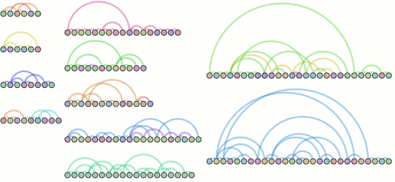
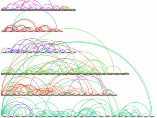
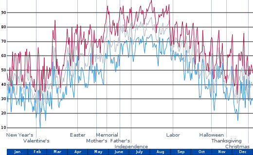
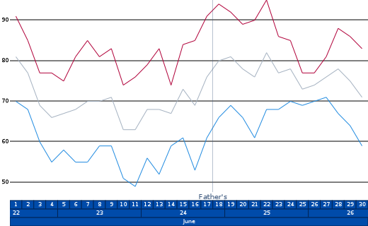
Er, so, every post gets two pictures, and there’s your second one. It’s the stacked line-chart being all curvy instead of not (curvy). The data is from the mailman feed, although I don’t think it’s actually supposed to look like that… the colors could also use some work.

Pretty Polish

pretty-pretty.png

As part of a continuing effort to make visophyte’s byproducts look attractive, I implemented a bit more shiny today. Using this aqua sphere effect photoshop tutorial at skdstudio.com as a basis, I have made the simple circle renderer support a ‘pretty’ option.

Unfortunately, this took a lot longer than I was hoping. Cairo lacks a Gaussian blur mechanism, PIL only supports 5×5 image kernels (iterative application is too slow), and using SciPy was absurdly slow and didn’t even work right before I gave up on it. Thankfully, in my googling it turned out that box blurs can be used to approximate a Gaussian blur. So visophyte’s cairo renderer now has a home-grown “box blur” filter using a boxcar average to keep the iterations and redundant calculations down.  (And only using the array module, so no new dependencies.)

mailman-pretty-circles.png

The latter vis is just the same vis as in my post about pretty pie charts, but with the pie visualizations replaced with circles. A net loss in information, but perhaps a net gain in prettiness? (Utility probably stays about the same…)

contacts, tallies, sparklines, but no clever title.

sparkbar-contacts-others.png

I have hacked up my local posterity bzr branch to process messages to extract contacts (and mailing lists). These contacts result in synthetic tags (to, from, and cc) applied to each message. My changes also include maintaining per-time interval (day, ISO week, month, year, ever) sparse counts for each tag.

Visophyte (bzr trunk) has been augmented to create bar-graph style sparklines (as coined/created/etc. by Tufte). Visterity, my happy-go-visualizy posterity plugin (also in the visophyte repository), consumes the new posterity contact statistics and produces what you see above.

sparkbar-contacts-me.png

If you’re not sure what you’re seeing, each bar is a week. The grey-colored bars ‘above’ the invisible line are messages from that contact (to anyone). The red-colored bars ‘below’ the line are messages to that contact (from anyone), while the lighter-red-colored-bars below the line are messages cc’ed or bcc’ed to that contact (from anyone).

It is important to reiterate that, at this time, these from/to/cc relations have nothing to do with the person whose email repository it is (mine, in this case). If messages are red, that doesn’t mean I sent them the message; it just means someone sent them a message and it somehow passed through my account. Of course, when viewing a list of contacts, I’m only really going to care about that person’s interactions with me. So that is a must-have and up on the near-term to-do list. The current set of tags are really most useful in attempting to visualize messages sent through a mailing list or other broadcast medium, which is also of great interest to me.

I should probably also note that when writing the list-handling logic here, I forgot to have the code generate an implied ‘to’ when the person replied only to the list but the author of the previous message could be presumed to be the intended recipient of the message. Which explains why so many of the people in the example image up there do not end up receiving many messages. I would have fixed this, but re-processing my full downloaded gmail corpus of something like 68,000 messages takes a while.

Also, the blurred out guy in the example doesn’t need to be blurred out. I ended up eliding a useless column that I had decided to blur for no clear reason, but in my sleep-desiring state I also screwed up and blurred a column that really didn’t need to be blurred. (All the people shown have posted to public mailing lists, so their e-mail addresses are already out their, and their names aren’t exactly going to get them more spam. And OCR would be required anyways, as the sparklines are images rather than inline-SVG for caching reasons.)

UPDATE: Uh, as I quickly re-read the post and looked at the sparkline, I realized I completely flipped (both color-and above/below) the sparkline from what I had originally intended.  Thankfully my original intent didn’t make all that much sense either, at least color-wise, so I think I can sleep easy without correcting that.  Better color suggestions,etc. are appreciated.

Click your way to health. Oh, and email visualization.

The SVG renderer is in and brought with it much refactoring of the renderers. Cairo still works. But what does this buy us?

visterity-conv-threadarc.png

It buys us a working clickable demo of posterity with the visterity plugin. And a second one too. (You probably need to be using Firefox for it to work. And one with SVG support to boot. Firefox 2.0.0.6 on Ubuntu gutsy definitely works at the minimum.)

Oh, I should probably clarify “working”. I used Firefox’s “Save Page As…” functionality so you get the same experience I got when browsing that page. But if you think you can click on any of the other links and read my e-mail, you will be sadly disappointed.

visterity-conv-timeline.png

For the unadventurous, I will tell you what you could do if you clicked on either of those images:

  • The circular nodes have title attributes with the name of the author of the email, so if you hover you get a tooltip with their name. (Not fancified, but it could be.)
  • Clicking on the circular nodes expands the e-mail in the conversation and smooth-scrolls you to that e-mail.

It does not get you any form of connection in the opposite direction. So as you move your mouse over the message headers, the messages in the visualization do not light up. However, I probably wouldn’t be bringing that up if I didn’t plan to address it. I mean, who would do that and make themselves look bad? Not me, certainly. I’m cagey.

Oh, and please keep in mind that these visualizations are not intended to be polished in any way shape or form. In fact, it took all of 5 minutes to throw the time-line vis together, which would explain why the use of color is rather redundant. (It would be okay if I had an animated transition between that visualization and another visualization. But I don’t. It turns out I’m okay with making myself look bad.)

a posterity-based email visualization says what?

Exactly.

posterity-hooray-hooray.png

It’s posterity, the exciting new Python mail client (as web server) with some mods (that’s my bzr branch) to support plug-ins slightly more and new chrome ‘decorators’. Into that we have plugged “visterity”, a new visophyte-ish thing. (Found in the visophyte bzr trunk under src/visterity-py) This works with the cairo renderer (so have python-cairo), and may work with the aggdraw renderer, but I haven’t tried it and make no promises.

To elaborate on the graphic, it’s posterity’s conversation view with the visterity plugin providing a png at a chrome decoration point (‘conversation’, ‘top’). It is not yet click-able! It is most definitely not responsive to what the current message you are dealing with is. However, those are the next steps!

I will likely implement a mixed svg/js renderer that should then be able to interact bidirectionally with posterity. This is what I have been hoping to do with Thunderbird but have been punting on because it involves a degree of pain/difficulty that is hard to justify given my limited hobby-programming time. However, Thunderbird is still on the map and I will attempt to ensure the implementation is general enough that I can plug it into Thunderbird as well.

Cairo bakes Pretty Pies

Vacation found me actually relaxing, but some pretty progress has been had. I forgot to push my 64-bit aggdraw patches to the laptop I brought, so I implemented a cairo renderer. This has resulted in some backend cleanup and refactoring, although there is more to do. This also allows for attractive use of gradients:

pretty-pie.png

The changes to the pie-chart rendering are based on an Illustrator tutorial on how to make pretty pie charts. Although the pie chart has long known how to label itself and is now more competent at it, labels still overlap so they have been mercilessly disabled in this picture.

pretty-graphito-pies-python-dev-2007-july-twopi-fancy.png

This is a graph of the python-dev traffic (from the mailman archive) for July 2007 once more. This time:

  • The nodes are authors.
    • The radius of the node is a linear mapping lower bounded at 8 and upper-bounded at 24 based on the number of messages the author wrote during the time period.
    • The pie slices are the threads the author replied to/started during the month.
      • Their weights are the number of messages they wrote involved in that thread.
      • Their colors are distinctly colored. Because the previous distinct color mechanism clearly fell down by providing colors which were too similar, I did a first pass at varying the saturation in addition to varying the hue. Varying value/brightness seemed a little too distracting, but it might be okay with less severe variations.
  • The edges indicate that the author replied to a message by another author.
    • The width is (linearly) based on the number of times the user replied to the other author.
    • The color is always 25% opaque 50%-gray. Since the edges are effectively directed (but not visually distinguished), a case in which two authors replied to each other will result in a darker gray, at least in the region of overlap (since width can vary).
  • The layout is graphviz‘s twopi.

python-dev mailman archive thread-arc visualizations

What’s new? Mailman archive processing! Bezier segmenting for more accurate arcs (thank you Luc Masonobe)! Pseudo-thread-arcs! (Actual thread arcs as visible on the whoa-awesome-but-why-aren’t-you-released-software ReMail project would seem to more practically squash ridiculously-large arcs and of course leverage the other side.)

python-dev-july-2007-threadarc-assembled.png

  • Node colors are per-author. The middle bottom thread demonstrates the need for a smarter distinct color logic, as I’m pretty confident that thread isn’t the result of one person with multiple personalities.
  • Nodes are sequenced time-wise from left-to-right with uniform (pixel-based) spacing. I tried placing them by time, but things clump up pretty uselessly. Non-linear time scaling is on my list.
  • Arc colors are based on the subject, whereas reconstruction is based on the headers. As such, arc colors in a thread may change if someone changes the subject.
  • Arc width is constant, though I was entertaining varying it based on the amount of new content in each e-mail. Of course, there’s always knobs to tweak.

Please note that the above image is actually the result of re-arranging the contents of two separate images; the layout currently used just stacks them all vertically with a (dynamic) uniform spacing. For this reason, the rightmost threads are actually from a separate run where I set the ‘chaos’ filter with a much higher bar. Oh, and those are threads from the July 2007 python-dev archive, although without labeling you have no reason to believe me.

python-dev-2007-threadarc-chaos200.png

And this is the result of sucking up January-July 2007, filtering on threads with a ‘chaos’ greater than 200. (‘chaos’ being an arbitrary and arguably incorrect term for the total distance of all nodes from their parent (less one). So a thread where every message is just a response to the one that chronologically preceded it will have a chaos of 0. A thread where every message is a response to the message before the one that chronologically preceded it will have a chaos of (n – 2) where n is the number of messages. Apply algebra, rinse, and repeat.

I’m going to try and get this going with Thunderbird reasonably soon, but it might take longer than I’d hope. Thunderbird w/pyxpcom didn’t build clean on my amd64-arch laptop, chronicle-recorder’s valgrind crashes on amd64, and the like means some busywork on the horizon.

A step sideways

This seemed like a better idea in my head:

when others ask why, I clearly am not even listening.

What is it? It’s a variant on the blog visualization below from this post, but using crescent/lune slices instead and with no sustain (aka, if there’s no data point, we don’t draw anything). It self-normalizes so that the maximum value range takes up a full 180 degrees. It does not bother to account for the loss of area when apportioning the slices, though it could. I doubt that would make up for the perceptual issues anyway.

older and maybe better

The good news is that the visualization motivated me to properly abstract the previously inane special-cased implementations for rings/curves to a path-based implementation like reasonable people would expect. (Refactoring still to be done.)

In other news, I’ve changed up the revision control for my chronicle-recorder patches after it became clear my stacked git approach was not going to cleanly allow concurrent development on my new laptop. The new way is a bunch of bzr branches; the ‘rev control’ page link on the left is the authority on what is what.

Chronicle-Recorder Graph/Ring Visualization! Hooray!

Thanks to new and improved time management skills (and a holiday weekend doesn’t hurt), I’ve got a chronicle-recorder visualization going on via chroniquery:

visichron.py trace vfancy -f smain

Above, we have the visualization run against the ‘fancy’ program seen in the previous chroniquery posts (with one caveat, addressed later). What does it mean?

  • The circular nodes are functions in the executed program. In this case, we start from ‘smain’ and pull in all the subroutines that we detect.
  • The edges between nodes indicate that a function call occurred between the two functions sometime during the execution; it could be once, it could be many times. The color of the edge is a slightly more saturated version of the color of the node that performed the call. If they call each other, only one color wins.
  • The rings around the outside of each node indicate when it was called, specifically:
    • The ring starts and stops based on the chronicle-query timestamp. Like on a clock, time starts at due north and flows around clock-wise, with the last smidge of time just before we reach due north again.  This has its ups and downs. The reason we are using ‘smain’ instead of ‘main’ is that when we used the untouched main, the first “new” ended up taking up most of our timestamp space. So I turned main into smain and had a new main that takes the memory allocator start-up cost hit and then calls smain.
    • The thickness of the ring indicates the depth of the call-stack at the time. The thickest ring corresponds to the outermost function, the thinnest ring to the innermost function. This results in a nice nesting effect for recursive functions, even if it’s more of an ‘indirect’ recursion.
    • The color of each ring slice is based on the control flow taken during the function call. (I think this is awesome, hence the bolding.) Now, I’m making it sound fancier than it is; as a hackish first pass, we simply determine the coverage of all the instructions executed during that function call. A more clever implementation might do something when iteration is detected. A better implementation would probably move the analysis into the chronicle-query core where information on the basic blocks under execution should be available. Specific examples you can look at above:
      • print_list: The outermost calls are aqua-green because their boolean arguments are true. The ‘middle’ calls are light green because their boolean arguments are false. The fina, innermost calls are orange-ish because they are the terminal case of the linked-list traversal where we realize we have a NULL pointer and should bail without calling printf. They are also really tiny because no printf means basically no timestamps for the function.
      • nuke: Four calls are made to nuke; the first and third times (light blue) we are asking to remove something that is not there, the second and fourth times (purple) we are asking to remove something that is. I have no idea why the third removal is so tiny; either I have a bug somewhere or using the timestamps is far more foolish than I thought.

Besides the obvious shout-out to chronicle-recorder, pygraphviz and graphviz power the graph layout. Now, a good question would be whether this actually works on something more complex? Could it be? Well, you can probably see the next picture as you’re reading this, so we’ll cut this rhetorical parade short.

visichron.py trace chronicle-query -f load_all_mmapped_objects

Besides the obvious font issues, this actually looks pretty nice. But what does it tell us? Honestly, the full traversal here is excessive. All we care about is the center node, load_all_mmapped_objects, and load_dwarf2_for (due north and a teeny bit east of the center node). If we look at the calls to load_dwarf2_for, we can see that two of them have different control-flow coverages. Those happen to be the times debug symbols could not be found (which is my problem I want to debug). The first one is for ld-2.6.1.so (I’m looking at the textual output of chronisole for the same command), and the second one is for /usr/bin/python2.5. The second one should definitely not fail, because it should find the symbols in /usr/lib/debug, but it does.

Unfortunately, the trail sorta stops cold there with a bug in either chronicle-query or in chroniquery (possibly cribbed from chronomancer). load_dwarf2_for should be calling dwarf2_load, but we don’t see it. I don’t know why, but I haven’t actually looked into it either. Rest assured that a much more awesome graph awaits me in the future!

Because there’s too much text and not enough pictures, I’ll also throw in the output of the ring visualization test which uses a stepped tick-count (1 per function call) to show how things could look if we went with an artificial time base…

ring visualization example

Bzr repositories for both can be found at http://www.visophyte.org/rev_control/bzr/.

some practicality comes to visophyte town

In a nod to making useful visualizations, the marker infrastructure has been beefed up. The linear mapper now has reasonable heuristics to use pretty round numbers. And the time mapper has all sorts of time ranges under its belt.

weather vis demo, year time range

While I have thoughtfully left out units, there is now at least a chance of someone guessing that the above is a graph of the high, average, and low temperatures for somewhere in some year. Maybe someone really fancy could narrow it down by figuring out when the various inconsistent holidays fall and the overall temperature trends. But I’ll spoil the fun; it’s Dulles, VA in 2006! Thanks to a CF6 ‘Preliminary Climatology Data’ parser/’data feed’ we have a limitless* source of data which is only good for examples. Also, thank you weather.gov.

weather vis demo, june

This one is just the month of June. The non-intuitive numbers are ISO weeks. Overkill demands the ‘rulers’ that provide the date ranges eventually be capable of visualizing data themselves**, but for now they just derive their colors from primitive theming support which is also new.

I should probably note that I have begun to push my bzr repository to this server (/rev_control/bzr/visophyte) simply because I can’t think of a reason not to. The visophyte code proper is LGPL v3, but examples are MIT/X11 (though they need to be more explicitly labelled as such). That said, the code is still in an aggressive state of flux and I suggest no one even bother looking at it. Simply put, I keep adding features as needed, and the waves of non-backwards-compatible constraint/feature propagation often need to ripple through the entire codebase. And when I say ripple, I mean ripple; it’s not instantaneous.

* For the purposes of this asterisk, limitless still involves limited cutting and pasting. The parser likes to read files, not interwebs.

** Although I am likely to use such functionality to render the rulers useless and somewhat gaudy, there are sane possibilities too.