Vacation found me actually relaxing, but some pretty progress has been had. I forgot to push my 64-bit aggdraw patches to the laptop I brought, so I implemented a cairo renderer. This has resulted in some backend cleanup and refactoring, although there is more to do. This also allows for attractive use of gradients:
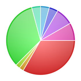
The changes to the pie-chart rendering are based on an Illustrator tutorial on how to make pretty pie charts. Although the pie chart has long known how to label itself and is now more competent at it, labels still overlap so they have been mercilessly disabled in this picture.
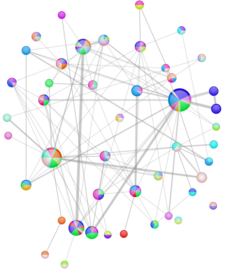
This is a graph of the python-dev traffic (from the mailman archive) for July 2007 once more. This time:
- The nodes are authors.
- The radius of the node is a linear mapping lower bounded at 8 and upper-bounded at 24 based on the number of messages the author wrote during the time period.
- The pie slices are the threads the author replied to/started during the month.
- Their weights are the number of messages they wrote involved in that thread.
- Their colors are distinctly colored. Because the previous distinct color mechanism clearly fell down by providing colors which were too similar, I did a first pass at varying the saturation in addition to varying the hue. Varying value/brightness seemed a little too distracting, but it might be okay with less severe variations.
- The edges indicate that the author replied to a message by another author.
- The width is (linearly) based on the number of times the user replied to the other author.
- The color is always 25% opaque 50%-gray. Since the edges are effectively directed (but not visually distinguished), a case in which two authors replied to each other will result in a darker gray, at least in the region of overlap (since width can vary).
- The layout is graphviz‘s twopi.