
So, motivated by recent prettiness (C26000’s Last.fm Extra Stats ‘Wave Graph‘ and its inspiration Lee Byron’s Layered Histogram, which also reminds me of the fundamentally different but visually close-enough IBM Research/Viégas/Wattenberg’s history flow), I have put in some preliminary aggregation logic and a ‘stacked linechart’ visualization. It’s quite the poor cousin to Lee Byron’s stuff, but we’ve got to start somewhere.
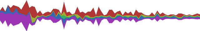
Although histogram is probably a better term for the result, the visualization is actually ignorant that there’s aggregation going on, so stacked linechart it is. The data is the same data (wordpress shoutbox ‘shouts’) from my last post, but instead of block stacking to get a de facto histogram, the binned time-intervals are aggregated by author. The stacked linechart consumes these and — presto — a de facto trendy histogram. The main difference here is that the bin period is 7 days, although bugs remain. I am going to replace my haphazard date logic with python-dateutil shortly to resolve this problem.

Of course, the whole point of visophyte is (excessive) flexibility, so let’s at least leverage that. The above is the same data, but with the fill’s saturation varying with the total number of hyperlinks included in ‘shouts’ for that time interval, producing a quasi-retro wire-frame effect. Stronger/bolder colors = more links, lighter/faded colors = less/no links. Some day, perhaps a pretty spline version, but up next is getting back to Thunderbird.