Anyone going to InfoVis 2007? And a dubious contact vis.

I’m going to be at Vis 2007/InfoVis 2007/VAST 2007 next week thanks to my employer, The PTR Group (who is hiring, especially embedded folk in the greater DC area). So, if anyone who reads this will be there, feel free to drop me a line in the comments below or via e-mail at sombrero@alum.mit.edu.

magneto-contact-vis-dubious.png

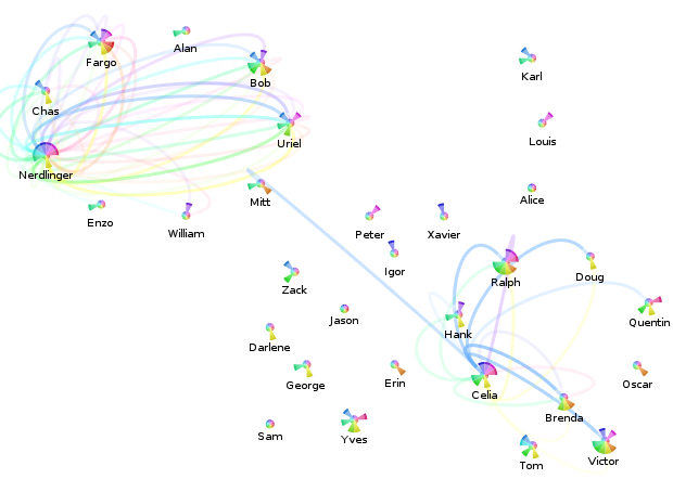
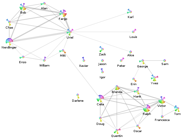
The above is an attempt to visualize the per-month message flows between contacts, originally drawing inspiration from iron filings in a magnetic field. It doesn’t really work, even filtering things so only messages between the contacts involving “Nerdlinger” (upper left quadrant) and “Celia” (lower right quadrant) are displayed.

The Celia one works out a lot better, as you can see. Please overlook the fact that somehow there are all sorts of messages from Celia during that blue month with neither her nor the other contacts having any meaningful message traffic per the pie-chart. (The filtering constraint is that the contacts of interest have to either be in the to/cc or the from part.) This is a result of a bug in my contact consolidation logic (now fixed), that resulted in the summary statistics not properly being updated in all cases. Recalculating the statistics isn’t going to happen tonight, so this screenshot shall forever be buggy.

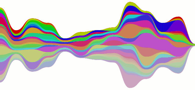
What I take away from this visualization is that when attempting to indicate the relative proportion of messages between contacts across time, it would probably be better to use a single straight rainbow line. I define a rainbow line as a line made up of multiple colors; I’m sure there’s a better (pre-existing) term for the concept.

revised-me-relative-sparkbars-redblue.png

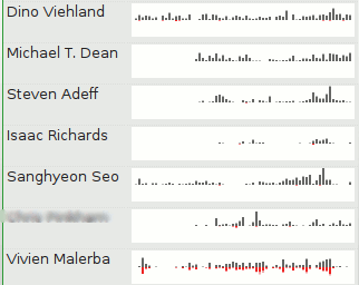
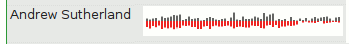
And these are some of the newer sparkline bars that only include messages to-me-from-the-contact (above: blue for to, light blue for cc), or from-me-to-the-contact (below: red for to, pink for cc). The color scheme is a red-shift (away from me)/blue-shift (towards me) sort of metaphor which no one (cooler than me) should ever guess. I think I’ll have to resort to text or icons, or just stop trying to cram so much information in there.

visualizing contact relationships

anonymized-contacts-village.png

First, there’s bad news on the shiny front. Although I made the SVG renderer capable of producing the gel-like circles, Mozilla’s SVG support currently lacks the features to do it as implemented. (Curse your full-featured-ness, Eye of GNOME!) Hopefully someday soon, it will support the synthetic BackgroundImage filter input (bug).

Our show-and-tell for the end of this weekend is a screenshot of the anonymized visualization from my Posterity contacts page for my ‘village’ tag (using my visterity plugin):

  • The nodes represent the contacts tagged with ‘village’.
    • The pie-slices represent the activity of the contact overall for the last year:
      • Each pie slice corresponds to a month. The current month is the slice just below due east, and we go back in time as we rotate around clockwise. The oldest month is just above due east.
      • The radius is a clamped linear scaling (over all nodes displayed and all months) of the number of messages sent by this person to anyone (including me).
      • The color is just a consistent hue-variation designed to look pretty. I was actually planning to use a single color whose saturation was at max for the current month and decayed to black for the oldest month. That arguably would reduce confusion as to what pie slice means what.
    • The labels are anonymized. There’s a mapper in there that maps people’s actual names (eventually nicknames) to what you see.
  • The edges represent e-mail messages sent from the displayed contacts to the other displayed contacts. Since I did not add my contact to this label group, this means I have no impact on things.
    • The edge widths are a linear scaling of the number of messages sent from the one contact to the other. Because the edges are actually directed, there may be two edges between two nodes which will overlap. Because the edges are not fully opaque, you should be able to figure out if the communication is at least symmetric or asymmetric.

Interestingly, you can see that the two major clusters of contacts are linked by ‘Mitt’ and ‘Celia’.

mailman-flow-whoknows.png

Er, so, every post gets two pictures, and there’s your second one. It’s the stacked line-chart being all curvy instead of not (curvy). The data is from the mailman feed, although I don’t think it’s actually supposed to look like that… the colors could also use some work.

contacts, tallies, sparklines, but no clever title.

sparkbar-contacts-others.png

I have hacked up my local posterity bzr branch to process messages to extract contacts (and mailing lists). These contacts result in synthetic tags (to, from, and cc) applied to each message. My changes also include maintaining per-time interval (day, ISO week, month, year, ever) sparse counts for each tag.

Visophyte (bzr trunk) has been augmented to create bar-graph style sparklines (as coined/created/etc. by Tufte). Visterity, my happy-go-visualizy posterity plugin (also in the visophyte repository), consumes the new posterity contact statistics and produces what you see above.

sparkbar-contacts-me.png

If you’re not sure what you’re seeing, each bar is a week. The grey-colored bars ‘above’ the invisible line are messages from that contact (to anyone). The red-colored bars ‘below’ the line are messages to that contact (from anyone), while the lighter-red-colored-bars below the line are messages cc’ed or bcc’ed to that contact (from anyone).

It is important to reiterate that, at this time, these from/to/cc relations have nothing to do with the person whose email repository it is (mine, in this case). If messages are red, that doesn’t mean I sent them the message; it just means someone sent them a message and it somehow passed through my account. Of course, when viewing a list of contacts, I’m only really going to care about that person’s interactions with me. So that is a must-have and up on the near-term to-do list. The current set of tags are really most useful in attempting to visualize messages sent through a mailing list or other broadcast medium, which is also of great interest to me.

I should probably also note that when writing the list-handling logic here, I forgot to have the code generate an implied ‘to’ when the person replied only to the list but the author of the previous message could be presumed to be the intended recipient of the message. Which explains why so many of the people in the example image up there do not end up receiving many messages. I would have fixed this, but re-processing my full downloaded gmail corpus of something like 68,000 messages takes a while.

Also, the blurred out guy in the example doesn’t need to be blurred out. I ended up eliding a useless column that I had decided to blur for no clear reason, but in my sleep-desiring state I also screwed up and blurred a column that really didn’t need to be blurred. (All the people shown have posted to public mailing lists, so their e-mail addresses are already out their, and their names aren’t exactly going to get them more spam. And OCR would be required anyways, as the sparklines are images rather than inline-SVG for caching reasons.)

UPDATE: Uh, as I quickly re-read the post and looked at the sparkline, I realized I completely flipped (both color-and above/below) the sparkline from what I had originally intended.  Thankfully my original intent didn’t make all that much sense either, at least color-wise, so I think I can sleep easy without correcting that.  Better color suggestions,etc. are appreciated.

Click your way to health. Oh, and email visualization.

The SVG renderer is in and brought with it much refactoring of the renderers. Cairo still works. But what does this buy us?

visterity-conv-threadarc.png

It buys us a working clickable demo of posterity with the visterity plugin. And a second one too. (You probably need to be using Firefox for it to work. And one with SVG support to boot. Firefox 2.0.0.6 on Ubuntu gutsy definitely works at the minimum.)

Oh, I should probably clarify “working”. I used Firefox’s “Save Page As…” functionality so you get the same experience I got when browsing that page. But if you think you can click on any of the other links and read my e-mail, you will be sadly disappointed.

visterity-conv-timeline.png

For the unadventurous, I will tell you what you could do if you clicked on either of those images:

  • The circular nodes have title attributes with the name of the author of the email, so if you hover you get a tooltip with their name. (Not fancified, but it could be.)
  • Clicking on the circular nodes expands the e-mail in the conversation and smooth-scrolls you to that e-mail.

It does not get you any form of connection in the opposite direction. So as you move your mouse over the message headers, the messages in the visualization do not light up. However, I probably wouldn’t be bringing that up if I didn’t plan to address it. I mean, who would do that and make themselves look bad? Not me, certainly. I’m cagey.

Oh, and please keep in mind that these visualizations are not intended to be polished in any way shape or form. In fact, it took all of 5 minutes to throw the time-line vis together, which would explain why the use of color is rather redundant. (It would be okay if I had an animated transition between that visualization and another visualization. But I don’t. It turns out I’m okay with making myself look bad.)

a posterity-based email visualization says what?

Exactly.

posterity-hooray-hooray.png

It’s posterity, the exciting new Python mail client (as web server) with some mods (that’s my bzr branch) to support plug-ins slightly more and new chrome ‘decorators’. Into that we have plugged “visterity”, a new visophyte-ish thing. (Found in the visophyte bzr trunk under src/visterity-py) This works with the cairo renderer (so have python-cairo), and may work with the aggdraw renderer, but I haven’t tried it and make no promises.

To elaborate on the graphic, it’s posterity’s conversation view with the visterity plugin providing a png at a chrome decoration point (‘conversation’, ‘top’). It is not yet click-able! It is most definitely not responsive to what the current message you are dealing with is. However, those are the next steps!

I will likely implement a mixed svg/js renderer that should then be able to interact bidirectionally with posterity. This is what I have been hoping to do with Thunderbird but have been punting on because it involves a degree of pain/difficulty that is hard to justify given my limited hobby-programming time. However, Thunderbird is still on the map and I will attempt to ensure the implementation is general enough that I can plug it into Thunderbird as well.