
I have long had the goal of doing some form of e-mail visualization. After many false starts (for both Thunderbird and Outlook), I finally have something to show:
Now, of course, there are all kinds of caveats. This is all done in Python using PyXPCOM and PyDOM (hooray Mark Hammond!) The bad news is that the Python code is still unable to interact with the JavaScript pieces of Thunderbird. The good news is Mark Hammond already has a solution to allow Python and JavaScript to interact somewhat transparently (on bug 327689). Unfortunately, the patch does not work out of box for me, although it may be due to some underlying PyXPCOM problem that I still need to look into; I can’t even instantiate the error number service via PyXPCOM.
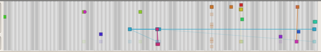
Since I haven’t implemented the labelling required to make the screenshot remotely intuitive, here’s an explanation of the visualization accompanied by a simpler picture generated by a test program using static data and the aggdraw renderer (no Thunderbird involved for this one):

- Time flows from left-to-right, old-to-new.
- The background represents the days of the week and standard 9-5 business hours. Dark grey for the weekends, lighter grey for the week days, and then bands of even lighter gray for the 9-5 business hours on week days. The background should simplify when dealing with larger time-scales, but that’s down the line.
- Nodes are placed vertically so that each horizontal strip corresponds to a single e-mail address. All nodes are colored based on their author.
- Opaque squares represent an e-mail from that person (the one who owns/is the strip) to me, the user of the program.
- Alpha-blended squares represent that person receiving a copy of the e-mail (‘to:’ only currently).
- Circles represent me, the user of the program, having sent an e-mail to that person. If I sent it to many people, they each were on the ‘to:’ line.
- Lines connect an e-mail with the message it is in reply to. Alpha-blended lines accompany alpha-blended nodes.
The first two visualizations are from a somewhat recent trunk build of Thunderbird with python and svg turned on. I have omitted the rest of the Thunderbird window because I’d just have to blur most of it out anyways. The data-sets come from two different folders that I copied interesting sets of messages to (including the messages from the thread in my ‘sent’ folder). Because of the aforementioned lack of javascript interaction, clicking on a node does nothing. However, I do print out info on the message when you hover over it or click on it. This is actually specified via the visualization infrastructure, it’s the ‘control’ object which just prints it out in a debug fashion.
 [1]
[1]
The visualizations are powered by the python ‘visophyte’ library which I have been developing. Visophyte is the successor to the koalaRainbow Movable Type plugin I wrote for the Movable Type 3.1 plugin contest. koalaRainbow (for MT) was more of a simple procedural drawing markup mechanism fronting a query-language than a visualization engine. Its visualization definitions were incomprehensible due to a lack of any real abstraction. With any luck, visophyte will suffer the excesses of too much abstraction. koalaRainbow (for MT) died because #1 I wrote it in order to learn Perl so that I could legitimately dislike Perl, and #2 I favor Python for all my scripting. Visophyte will enjoy continual development because I love visualization and I use python all over the place.
One important note from the outset is that although I am a fan of PyXPCOM, I doubt visophyte as it exists would be appropriate for an email visualization plugin for thunderbird that would enjoy wide usage. Developing a JavaScript visualization engine would be much less reusable for my purposes, so I’m not doing that. One possibility might be to compile the visualizations to javascript, optimizing them as we go, a la pyjamas.
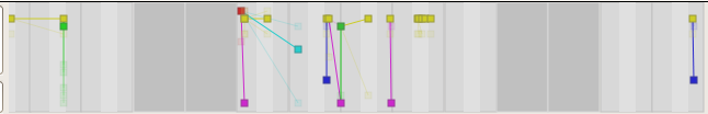
1: This visualization is just here to break up the text. It is also a visophyte simple test, but rather silly. It is unlikely anyone would really want a line chart with pie charts at each point. The line itself shows total sales by month, whereas the pie-chart shows a sales breakdown among products for that specific month. A stacked area chart would be the ‘sane’ alternative to this graph, though we could have multiple lines/pies here, I’m just too lazy to make up the data.